Brand identity · Beauty, Dubai
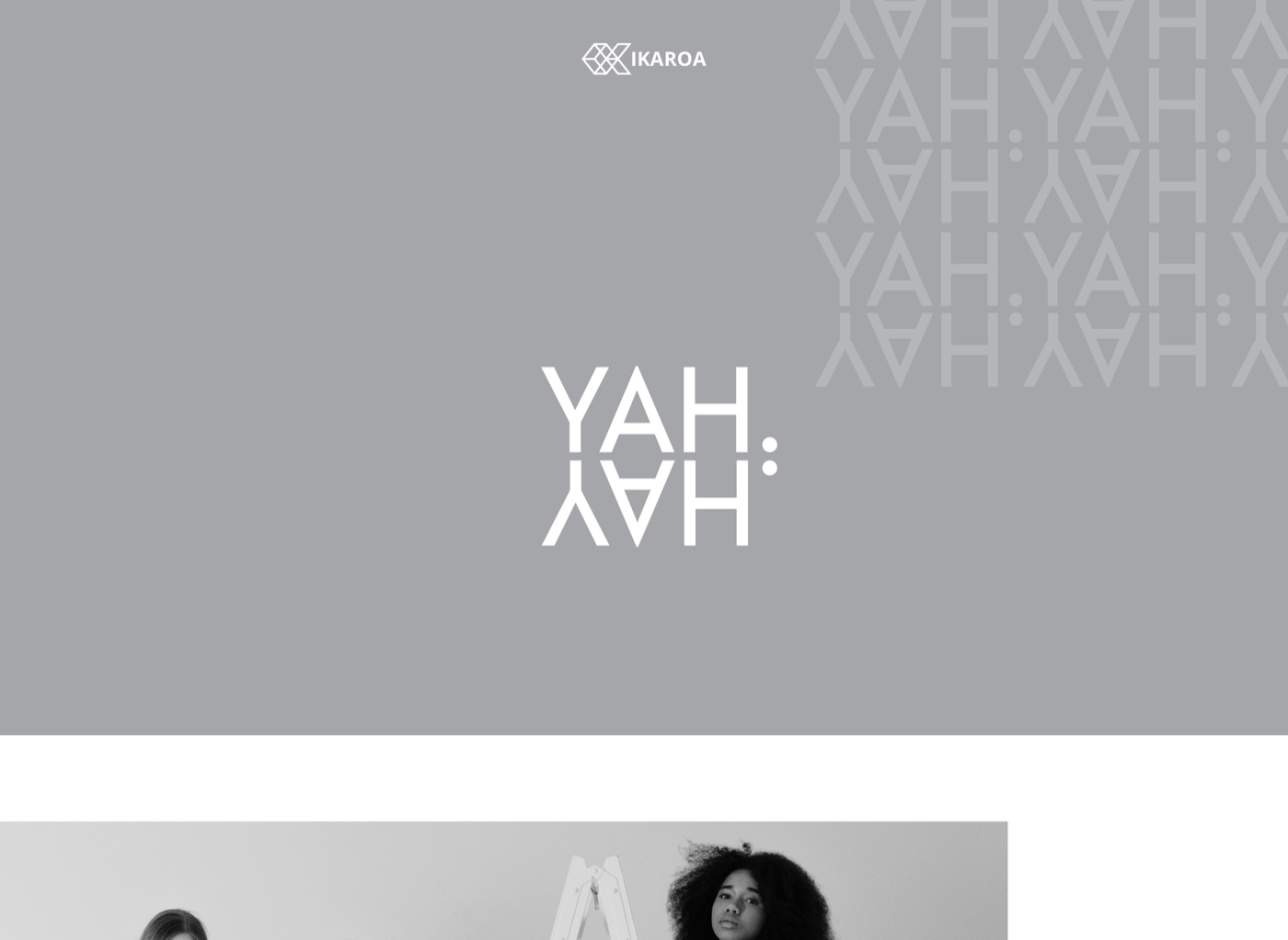
YAH
A minimal, mirror-monogram identity for a beauty brand in Dubai. One mark, read two ways. A palette of warm tan, soft grey and black, and a full editorial system built for the shelf and the feed.
The brief
A beauty brand that needed a mark worth remembering
YAHYAH is a beauty brand in Dubai, entering a category where most logos are interchangeable thin serifs. The brief was to find a mark with an idea in it. Minimal enough to sit on a foundation bottle, distinctive enough to recognise from across a store.
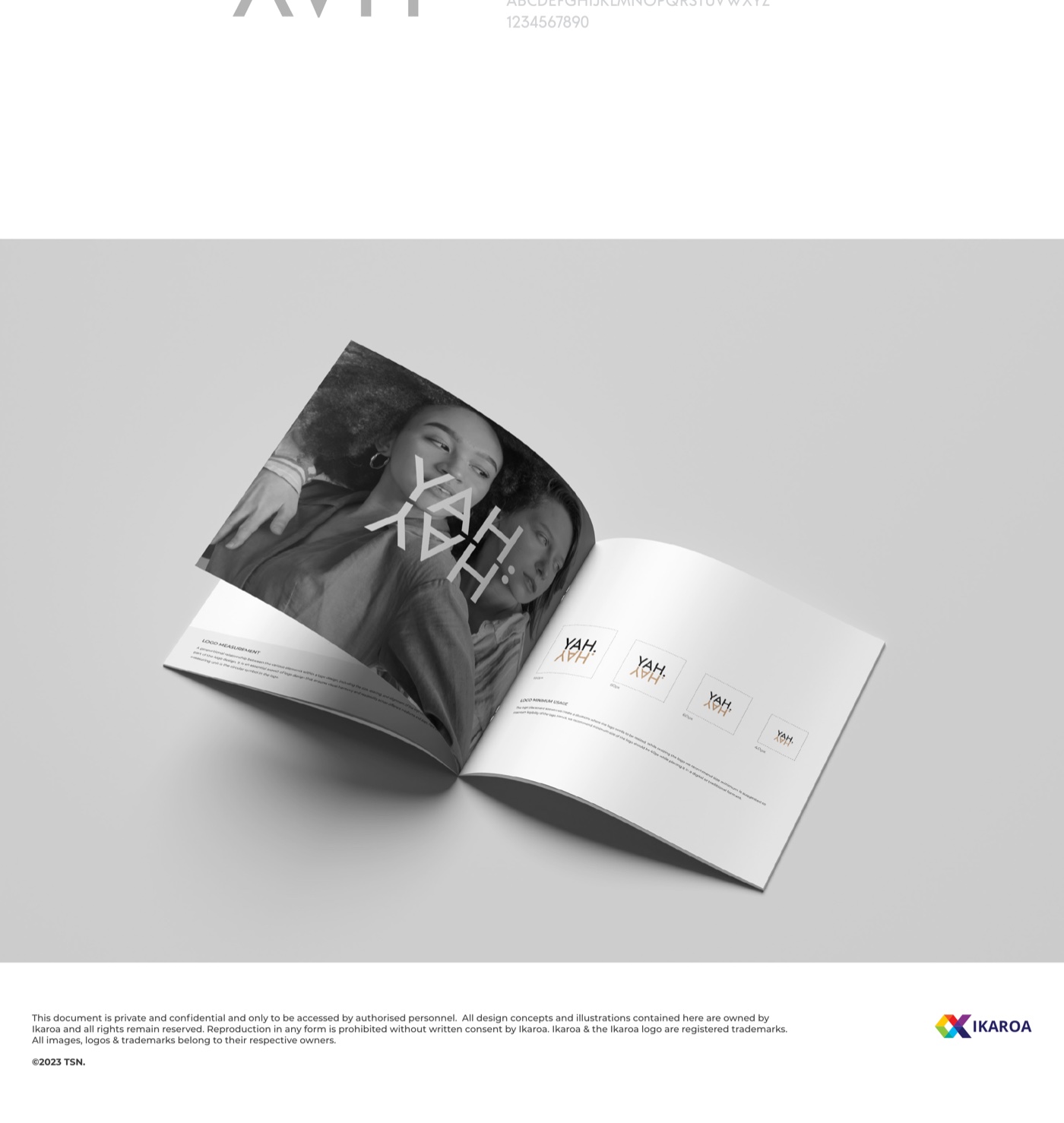
We explored four routes and landed on the mirror. YAH stacked over its own reflection, so the name reads top to bottom and the logo does a quiet double-take. Simple, modern, unmistakably its own.
The palette
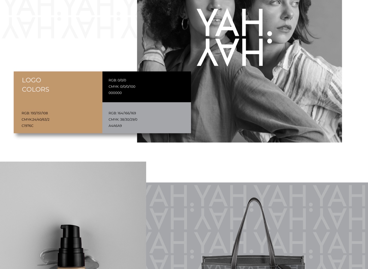
Three colours, no more
Warm Tan
#C1976C
Soft Grey
#A4A6A9
Black
#000000
What we shipped
From bottle to lookbook
01
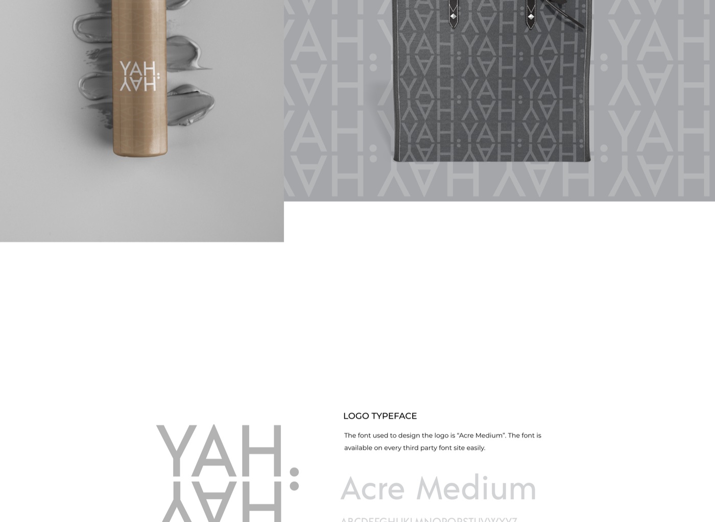
A mirrored monogram
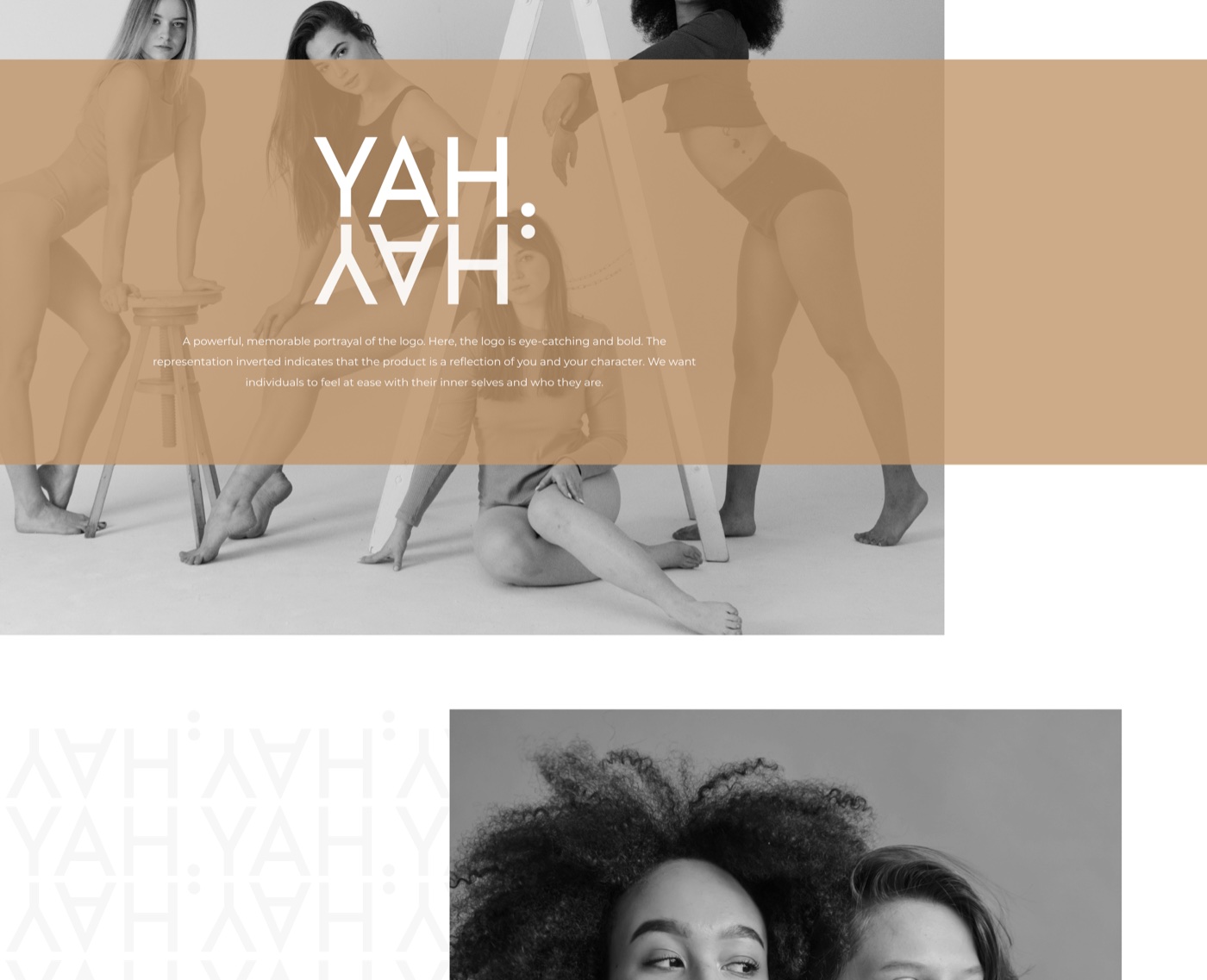
The final mark stacks YAH over its own reflection, so the name reads top to bottom and the logo does a quiet double-take. Set in Acre Medium, letter-spaced and calm, it is the kind of mark people clock once and remember.
02
A skin-tone palette
Warm tan, soft grey and black. The tan nods to foundation and skin without being literal about it. The neutral system steps back so the product and the faces carry the colour.
03
An editorial system
Product and packaging, tote bags, a repeating monogram pattern, and a campaign look built around real, diverse faces. Minimal enough for a shelf, rich enough for a magazine.
A logo that does a double-take for you. Read it once, then read it again.
Rolled out across
Everywhere beauty sells
How we approached it
Four calls that shaped the system
01
One idea, done properly
A beauty brand can get away with a plain wordmark, but a memorable one earns free recognition. The mirrored YAH is a single strong idea, executed cleanly, that reads after one look.
02
Let the faces bring the colour
The system is deliberately neutral so the product and the people supply the warmth. Diverse models, real skin, soft grey backdrops. The brand frames them instead of competing with them.
03
We explored, then committed
We worked through four logo routes before landing on the mirror. Showing the range mattered, but so did making a confident call. The final mark has the most life across product, pattern and print.
04
Made for the shelf and the feed
Beauty sells in two places now: the retail shelf and the phone. The minimal mark and the editorial layouts hold up at thumbnail size and at full page, with the monogram pattern bridging the two.
Want a mark people actually remember?
Beauty, fashion, retail. We build minimal identities with a real idea inside, made to work at thumbnail and full page.