The brief
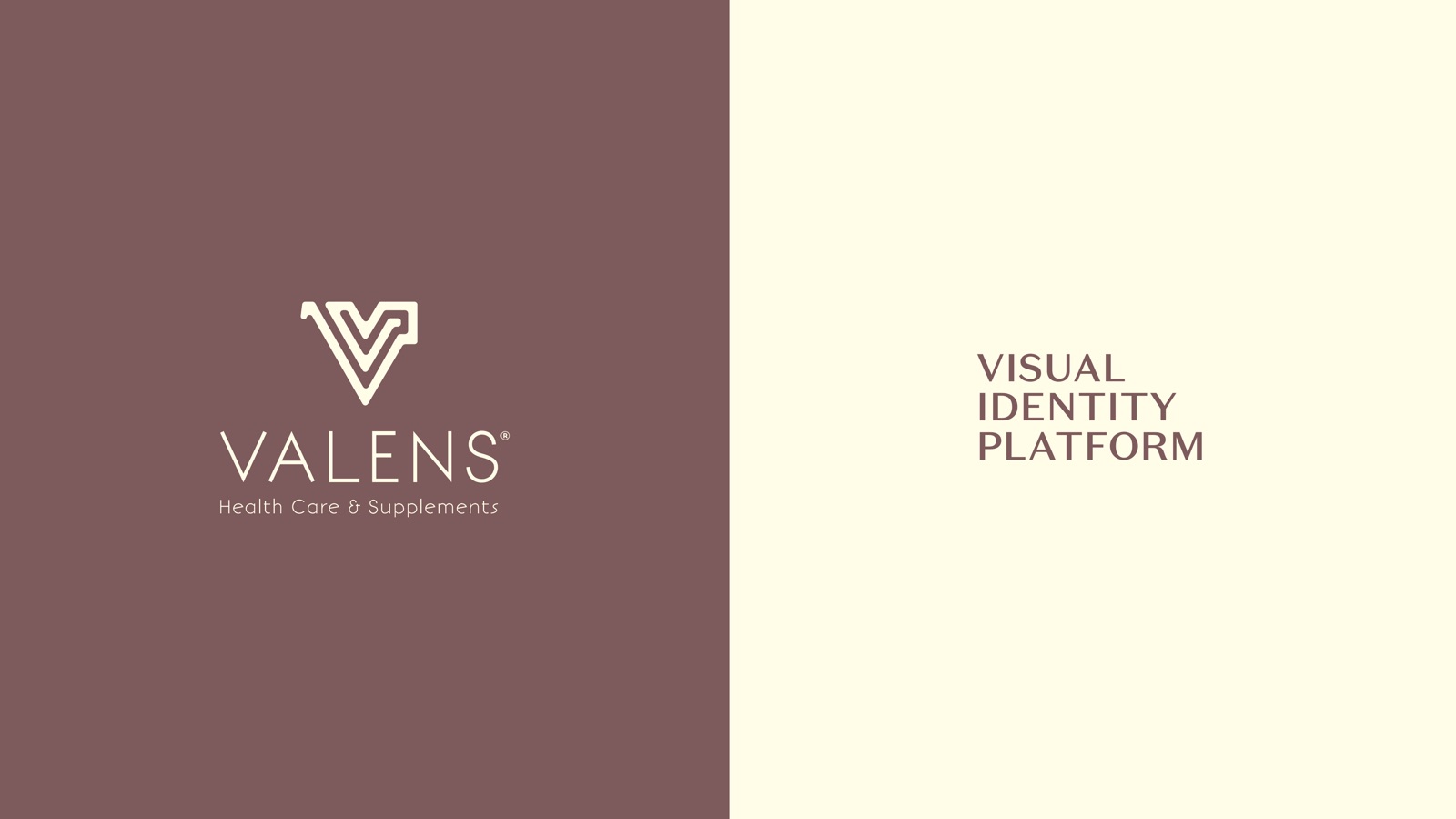
A supplement brand that tells you the truth on the label
Valens is a health care and supplement company built on doctor-backed formulation and clean ingredients. The category it sells into is full of noise: borrowed lab aesthetics, vague blends, health claims racing each other up the front of pack. The founder wanted the opposite. Honest eating, plainly stated, from a brand you could trust on sight.
Our job was the full visual identity. A logo, a palette, a type system and packaging that all carried one idea: clarity in a category that thrives on confusion.
The mark
The V is a maze with an exit
The supplement aisle works like a maze. Hundreds of products, competing promises, no obvious way through. That feeling became the logo.
The Valens V is one continuous line that folds back on itself like the corridors of a maze, then resolves cleanly into the letterform. The route is there if you follow it. The mark says what the brand says: there is an honest way out, and this is it.
“Honest eating. Tell people what is in the bottle, then get out of their way.”
One system, the whole range
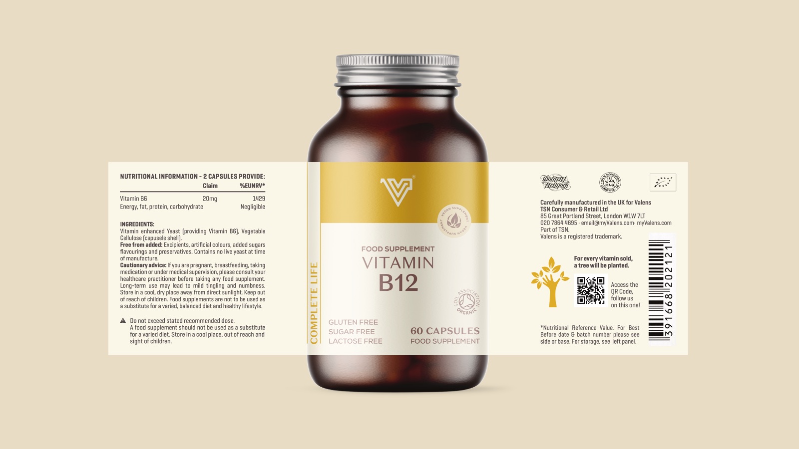
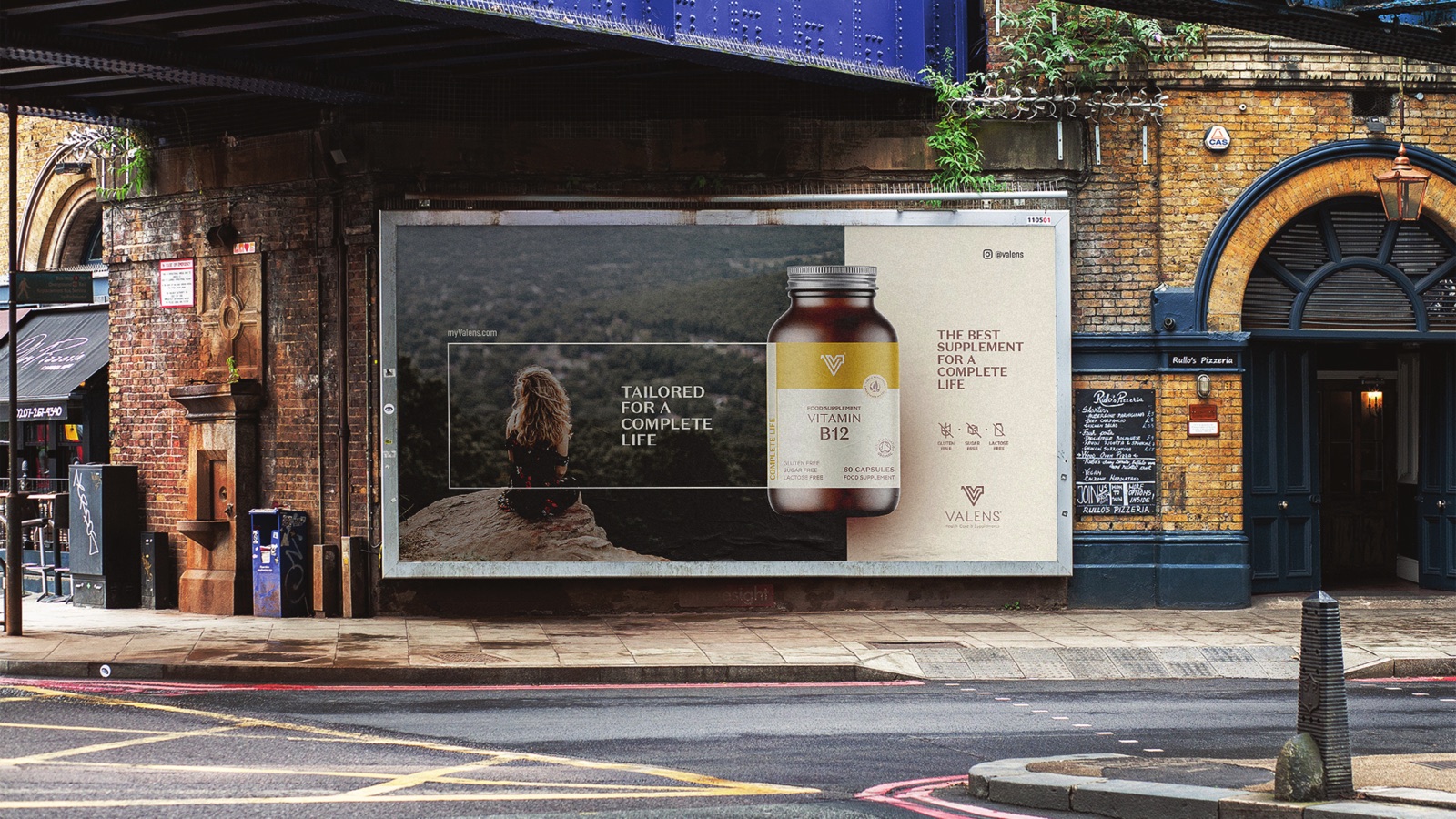
Vitamins and supplements
The core range is amber bottles of single-nutrient supplements, Vitamin B12 and the rest of the everyday shelf. Each label leads with the nutrient name set large in Domaine Sans Text, so a shopper reads exactly what they are taking before they read anything else. No proprietary blends, no asterisk theatre.
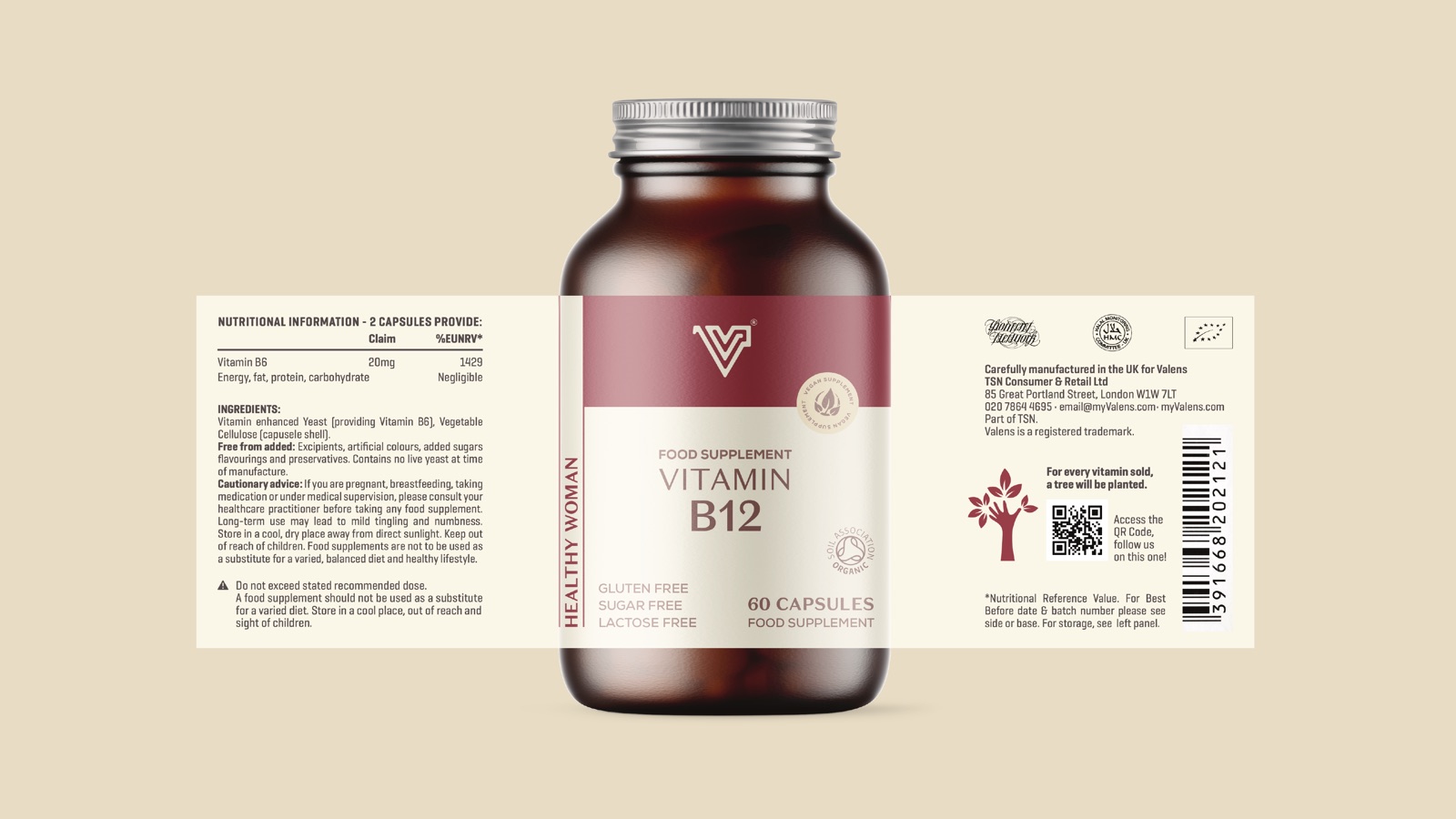
A second colourway for the body
Colour sorts the range without a single sub-brand. A berry label, a green label, an indigo label, each pulled straight from the master palette, so the line reads as one family on the shelf while still letting a regular buyer find their bottle at a glance.
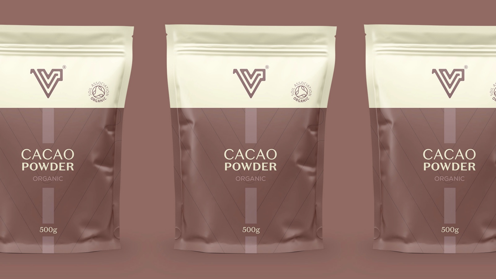
Organic foods, same rules
The system stretches past capsules into food: organic cacao powder in resealable pouches, carrying the Soil Association Organic mark and the same cream-over-mauve split. One identity covers the whole basket, supplements and pantry, without ever feeling stitched together.
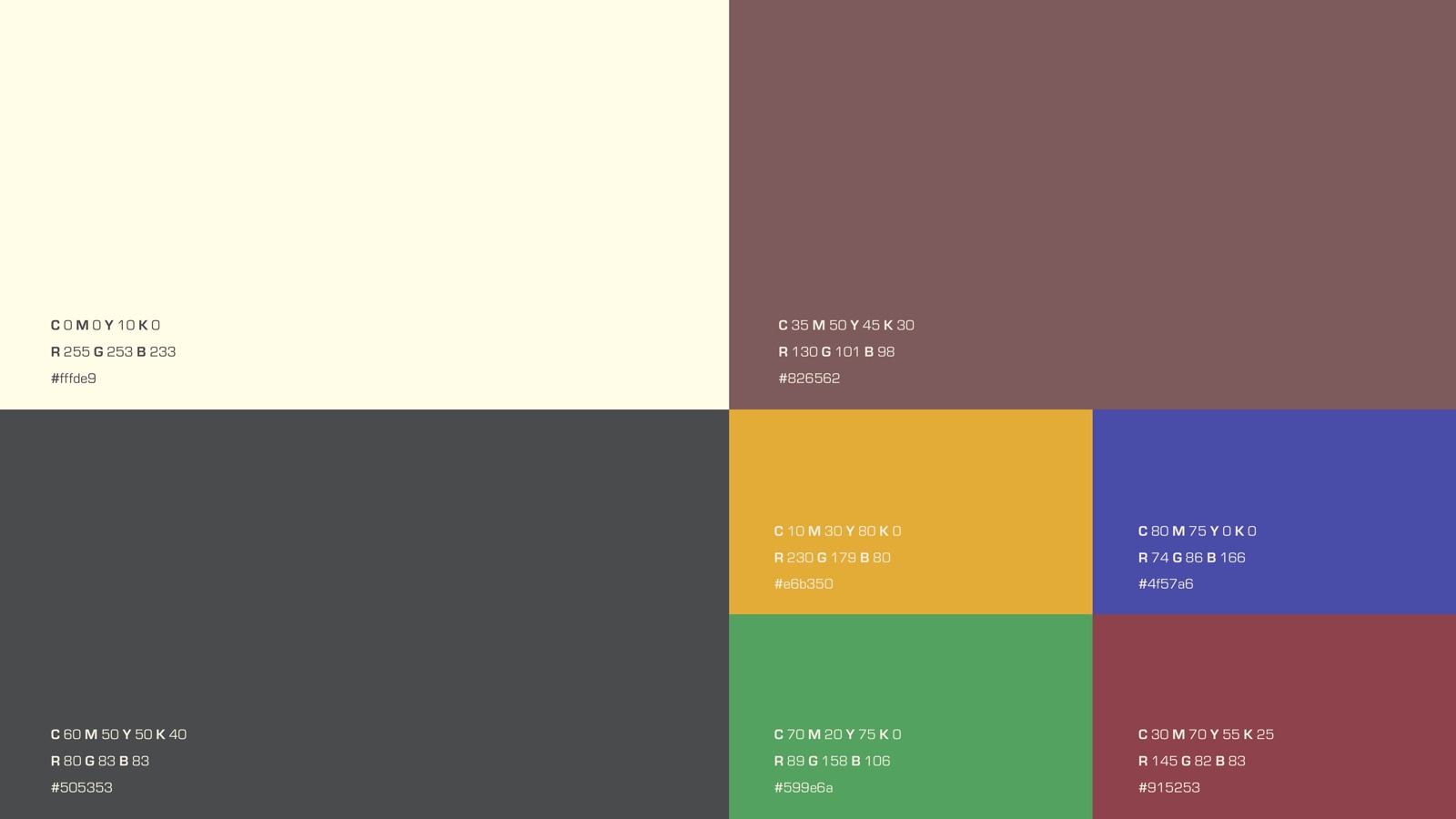
The palette
Seven warm, slightly muted tones, the kind you read as natural rather than synthetic. They sort the range, flag the organic line and hold the whole brand world together.
Paper Cream
#fffde9
Clinic Mauve
#826562
Honest Gold
#e6b350
Trust Indigo
#4f57a6
Leaf Green
#599e6a
Berry
#915253
Slate
#505353
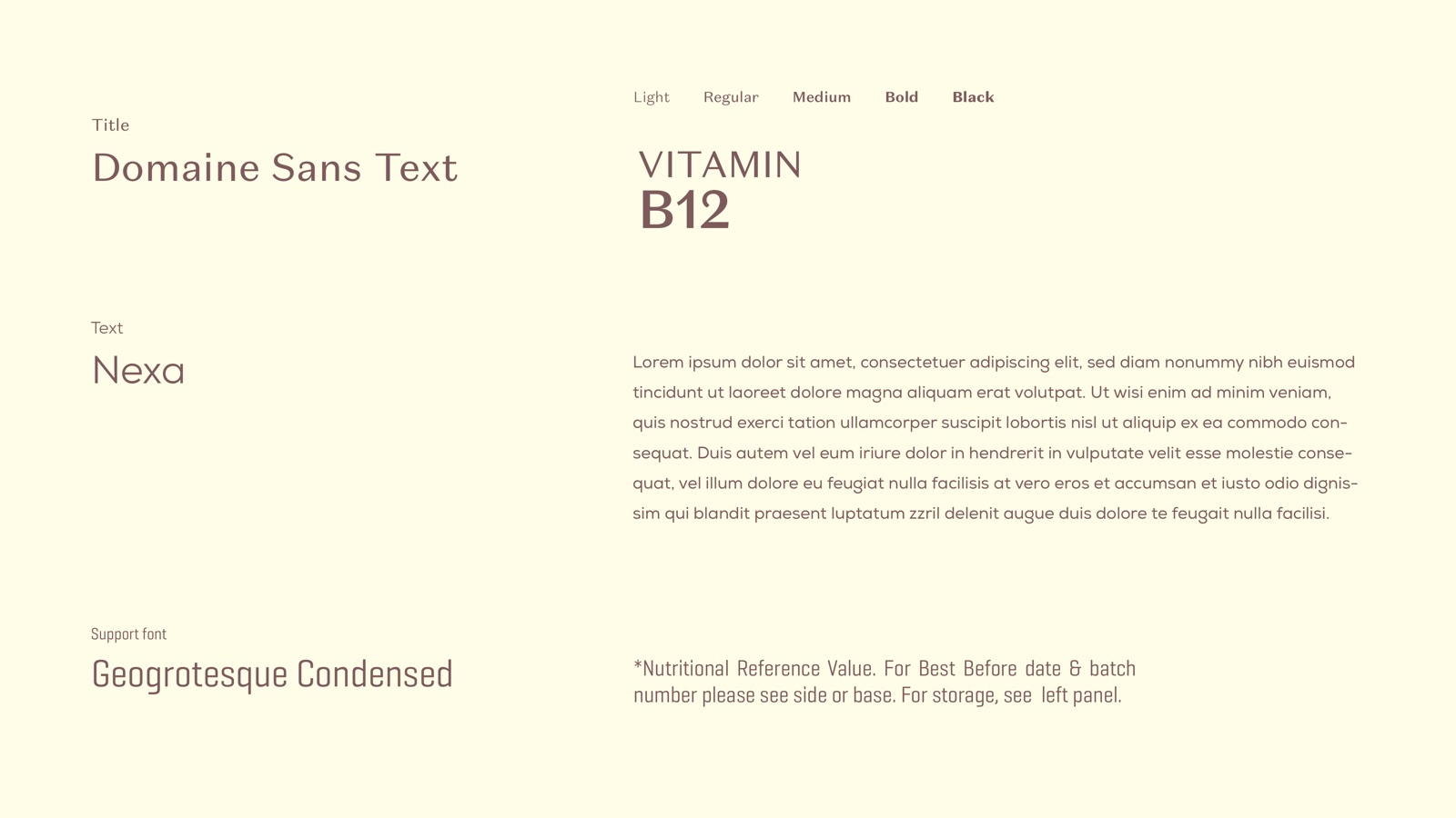
Type
Domaine Sans Text, Nexa, Geogrotesque Condensed
A high-contrast Domaine Sans Text sets the nutrient names and headlines, so the thing you are buying is always the loudest word on the pack. Nexa handles body copy, Geogrotesque Condensed carries the small print. Calm, legible, no gimmicks.
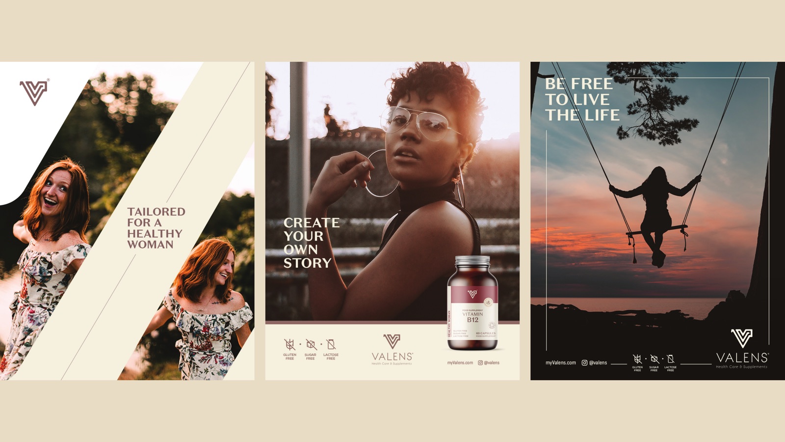
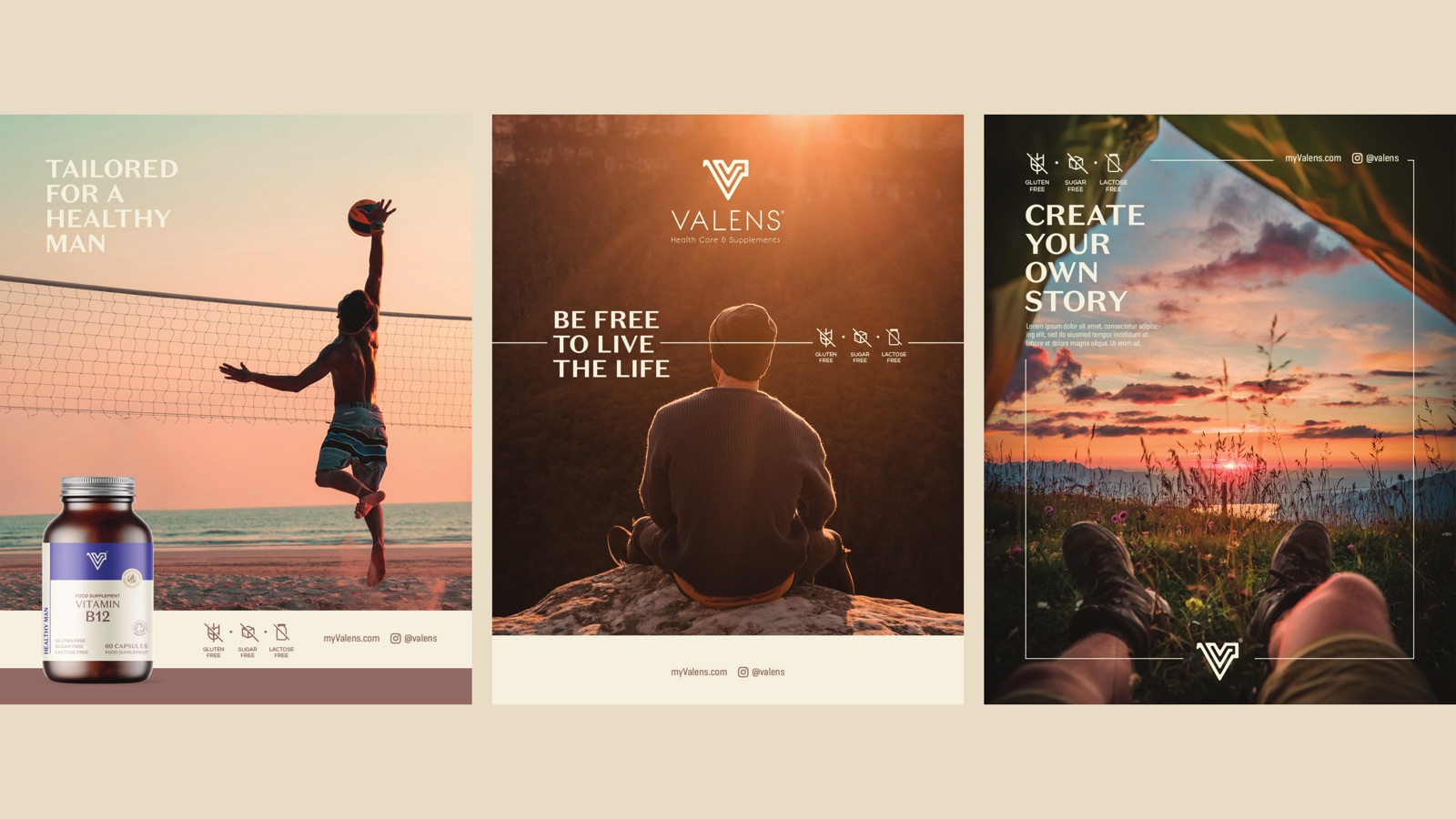
Out in the world
How we approached it
01
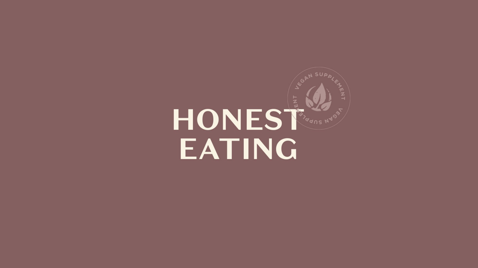
Honest eating, made literal
The whole brand sits on two words: honest eating. So the design refuses the usual supplement tricks. No fake lab gloss, no neon health-claim flashes, no shouting percentages. Warm paper tones, a real typeface, a label that tells you the nutrient and the dose and then stops talking.
02
Doctor-backed, shown not stated
Valens is built on doctor-backed formulation and clean ingredients. We carried that credibility through restraint rather than a stethoscope cliche. The mauve and slate read clinical and calm, the gold reads considered, and the layout has the quiet confidence of something you would trust on a pharmacy shelf.
03
Escape the maze
The founder gave us the idea: the supplement aisle is a maze, hundreds of competing claims and no clear way through. The Valens V is drawn as a single continuous line that loops like a maze and then finds its exit. The mark is the promise, one honest route out of the confusion.
04
One palette, a whole basket
Seven colours pulled from one swatch board do all the sorting. They separate the range, flag the organic line, and still hold together as a single brand world across bottles, pouches, vans, taxis and social. The discipline is what makes a growing catalogue feel deliberate instead of cluttered.
Building something people have to trust?
Health, supplements, food. We build identities and packaging that earn belief on the shelf, not just attention.