Brand, brochure & website · Tabanan, Bali
Spirit Hills
by VIV · your hidden sanctuary
A luxury wellness retreat and glamping-villa development in the hills of Tabanan. We built the whole brand world: a hand-drawn seed-burst mark, a palette pulled from rice terraces and forest, a brochure and a sales website that turn a quiet sanctuary into something you can own.
The brief
A retreat that also has to sell villas
Spirit Hills by VIV is two things at once. It is a wellness retreat in Tabanan, the quiet, rice-terrace side of Bali, and it is a glamping-villa development looking for owners. The brand had to romance a guest and convince an investor in the same breath.
So we built it as one piece of work. Identity, brochure and sales website share a single calm, crafted, natural world. The thing that makes someone want to stay is the thing that makes them want to buy.
The mark
Grown, not drawn
The seed-burst sits somewhere between a dandelion clock, a sunburst and a quiet firework. It feels grown rather than designed, which is exactly right for a retreat hidden in the Balinese hills.
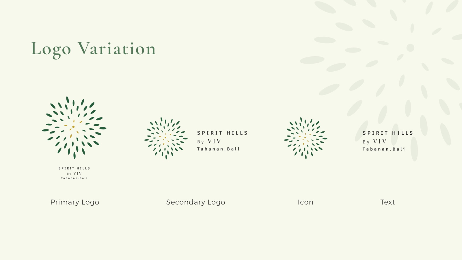
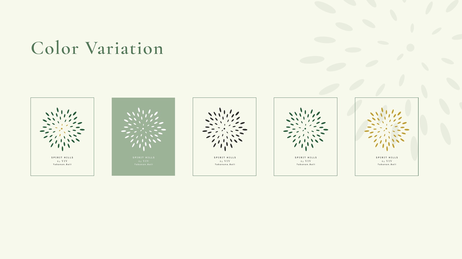
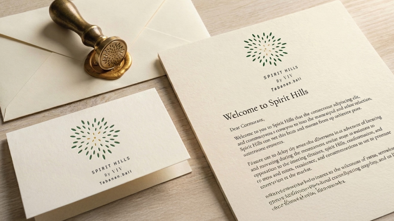
A full logo family backs it up: primary, secondary, icon and a text lockup, so the brand flexes from a tiny embossed stamp to a full brochure cover without losing its calm.
Forest Green
#255d3a
The hills at dusk
Rice Gold
#bf9e2d
Terraces before harvest
Sage
#9cb397
Cool, planted shade
Cream
#f8f9ed
Paper and quiet space
The mark, decoded
One number, repeated fifty-five times
Most golden-ratio logos announce the maths on sight. A spiral, a nautilus, a rectangle wearing a label. The Spirit Hills mark hides it so well that people see a lotus, a mandala, a paddy head, and only later, if they look closely, find a single irrational number governing all of it. The concealment is the point. This is a brand about depth that arrives slowly, and the mark behaves the same way.
Phyllotaxis, not a spiral
Every leaf sits at exactly 137.508 degrees from the one before it, the golden angle, a full turn divided by phi squared. That angle is irrational, so no two leaves ever land on the same arm. They never clump and never leave a gap. It is the rule a sunflower uses to pack its seeds.
The Fibonacci nobody drew
No spiral is drawn, yet the eye finds them anyway. Count and there are 8 arms turning one way and 13 the other, consecutive Fibonacci numbers. Nobody placed them. They fall out of the angle on their own. The mark is not decorated with Fibonacci. It is Fibonacci, made visible. 55 leaves is a Fibonacci number too.
Why it reads as a lotus
The easy version of this logo draws the golden curve itself, which arrives pre-explained with nothing left to find. We used the living version instead, the packing strategy, not the line. It resolves into a lotus seen from above, one of the most sacred symbols in Balinese Hinduism. The maths produced it. We did not force it.
Gold at the tip
The innermost leaves are the youngest, the growing point. They carry rice gold, grain at harvest, morning light on temple stone.
Green at the edge
The outer leaves settle into the deep forest green of the Tabanan hills. The two zones dissolve into each other with no hard line, the way mist dissolves into the valley each morning.
A source, not a target
One small circle sits at the origin, the growing tip every leaf unfolds from. A seed, a campfire, a sun or a still pool, depending on who is looking. Kept small on purpose, so the eye moves outward.
Built to survive anything
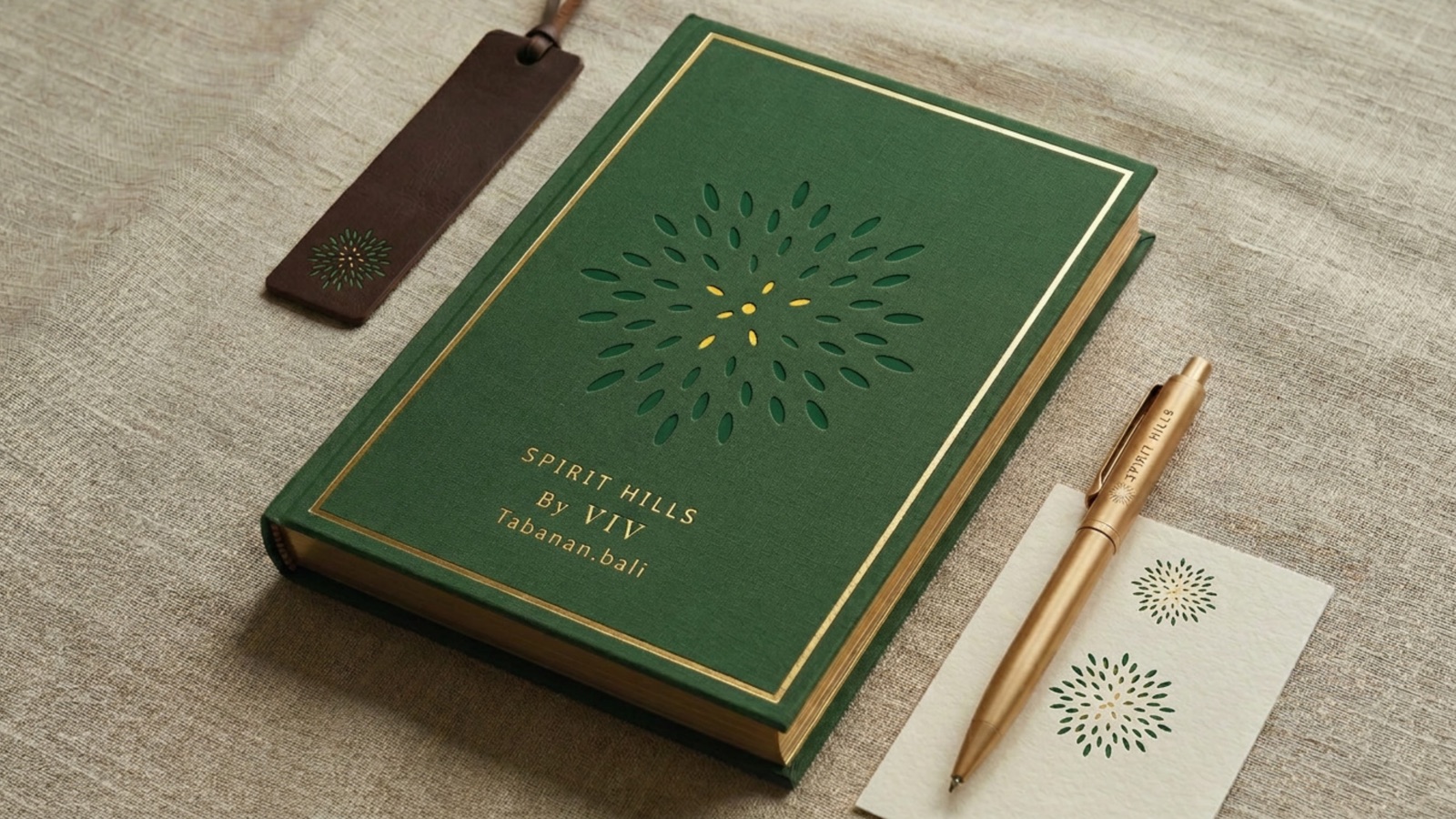
The whole mark is ellipses and one circle, so it holds from a 16 pixel favicon to a metre of carved teak. In a single flat tone, green on cream or gold on dark stone, the pattern still carries the idea. It is ready to be embossed, woven, carved or printed on raw linen.
A viewer who knows nothing of Fibonacci still reads it right: organic, precise, handmade, ancient, even though it was built by an algorithm. That paradox is the whole brand in one object. Internationally designed, locally rooted.
Out in the hills
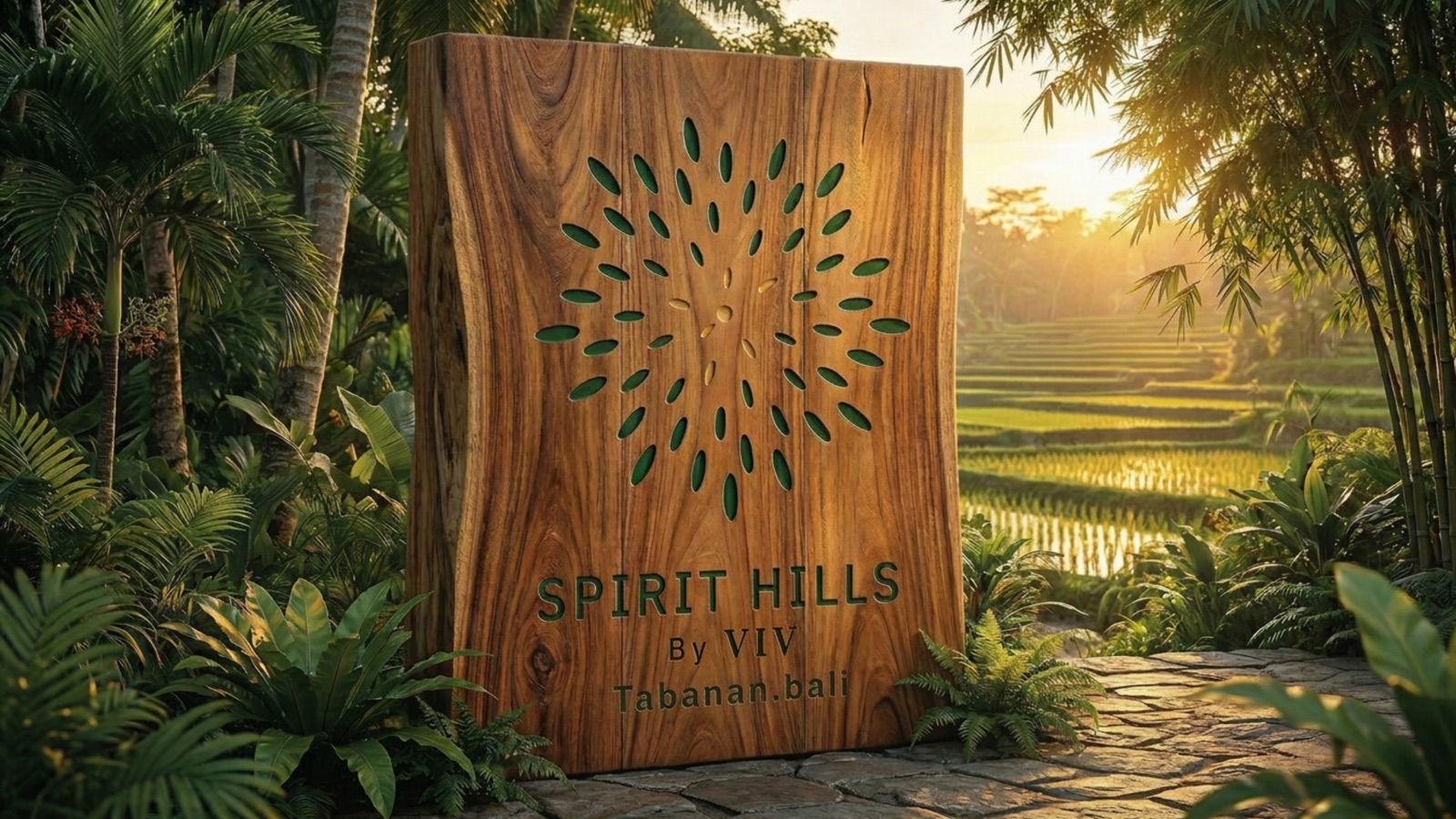
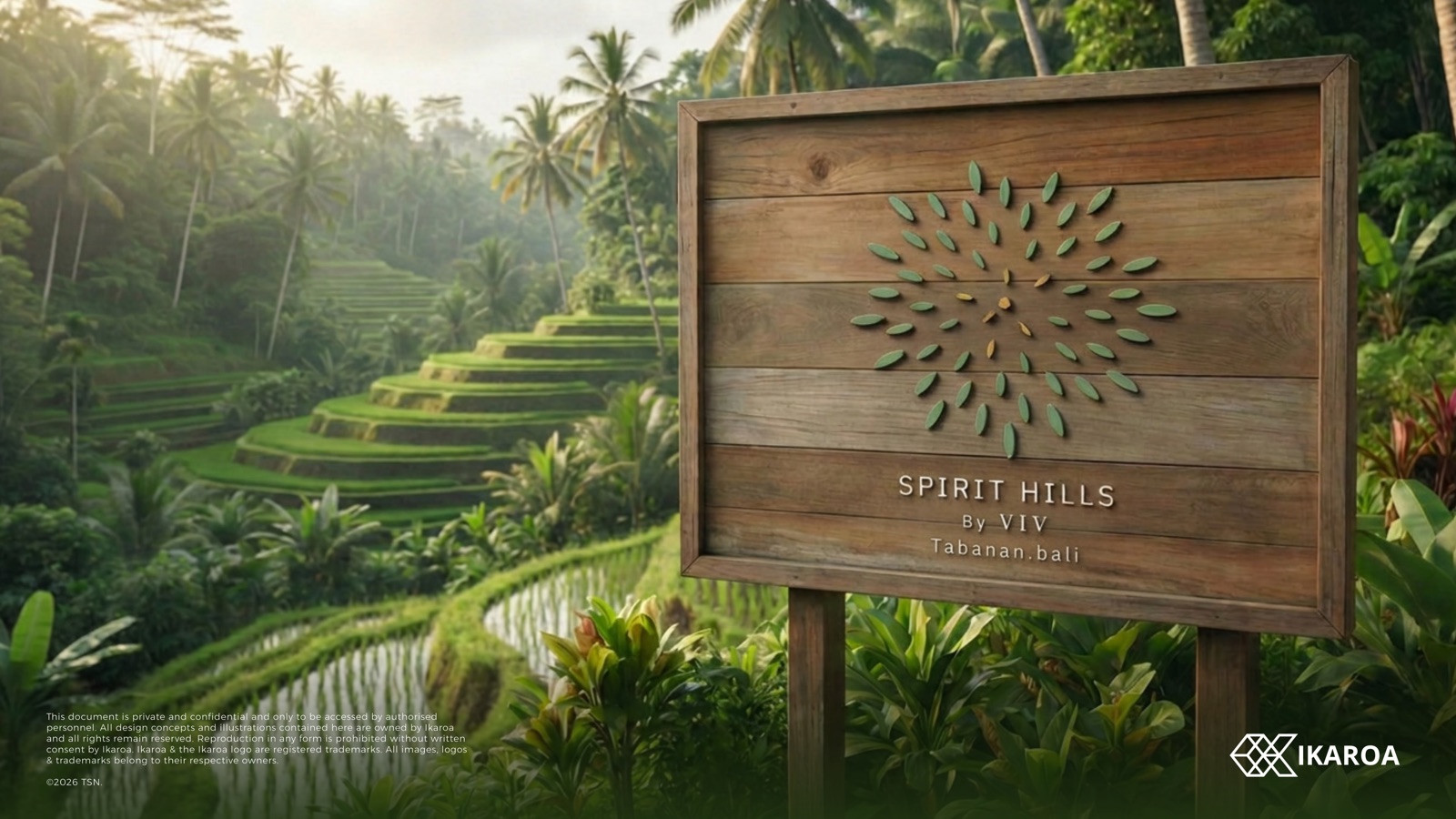
The seed-burst, carved into teak
On a signpost at the gate, lit by the late sun, the mark stops reading as a logo and starts reading as a place. This is where the brand meets the rice terraces it was drawn from.
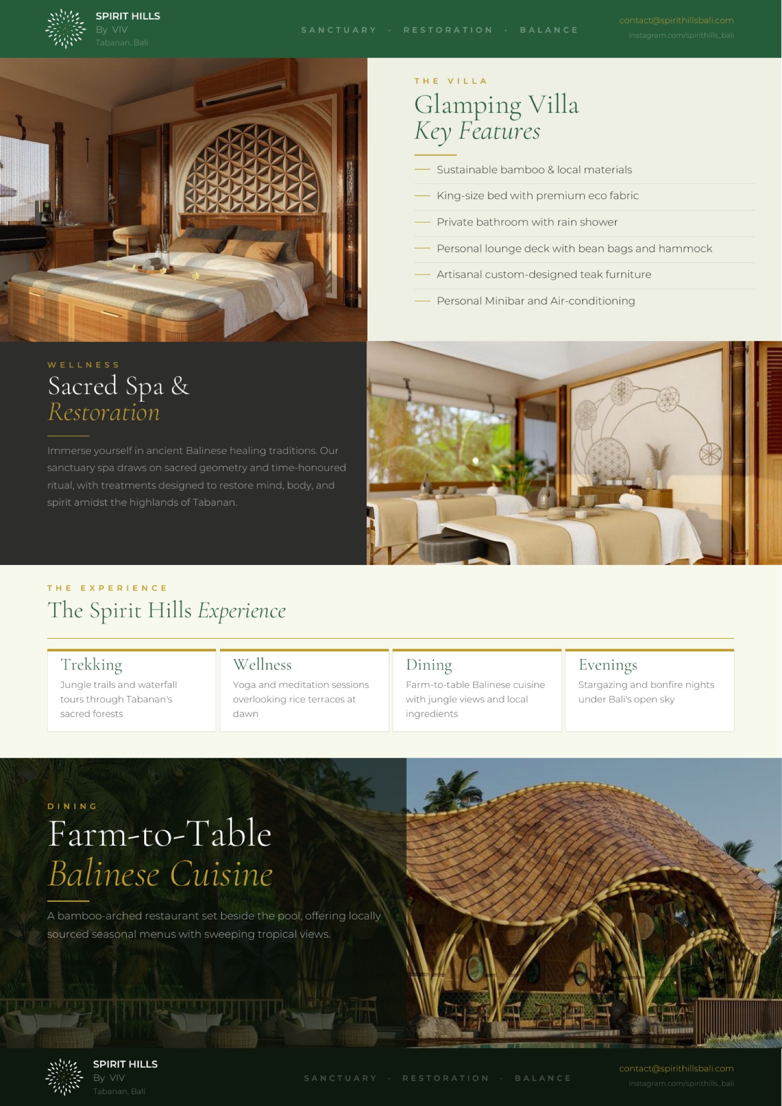
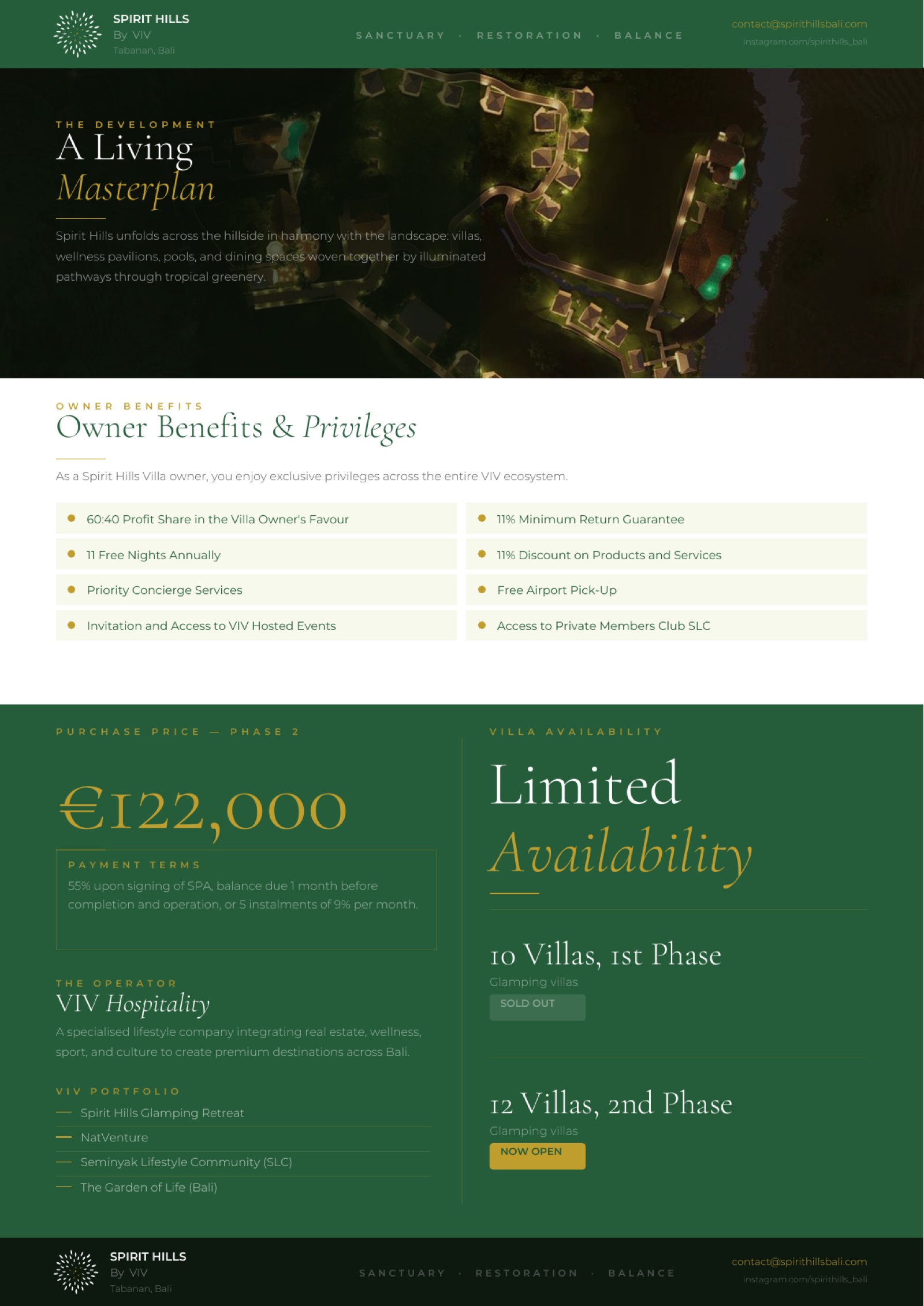
The brochure
Pages that feel like the place
The brand, lived in
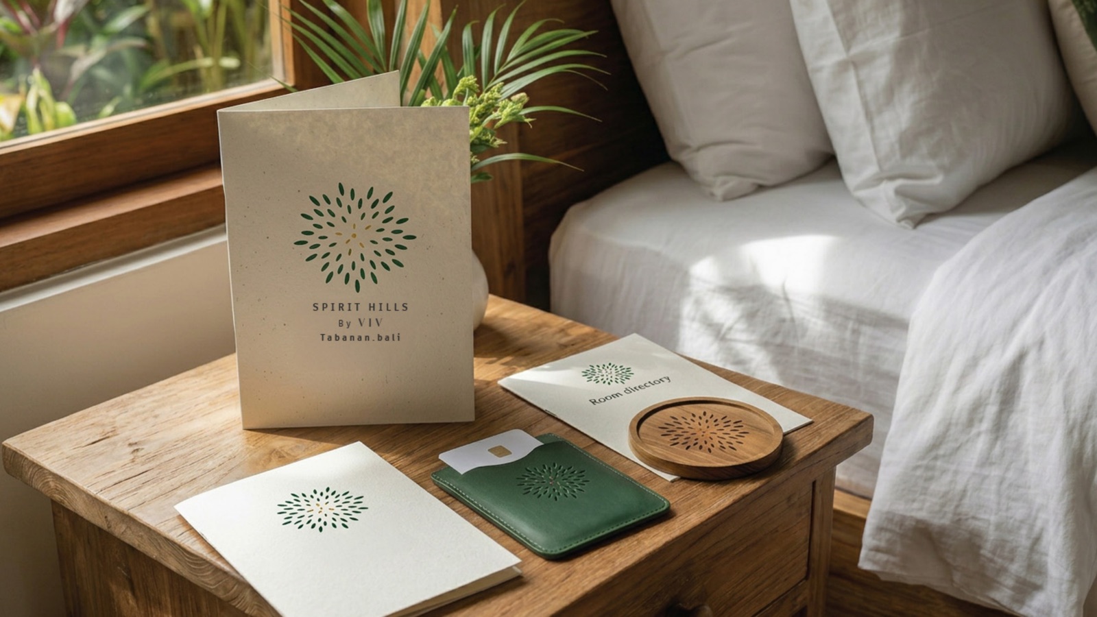
From the spa shelf to the breakfast tray
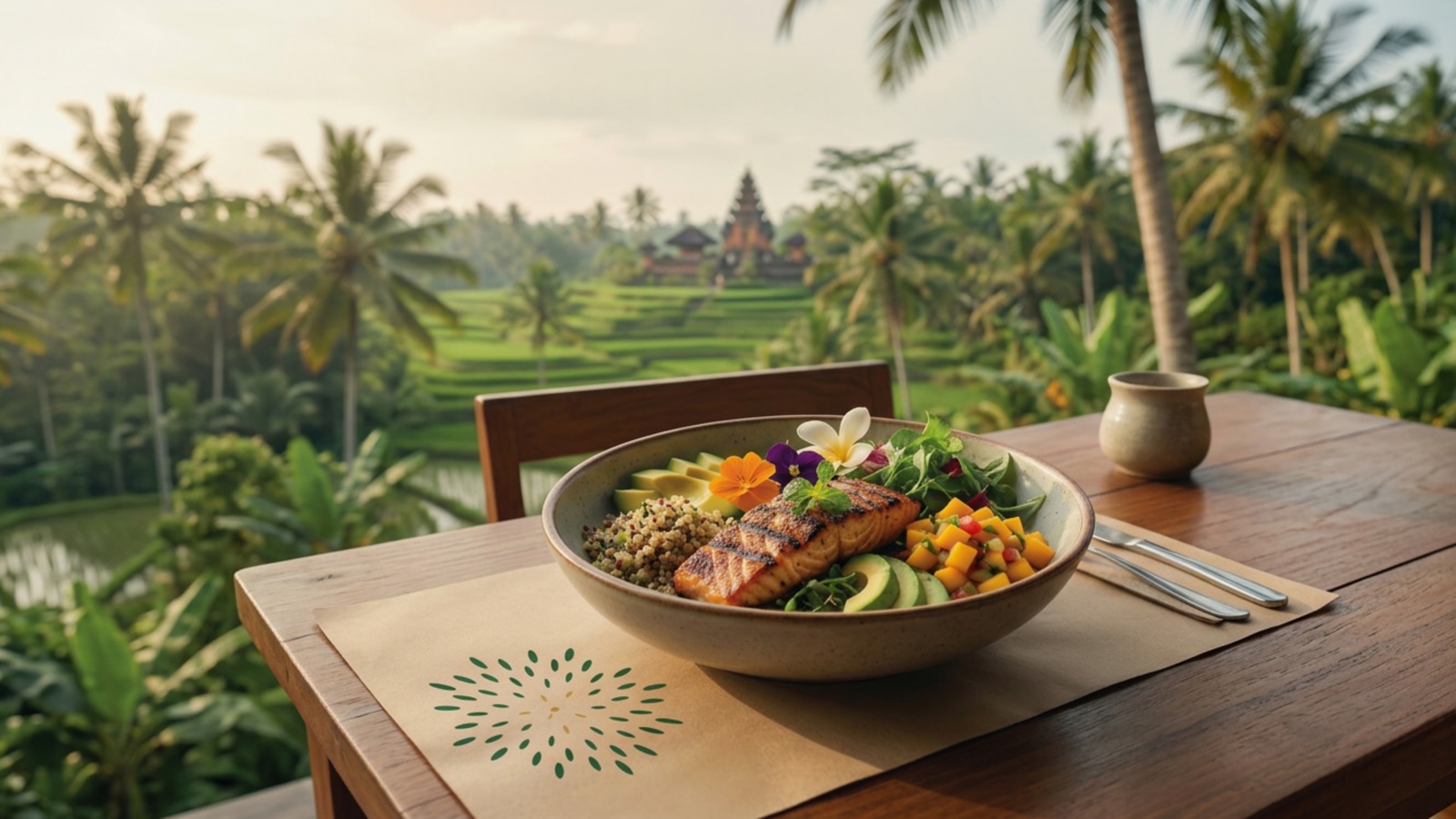
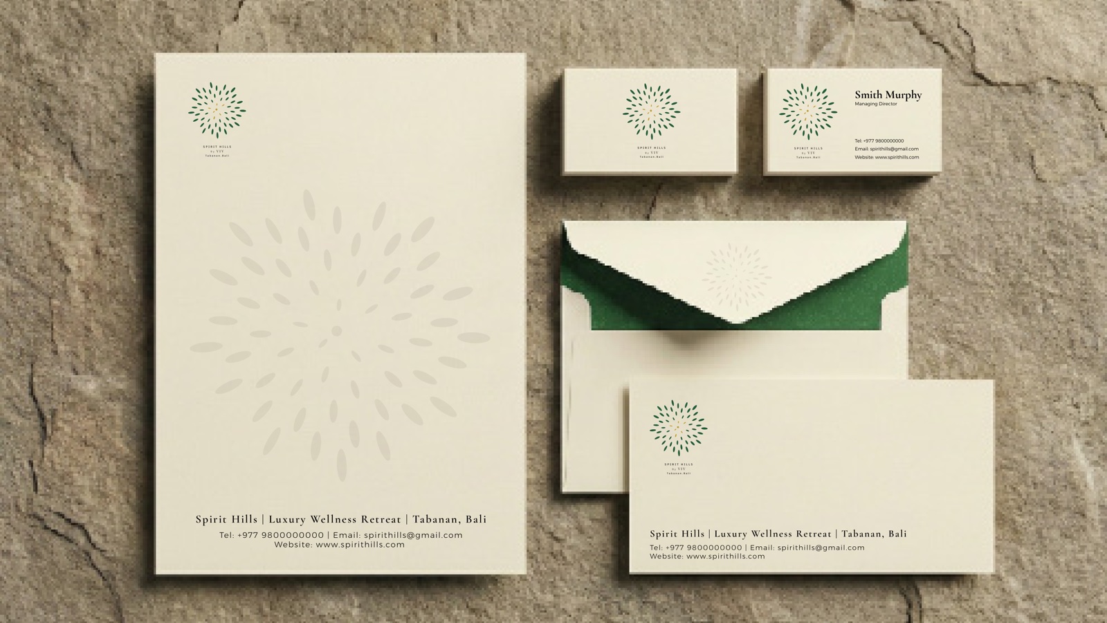
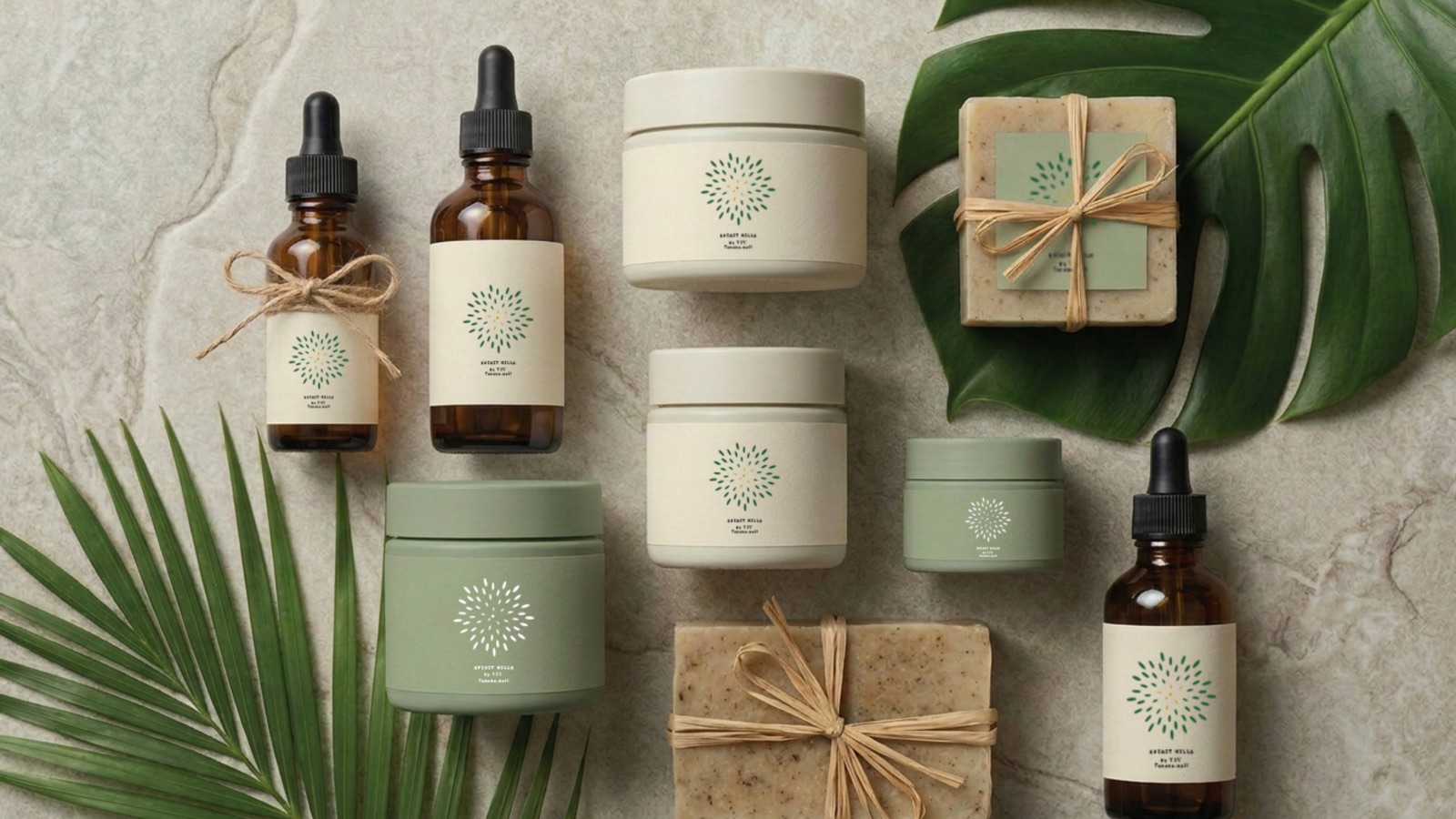
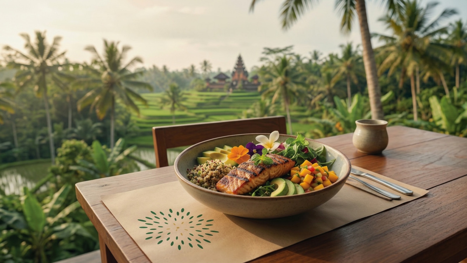
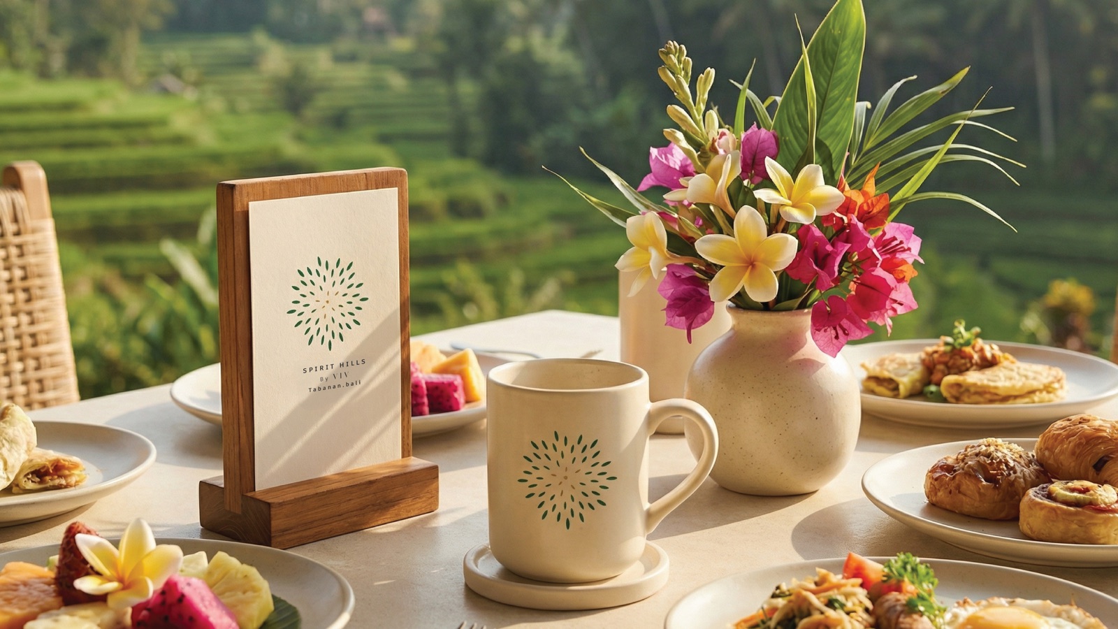
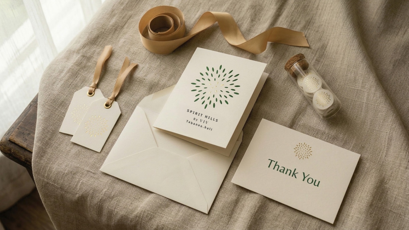
The mark had to survive the small moments as much as the brochure cover. Amber dropper bottles, a card propped on a morning tray, a tray of food carried out to the terrace. Each one carries the seed-burst without shouting it.
Why own a villa
Three reasons, in the brochure’s order
01
Earn passive income
A managed glamping villa works while the owner is somewhere else. The brochure carries the nightly-rate story and the occupancy case without ever reading like a spreadsheet.
02
Your personal escape
Ownership comes with a standing reason to come back. Rice terraces, the spa, a villa that is yours for the weeks you want it. The brand sells that feeling first.
03
Eco-conscious living
Tabanan is the quiet, planted side of Bali. Natural materials, low density, and a development that sits inside the landscape rather than on top of it.
Inside the retreat
A sanctuary, with an ownership case
How we approached it
Four calls that shaped the system
Sell the feeling, then the asset
A glamping villa is half lifestyle, half investment. The brand opens with calm, hidden, restorative, because that is what makes someone want in. The numbers and the ownership case follow once the heart is already sold.
Drawn by hand, on purpose
The seed-burst is hand-made. In a category drowning in the same palm-tree and infinity-pool stock photography, a crafted mark signals that this place, and this brand, was actually thought about.
One language, three documents
Identity, brochure and sales website were built in the same pass. The rules were proven on real, beautiful pages the moment they were written, so nothing in the brand book sits unused.
Eco-conscious, and it shows
The earthy palette, the natural textures and the restraint all back the wellness positioning. Tabanan is rice terraces and quiet, not party Bali, and the design refuses to pretend otherwise.
Got a place that needs a brand and a brochure?
Hospitality, property, retreats, developments. We build the identity, the brochure and the sales site together, so they actually match.