Property · Lifestyle community · Bali
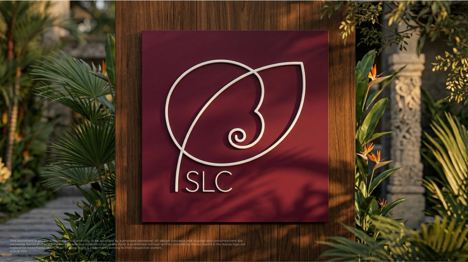
SLC
A burgundy-and-gold identity for the Seminyak Lifestyle Community, built around a single spiral.
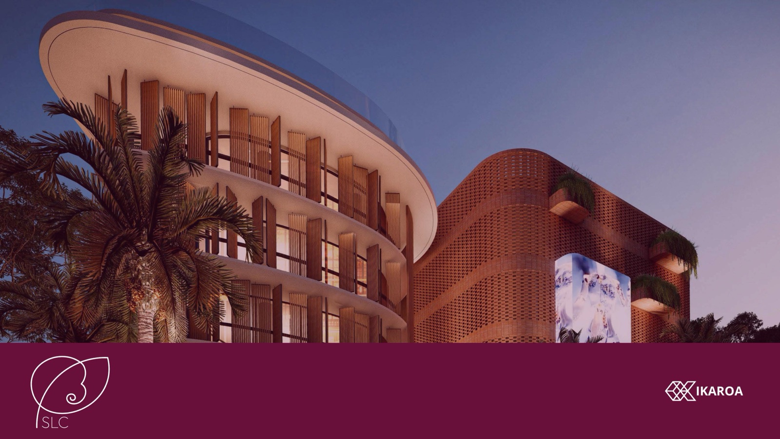
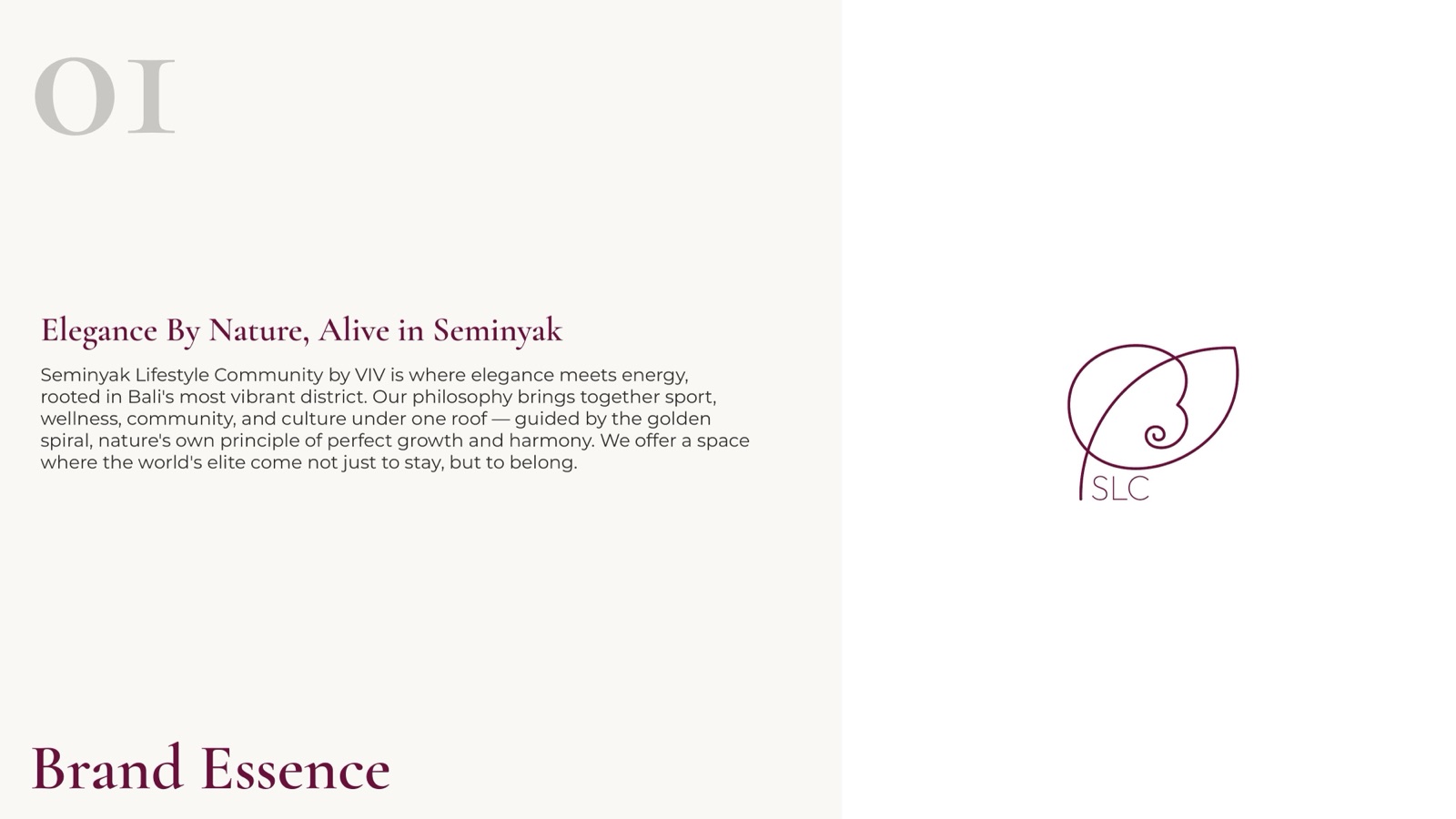
SLC is the Seminyak Lifestyle Community by VIV, a members’ address in Bali’s busiest district that pulls sport, wellness, culture and hospitality under one roof. We built the brand: a leaf-spiral monogram drawn from nature’s own geometry, a deep burgundy palette, and a system that holds from the welcome card to the facade.
Where the mark comes from
The golden spiral
The SLC monogram is built on the Fibonacci sequence, the same proportion that shapes a nautilus shell, a tropical fern and a breaking wave. It reads three ways at once: growth, momentum and refinement.
The spiral coils inside a leaf form and resolves into the letters SLC, so the mark works as a quiet badge on a door hanger and as a five-foot sign on a wall. One shape, every scale.
Five expressions
Burgundy on cream, reversed, single-colour, and gold on burgundy for premium pieces
Brand colours
Seminyak Burgundy
Warm Cream
Warm Gold
Charcoal
Soft Off-White
Typography
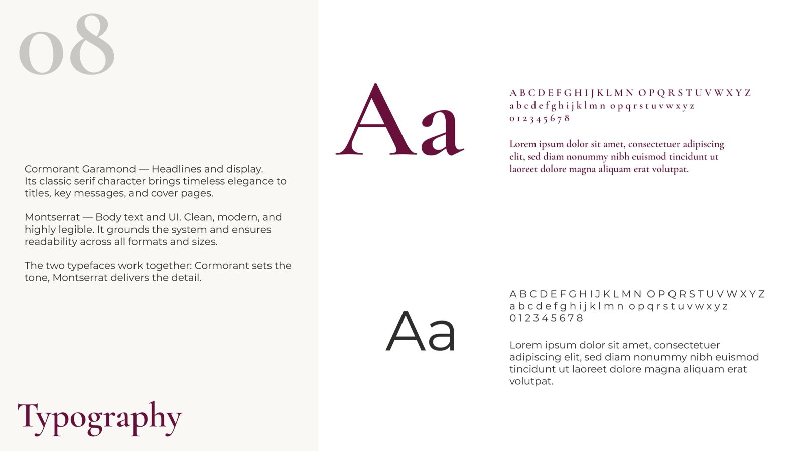
Cormorant Garamond sets the tone on titles and covers. Montserrat carries the detail in body and UI. The serif brings the elegance, the sans keeps it legible at any size.
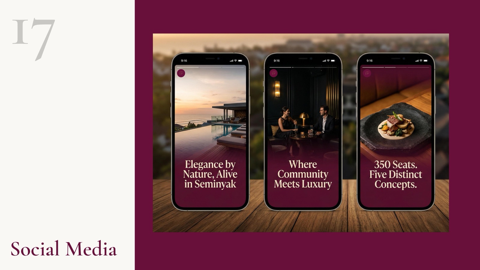
Across the property
How we approached it
01
A mark with a reason
The monogram is drawn from the Fibonacci spiral, the same proportion found in a nautilus shell and a breaking wave. It gives SLC a logo that means growth without having to spell it out, which matters for a property selling a way of living.
02
Burgundy as the whole personality
Most Bali brands reach for teal and sand. We went the other way. Seminyak Burgundy at dusk reads warm and authoritative at once, and it lets cream and gold do the lifting on the moments that need air.
03
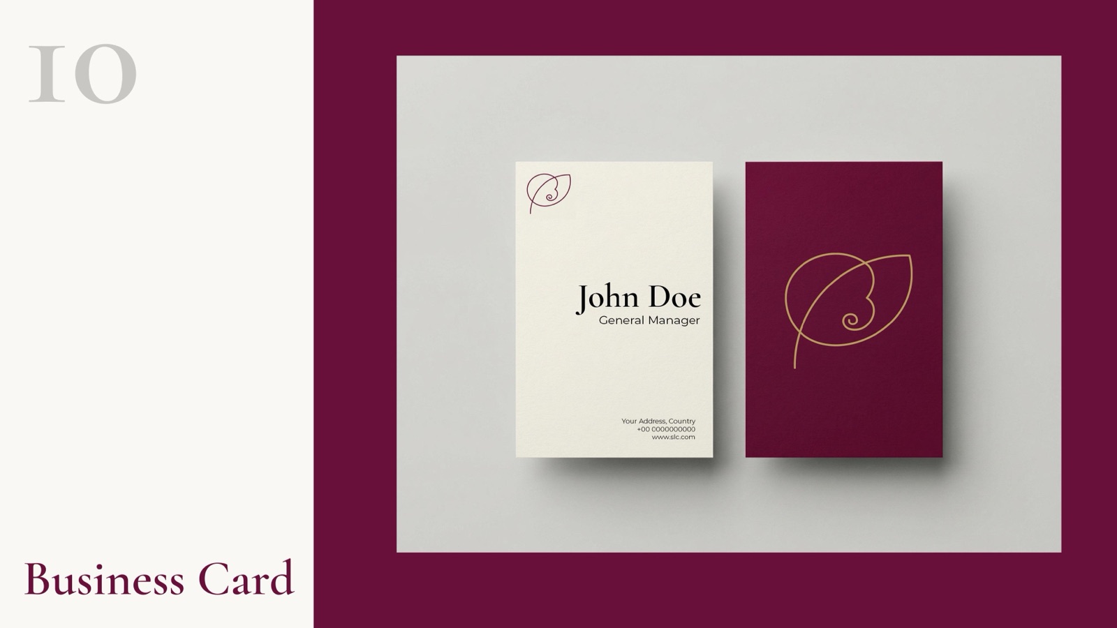
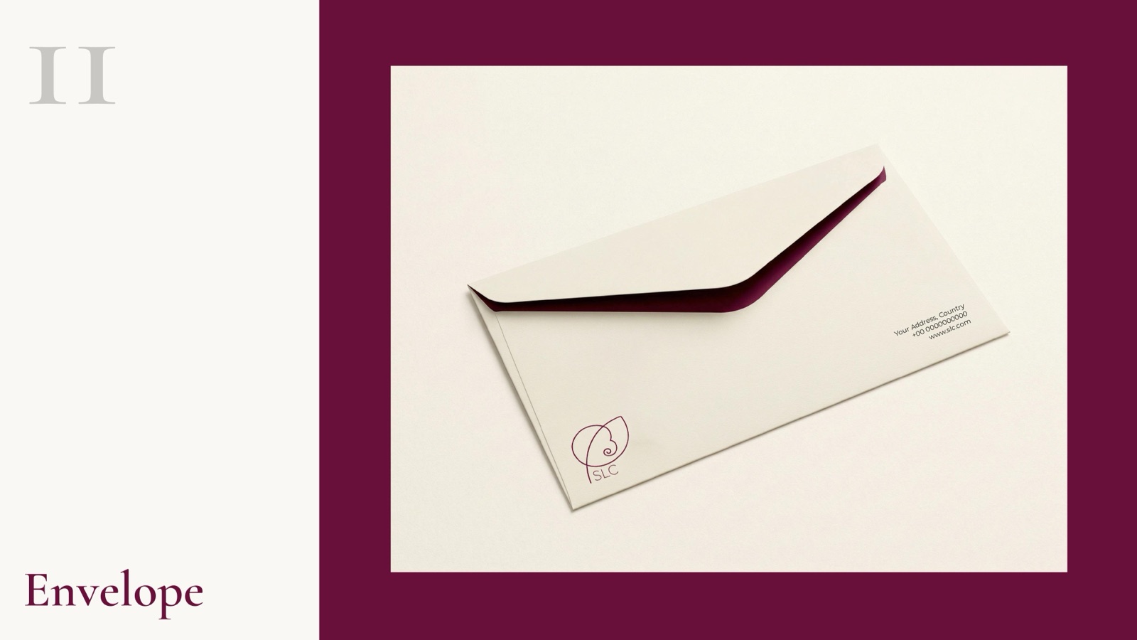
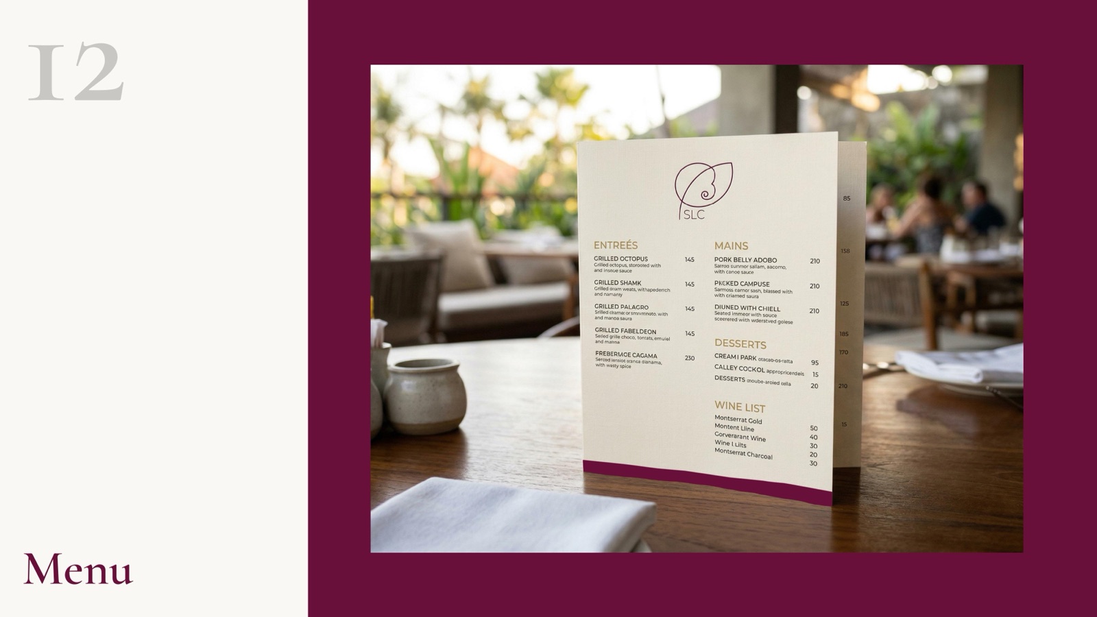
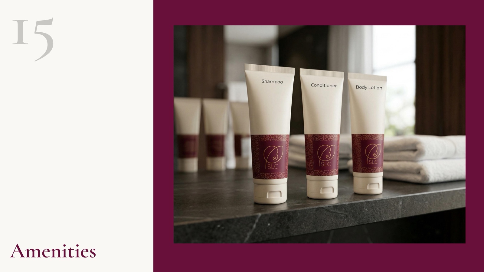
One system, twenty surfaces
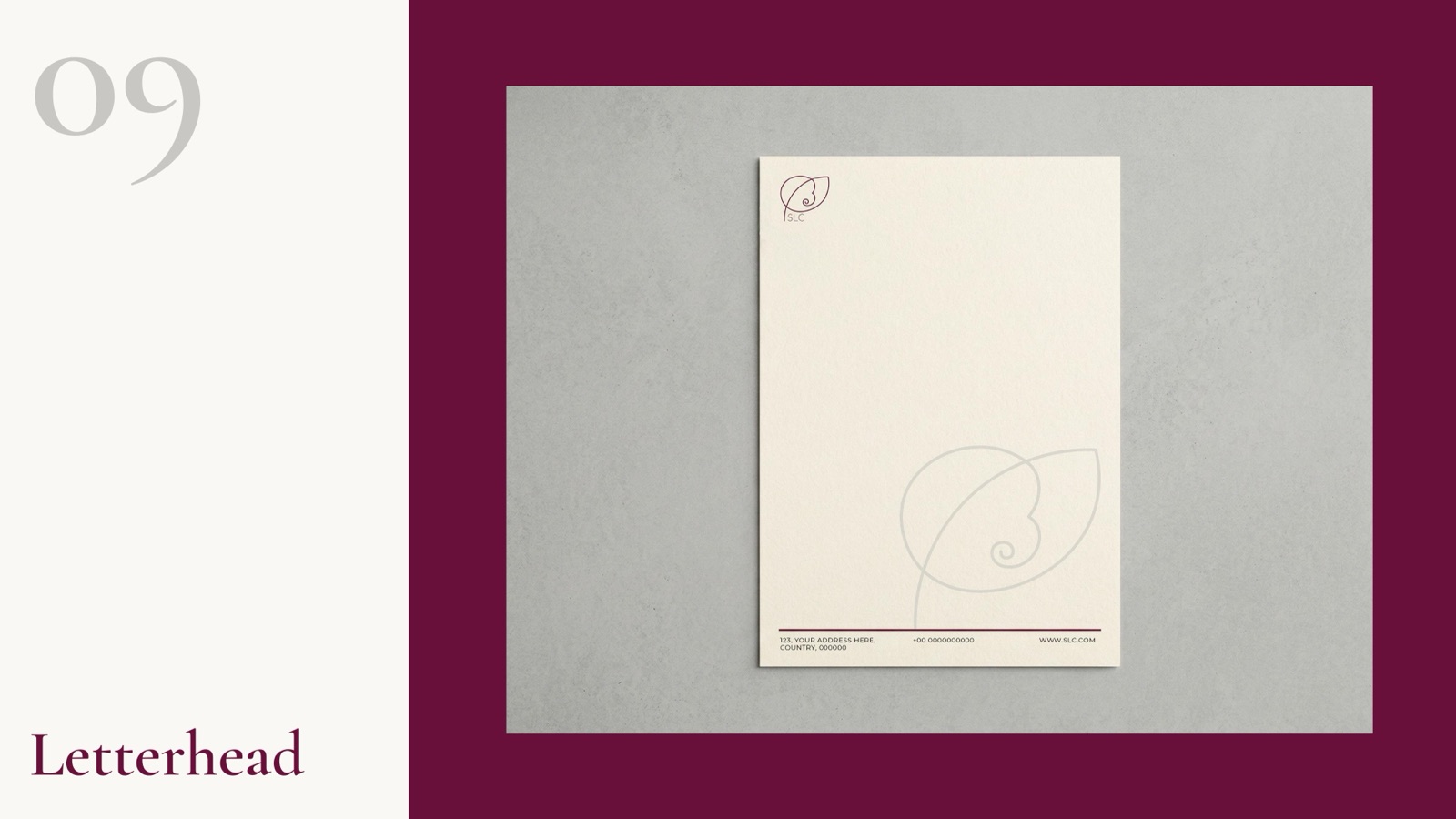
A lifestyle community touches a guest dozens of times a day: the door hanger, the menu, the amenity tube, the welcome card. We built the identity to hold together across every one of them, from a business card to a render on the facade.
04
Built to feel established
A new community has to look like it has always been here. Two typefaces, a tight palette and a single confident mark do more for that than any amount of decoration.
Building a place people belong to?
Communities, resorts, residences, clubs. We build the mark, the palette, the type and the full application system, ready for every surface a guest touches.