Brand identity · Fitness lifestyle
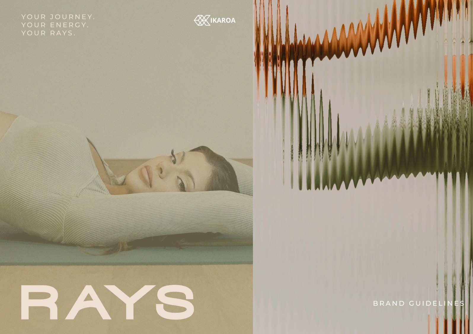
RAYS
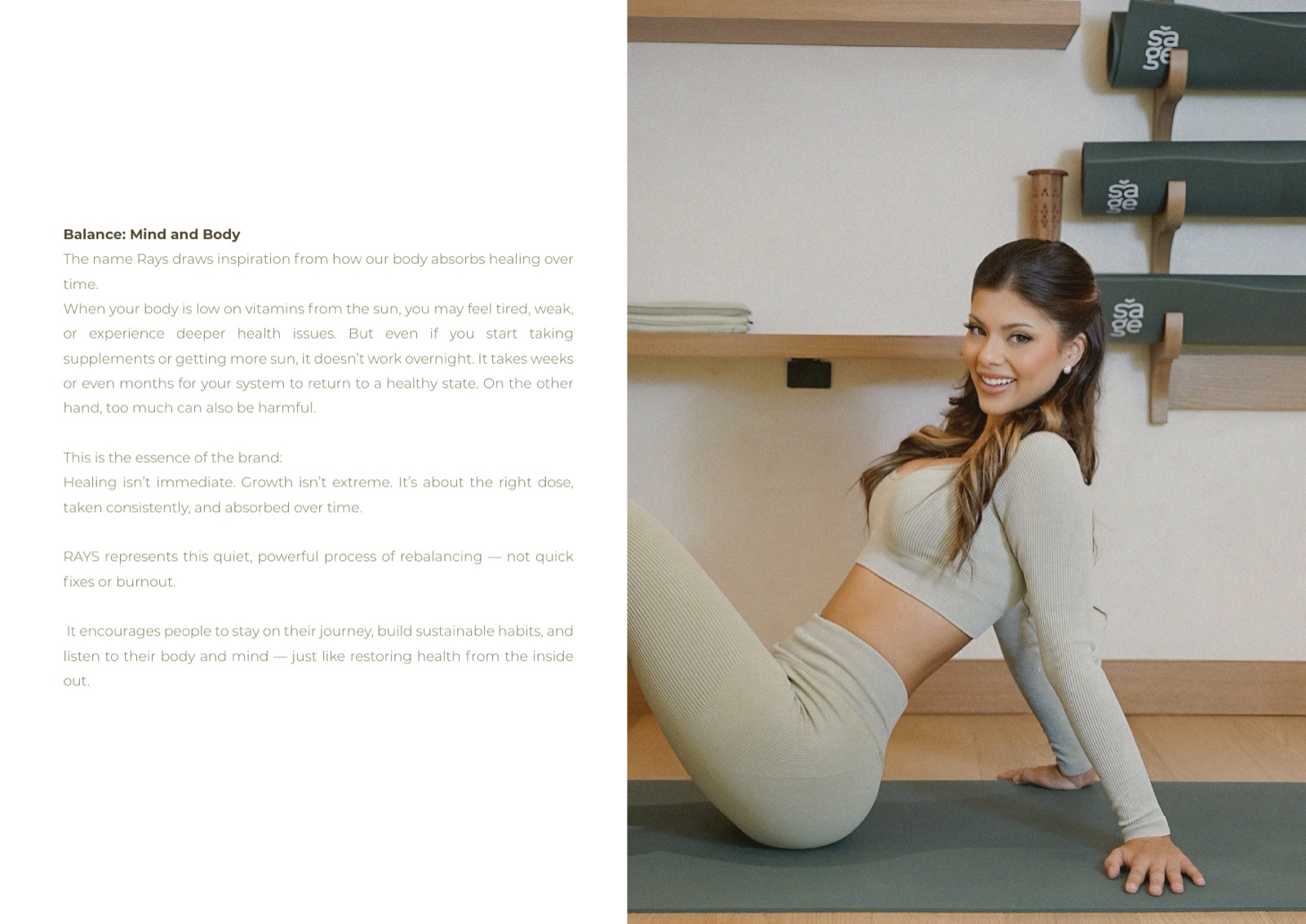
A fitness lifestyle brand built around vision and the slow change of becoming, not the count on the bar.
Your journey. Your energy. Your Rays.
Created with the influencer Sofia Rays
The brief
A fitness brand that is really about clarity
RAYS is a fitness lifestyle brand we created with the influencer Sofia Rays. The thing underneath it is not a workout plan. It is personal change. The self-awareness, and the quiet shift that arrives when someone finally tunes into their own body and energy. We built the brand so it carries Sofia’s voice without leaning on a single dumbbell.
So we built around an eye. A symbol of vision and waking up, set in a warm, earthy world that feels closer to a retreat than a gym floor. Grounded. Premium. Personal.
The arc
01
Awareness
It starts quietly. A person stops counting reps and starts noticing how their body actually feels, where the tension sits, when the energy lifts. RAYS sells that attention before it sells any workout.
02
Energy
Movement is the practice, not the point. The brand treats training as a way to find your own rhythm again, the warm pull of momentum that builds when someone keeps showing up for themselves.
03
Becoming
The shift is slow and personal. There is no before-and-after, no finish line. Just the steady change of growing into the version of yourself you keep catching sight of. That is the whole promise.
The mark
An eye that opens into a sun
The mark is an eye opening into a sun. Vision and energy held in one shape. It stands for what RAYS is really offering: not reps, but clarity, attention, and the moment something inside finally moves.
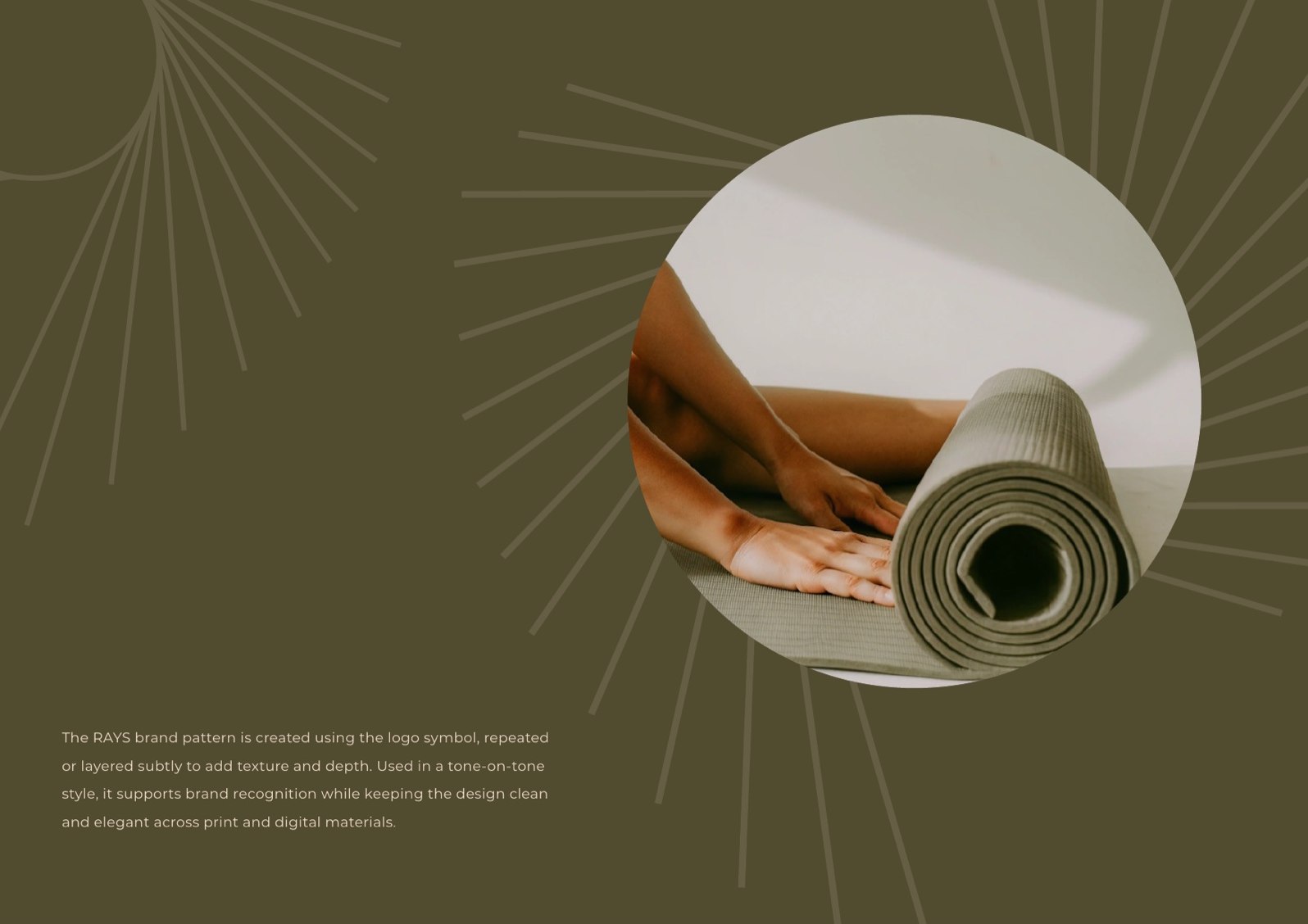
The pattern
One symbol, tone on tone, everywhere
The eye repeats softly across surfaces, sage on sage, clay on sand. It works as a full logo, a small monogram, a waistband print or a wall of texture. A single calm idea, said again and again, is what lets people recognise the brand across a feed before they read a word of it.
Sell the becoming, not the workout. The eye is a guide, not a drill sergeant.
On the body
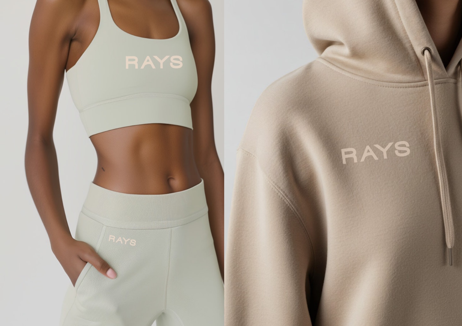
Activewear that wears the idea
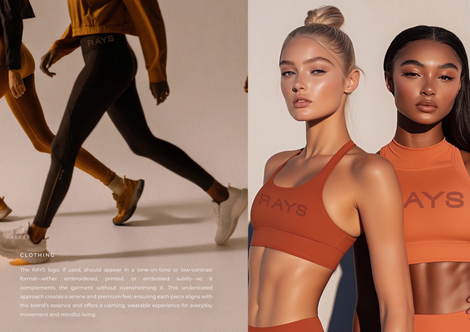
Sage, olive and warm terracotta over sand, with Montserrat throughout. The palette sits a long way from the neon and gloss of most fitness branding, because this is a way of living, not a supplement ad. Earthy reads as honest. It reads as premium too.
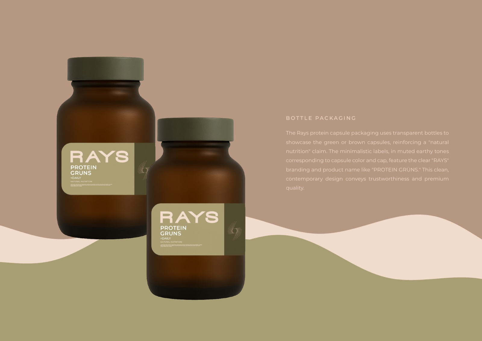
The product
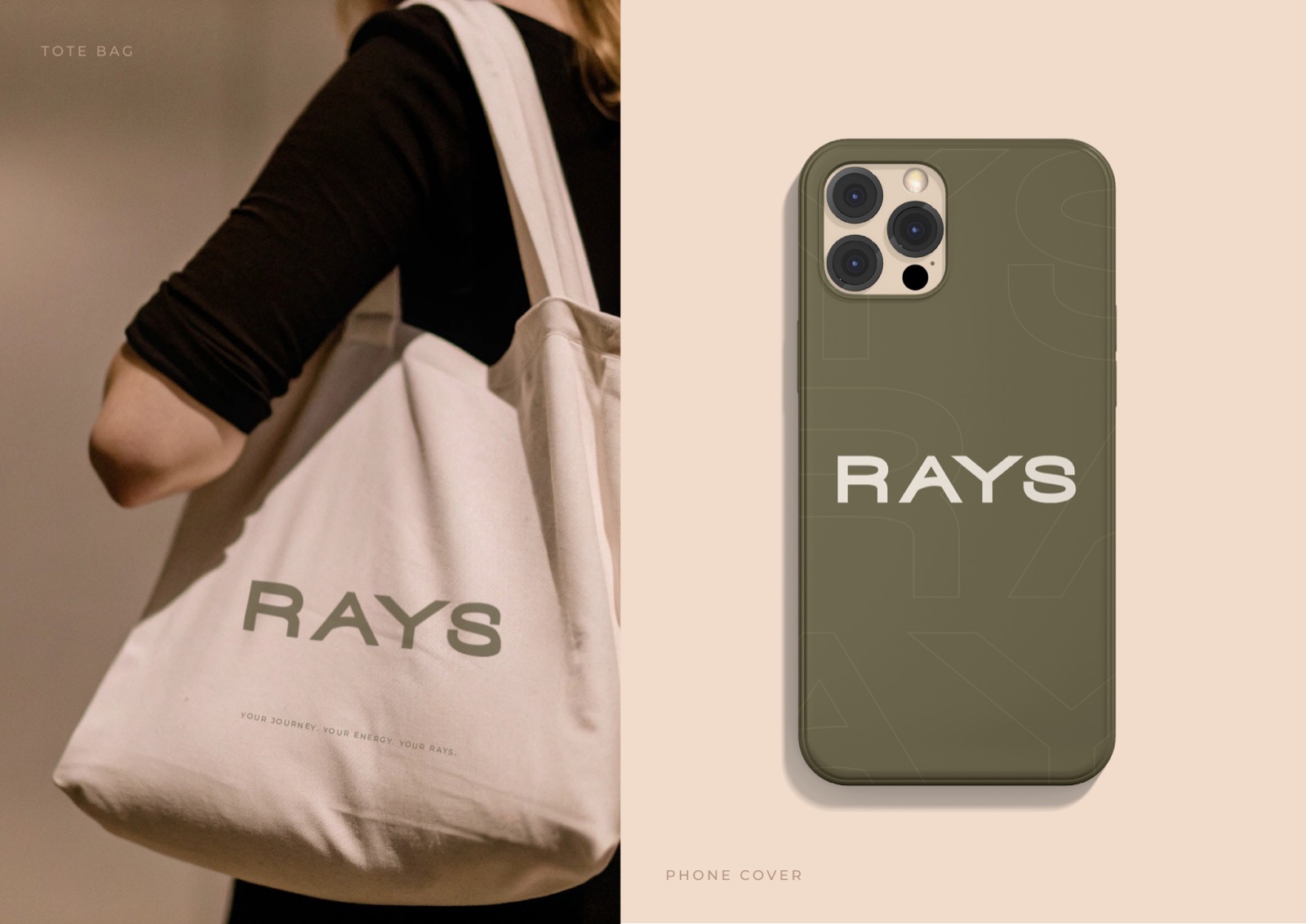
Objects that carry the calm
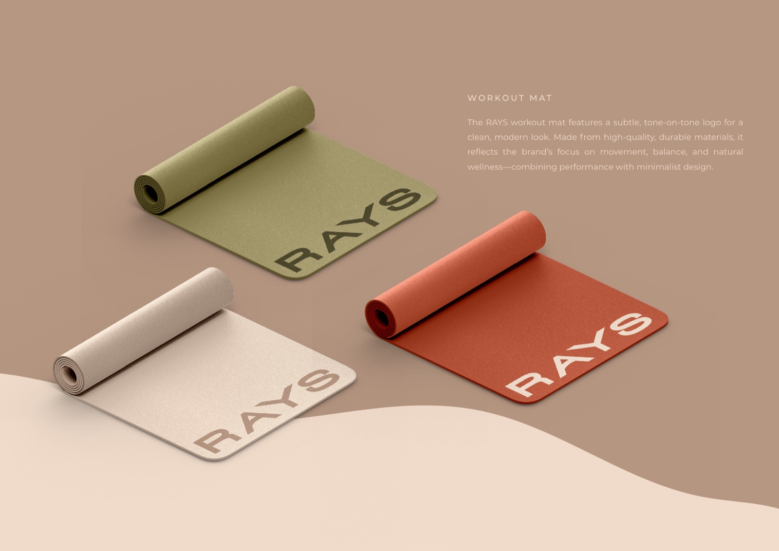
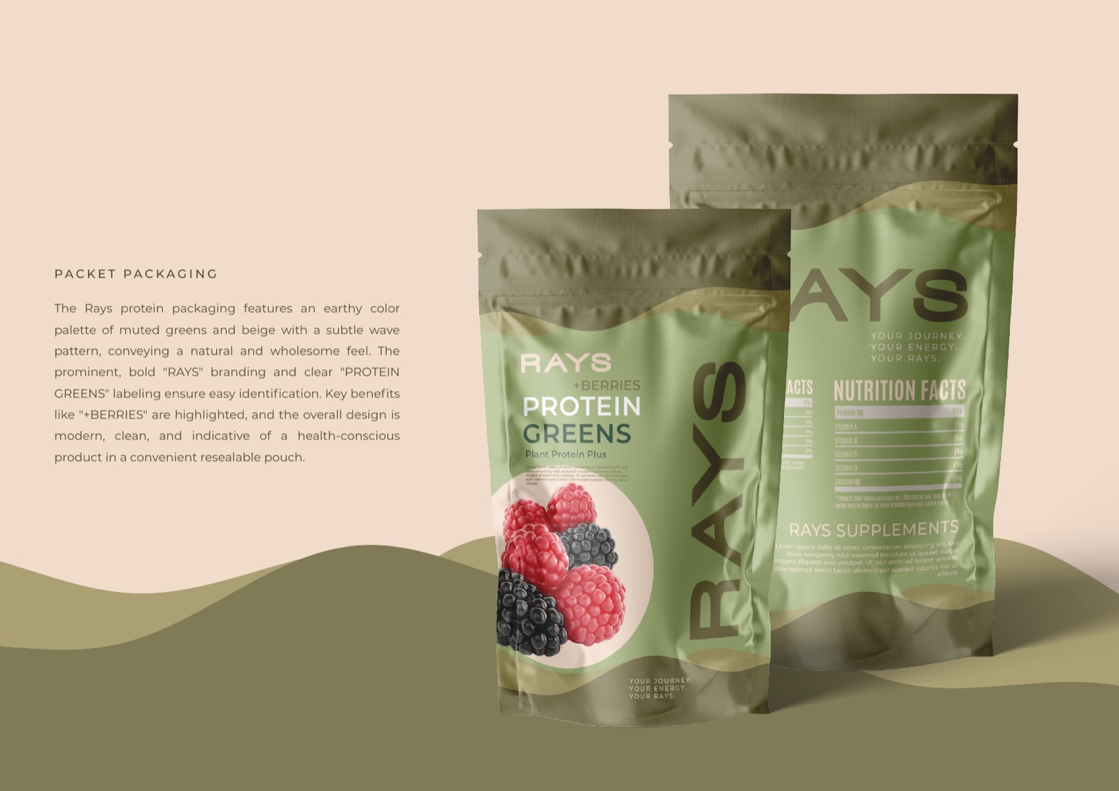

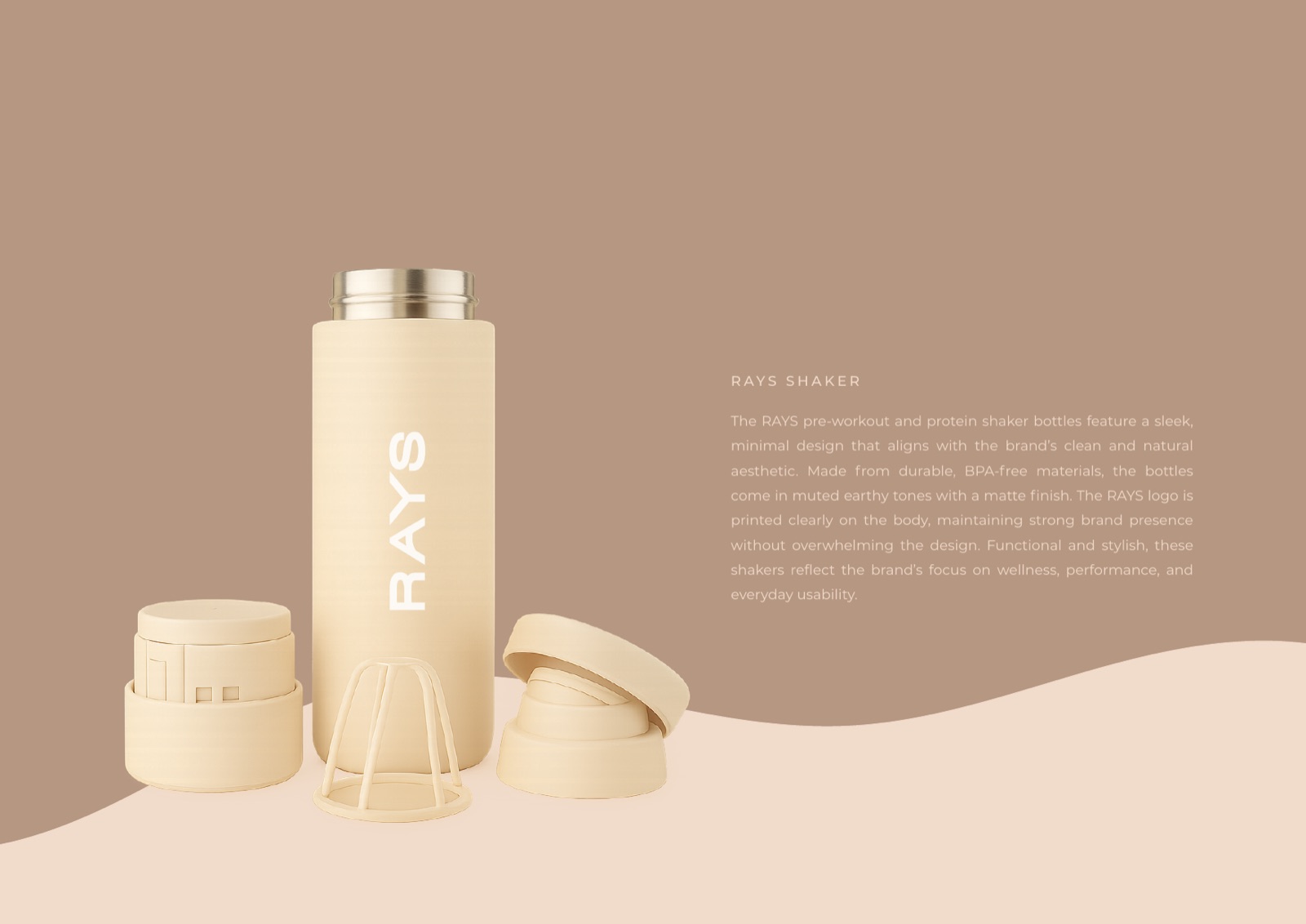
Mats, pouches, jars and bottles all read as one family. The same earthy palette, the same restraint, the wordmark sitting calmly on each surface. Nothing shouts. The product looks like something you would leave out on a shelf, not hide in a gym bag.
In the feed
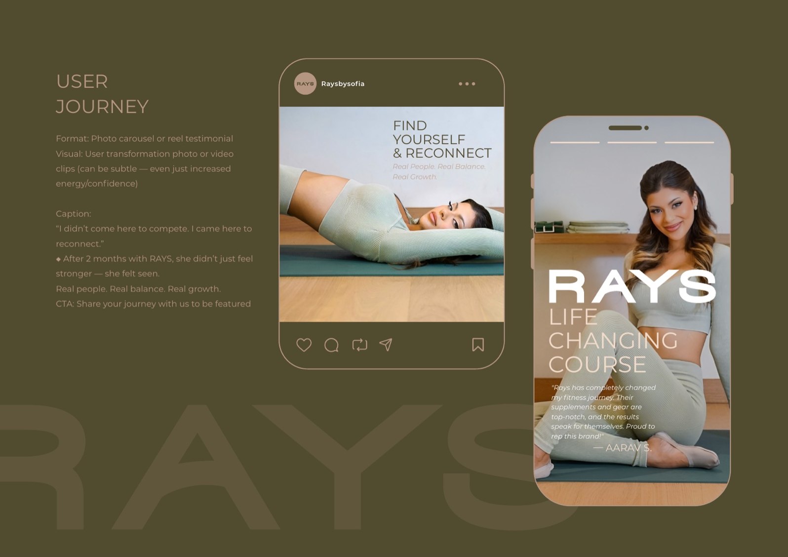
Built to be recognised mid-scroll
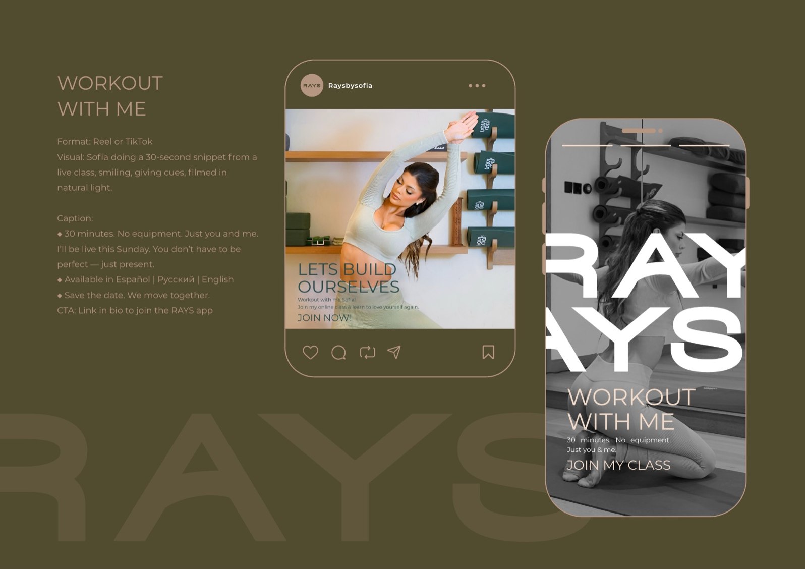
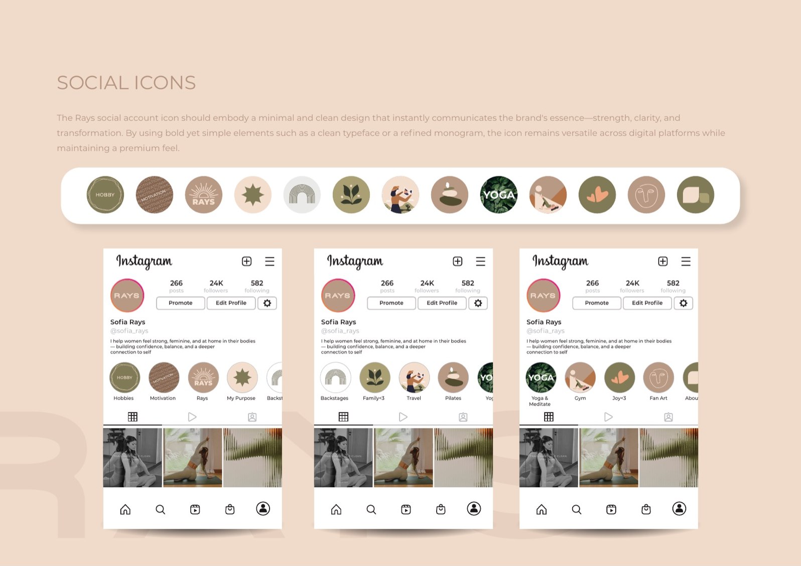
The social kit runs on Sofia Rays’ own channel. Soft highlight covers, a steady grid, the eye reappearing as a tiny monogram. The point is recognition: a follower should know a RAYS post a beat before they read the handle.
The world
Closer to a retreat than a gym
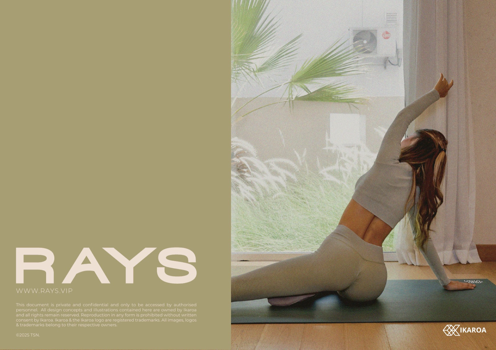
Warm daylight, plants, bare floors, no chrome. The photography keeps the promise the symbol makes: this is a practice you do for yourself, somewhere calm, at your own pace.
Rolled out across
Everywhere the brand moves
Building a lifestyle brand with a real idea underneath?
Fitness, wellness, lifestyle. We build identities that live on product, in a feed and on a body, held together by one idea worth repeating.