Bubble tea · London, UK
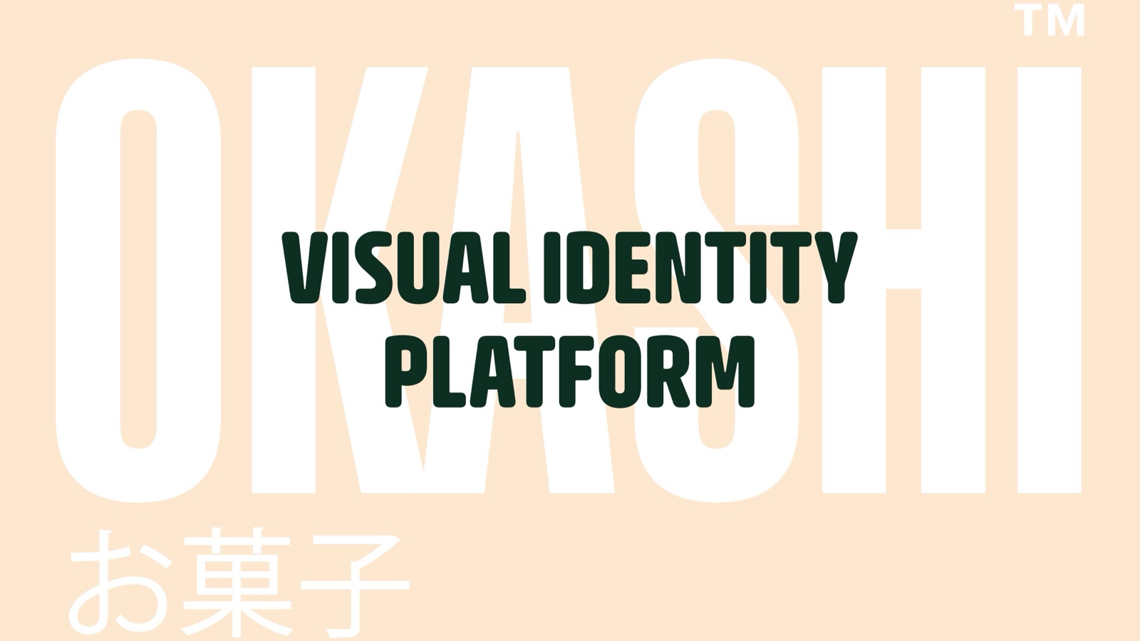
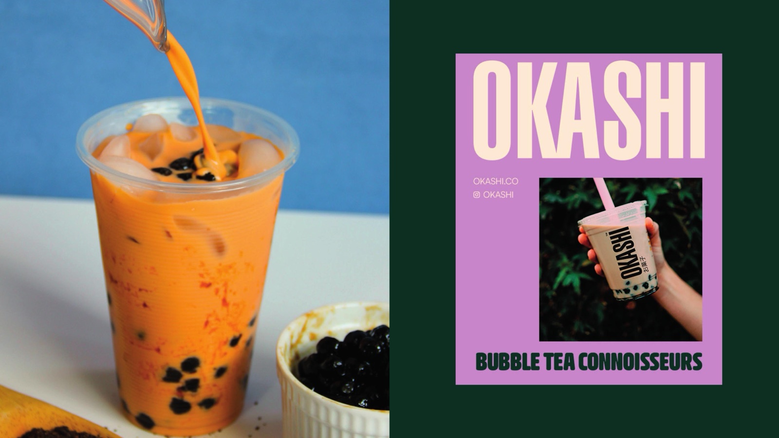
Okashi
お菓子
A bilingual identity for a London bubble tea brand that wanted to be taken seriously. The name is Japanese for sweets, the positioning is Bubble Tea Connoisseurs, and the kit was built to live on a phone.
The brief
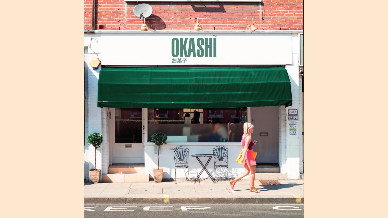
A tea brand named in Japanese, built for the UK high street
Okashi sells bubble tea: milk teas, fruit teas, taro, brown sugar, the lot. The name comes from お菓子, the Japanese word for sweets, and that heritage had to sit at the centre of the identity without sliding into pastiche.
The other half of the brief was attitude. Most bubble tea looks cheap and forgettable. Okashi wanted to read as a brand for people who actually care about the drink, then back that claim up on a cup, a shopfront and an Instagram story.
What we shipped
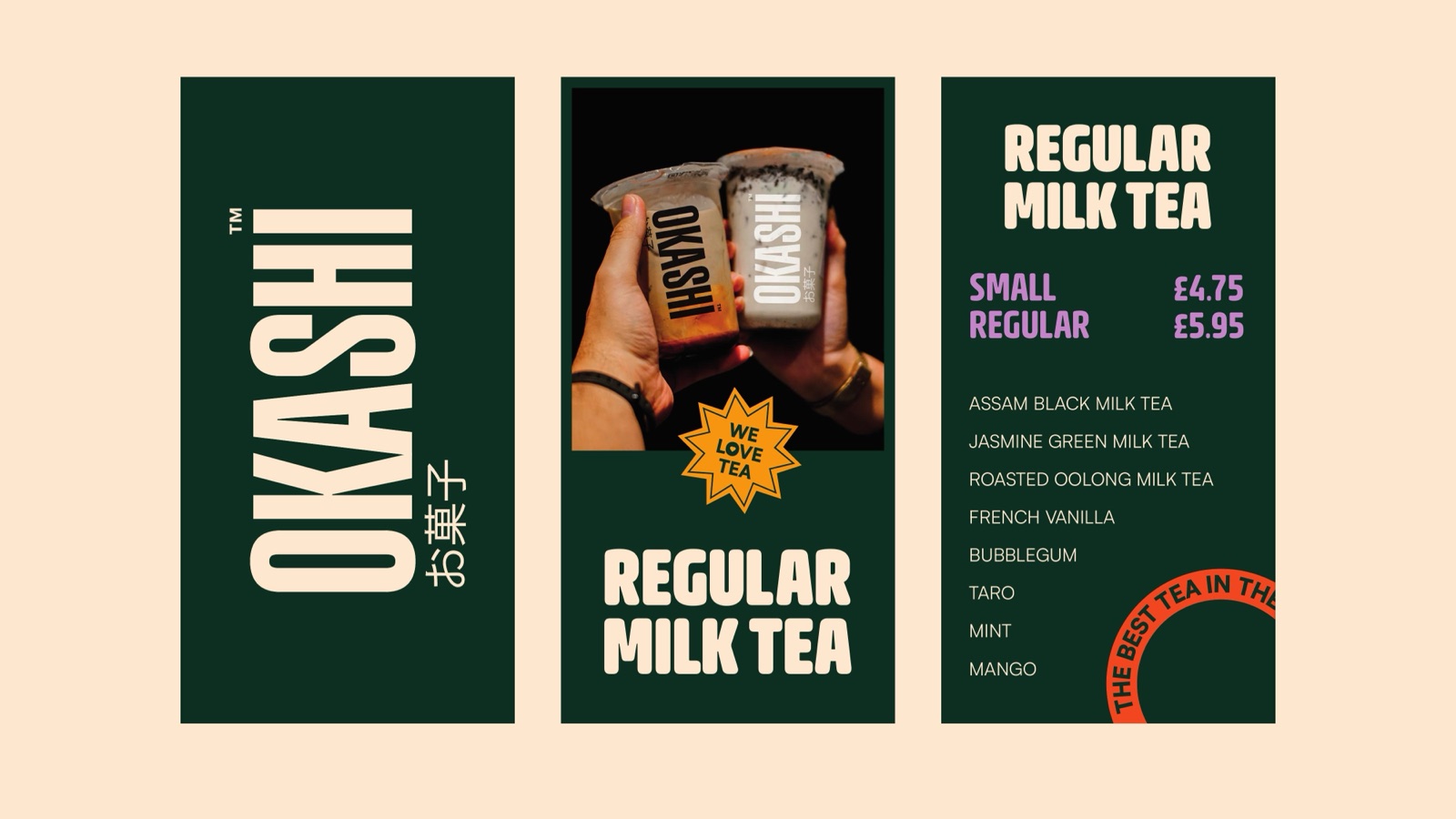
A wordmark that reads twice
OKASHI set in a chunky rounded display, with お菓子 sitting underneath it. The Japanese reads first as a texture, then as meaning: okashi is the word for sweets. One lockup carries the heritage and the product in the same breath, no explanation needed.
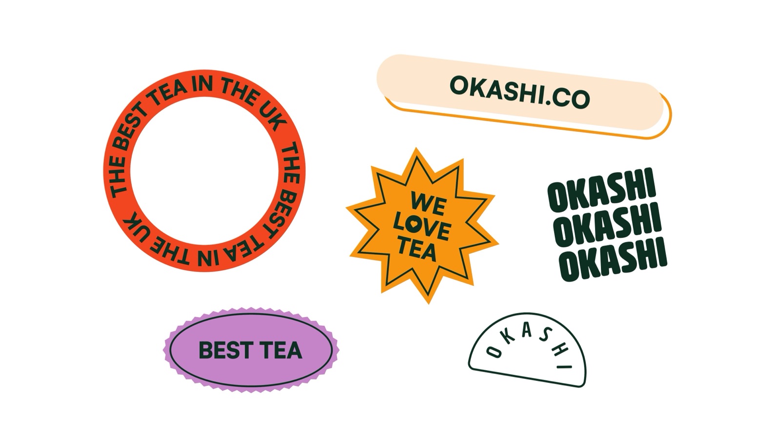
A sticker language
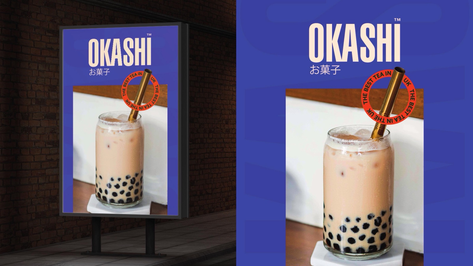
Badges, seals and slogans the team can stamp on a cup, a window or a story. The best tea in the UK runs around a ring, We love tea lives in a gold star, Best tea sits in a purple oval. Cheap to print, fast to post, impossible to mistake for anyone else.
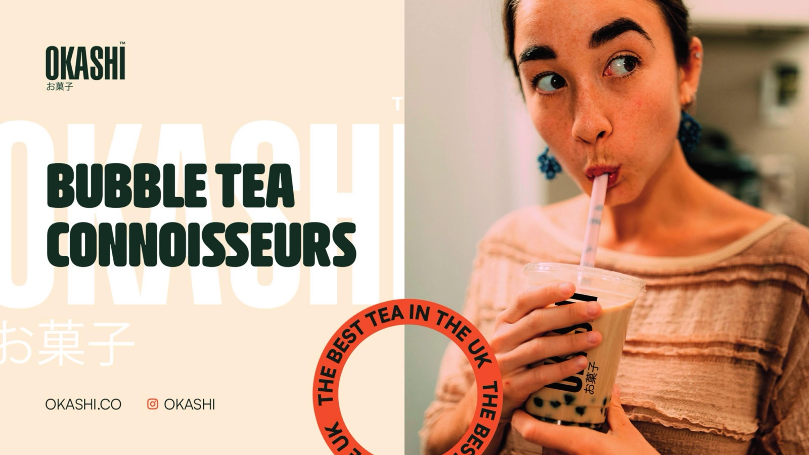
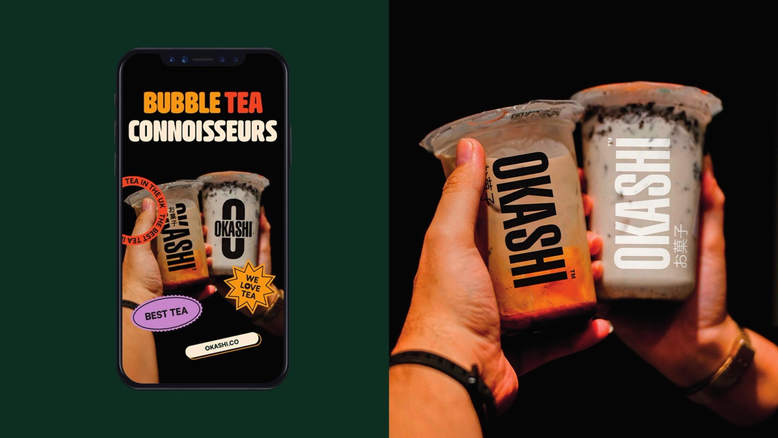
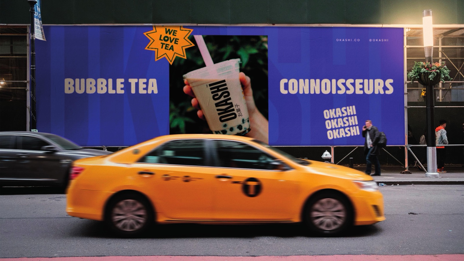
A system for the phone first
Bubble Tea Connoisseurs is the line everything hangs off. Story layouts, post frames and cup wraps were drawn for a 9:16 screen before a shopfront, so the brand is as strong in a feed as it is on a Saturday queue.
The mark
One lockup, two scripts
OKASHI sits in Bevellier, a rounded condensed display with enough weight to read across a food court. The kanji anchors it. Together they signal where the brand comes from before a single word of copy is read.
Bevellier carries the headlines, preferably in upper case. Satoshi Variable handles body copy, prices and the small print.
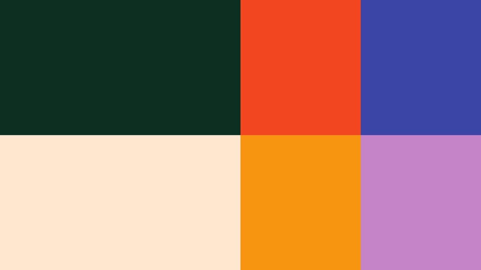
Colour
Calm base, bright on cue
Mochi Cream
#FDE7CF
Matcha Forest
#1D3D30
Brown Sugar
#F79510
Chilli Red
#F24620
Taro Purple
#C584C6
Indigo
#3946A4
The world
A sticker language built to be stamped anywhere
“Bubble Tea Connoisseurs. A claim, then a brand built to earn it.”
Out in the wild
Where the brand actually lands
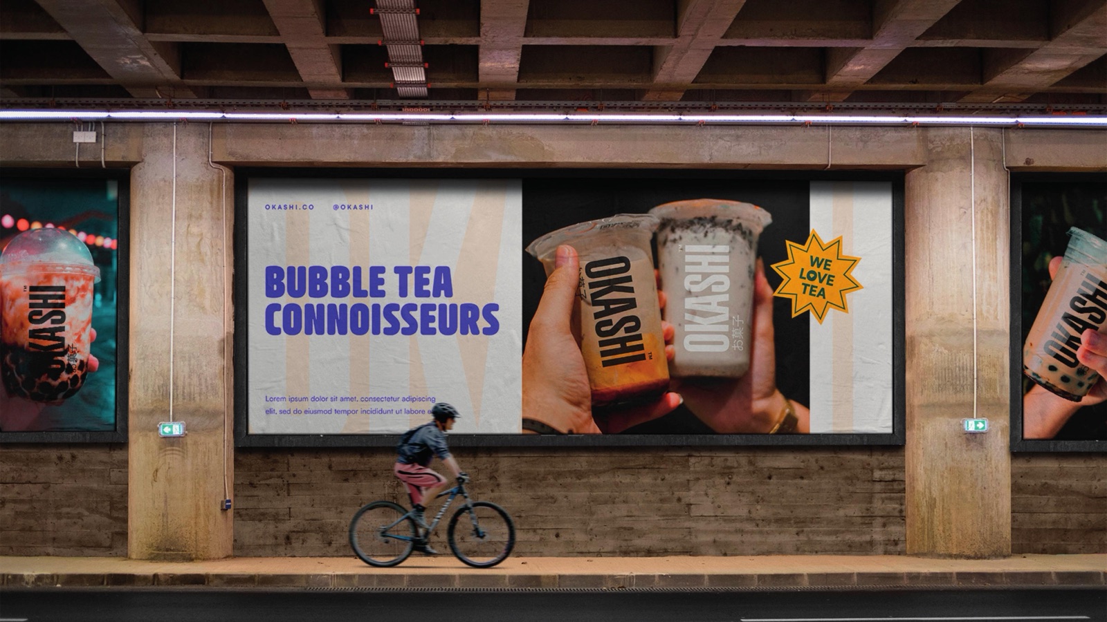
Rolled out across
From the cup to the camera roll
How we approached it
01
Two languages, one mark
The brief leant on the name. Okashi is Japanese for sweets, so the identity had to feel rooted in Japan without turning into a cliche of cherry blossom and brush strokes. The answer was restraint: a clean Latin wordmark, the kanji as a quiet anchor, and a palette that does the cultural work instead of decoration.
02
Connoisseurs, not a kiosk
Plenty of bubble tea reads cheap and disposable. Okashi wanted to sit a notch above, a brand a tea drinker would champion. Bubble Tea Connoisseurs is a claim, so the type, the green and the photography all had to back it up rather than undercut it with novelty.
03
Calm base, loud accents
Mochi cream and matcha forest do the heavy lifting and keep the brand feeling considered. The brown sugar, chilli red, taro purple and indigo only show up on stickers and posts, where energy earns its place. Quiet most of the time, bright on cue.
04
A kit a small team can run
No agency on call to make a Tuesday story. The stickers, frames and rules are simple enough that one person behind the counter keeps the brand consistent across the cup, the window and the feed, every single day.
Launching something people should queue for?
Food, drink, retail. We build identities and packaging that look the part on a shelf, a shopfront and a story.