Norvic
Pharmacy
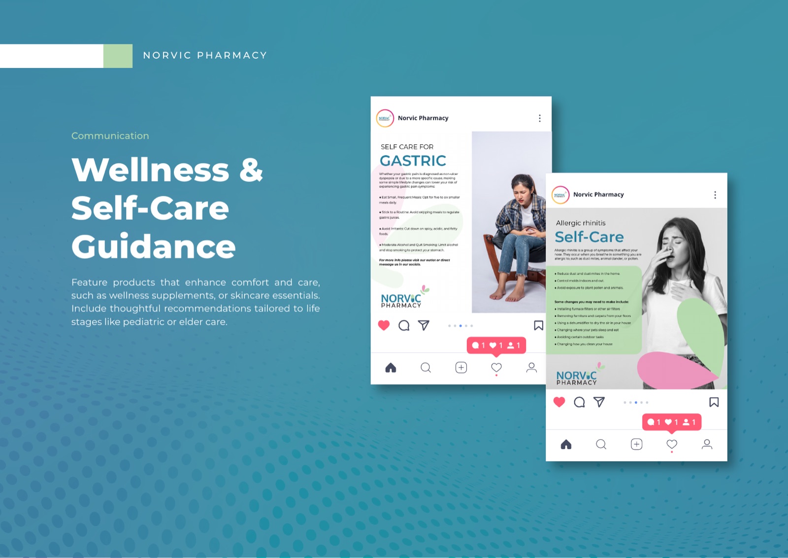
Committed to your health journey. A calm, human identity for a Nepali pharmacy, built so that walking in feels like being looked after.
The brief
A pharmacy that should feel like care, not a counter
People rarely walk into a pharmacy on a good day. They are unwell, worried, or caring for someone who is. Most pharmacy branding ignores that completely and leans on clinical whites and warning reds, which is the last thing an anxious person needs to see.
Norvic wanted the opposite. A brand that feels calm and human the moment you see the sign, that earns trust through warmth rather than sterility, and that carries one promise all the way through: committed to your health journey.
The brand film, produced end to end alongside the identity. A minute on the people and the promise behind the pharmacy, so the tone and colour arrive in motion, not just on a logo sheet.
The mark
A butterfly, hidden in the wordmark
The logo folds a butterfly into the letters. A soft symbol of recovery and gentle change, the kind that fits a pharmacy without resorting to a tired cross or a mortar and pestle.
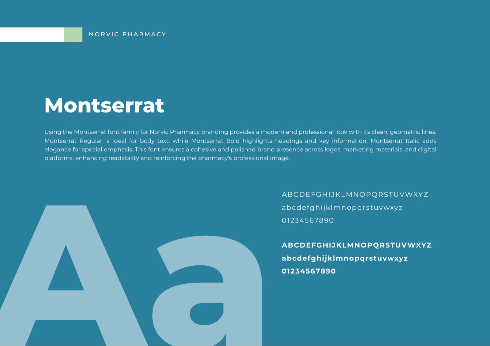
It is warm where most pharmacy branding is clinical. Paired with Montserrat, clean and friendly, it reads as calm before it reads as medical.
The colour
A palette that lowers the temperature
Care Teal
The anchor. Trust without the cold.
Soft Green
Recovery, growth, a deep breath.
Gentle Pink
Warmth, the human hand on the counter.
Paper White
Space to let the rest breathe.
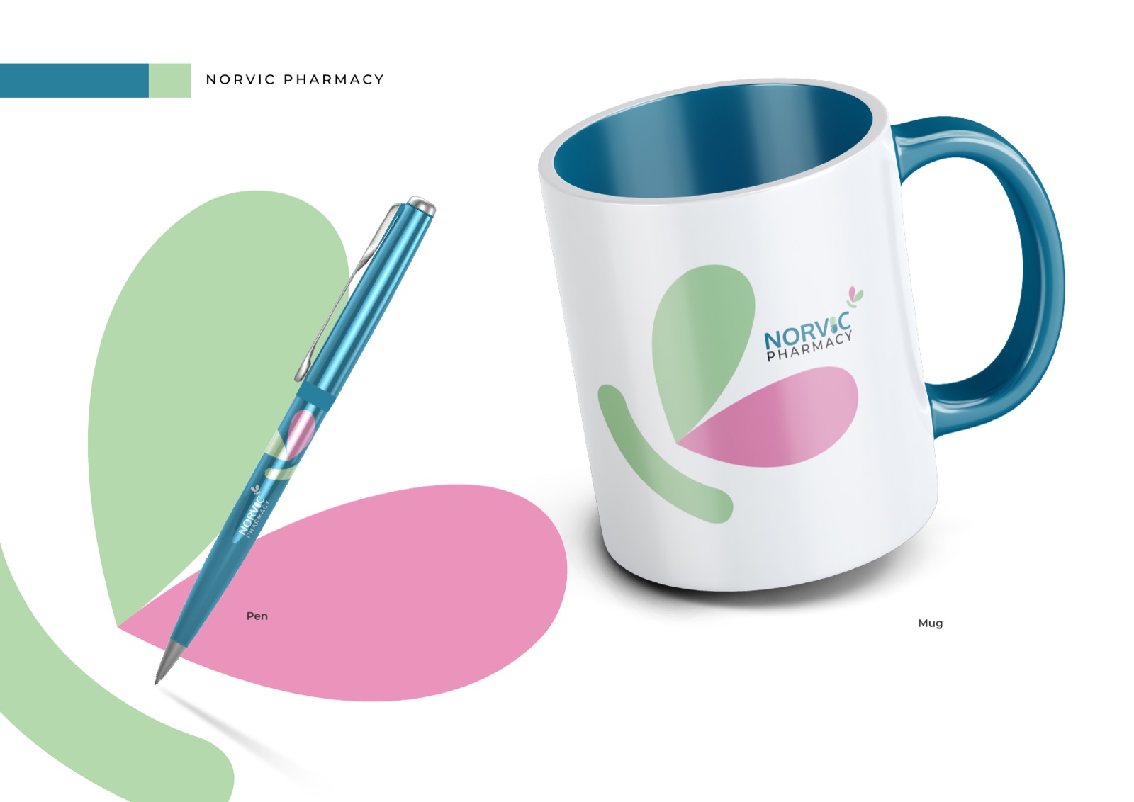
The system
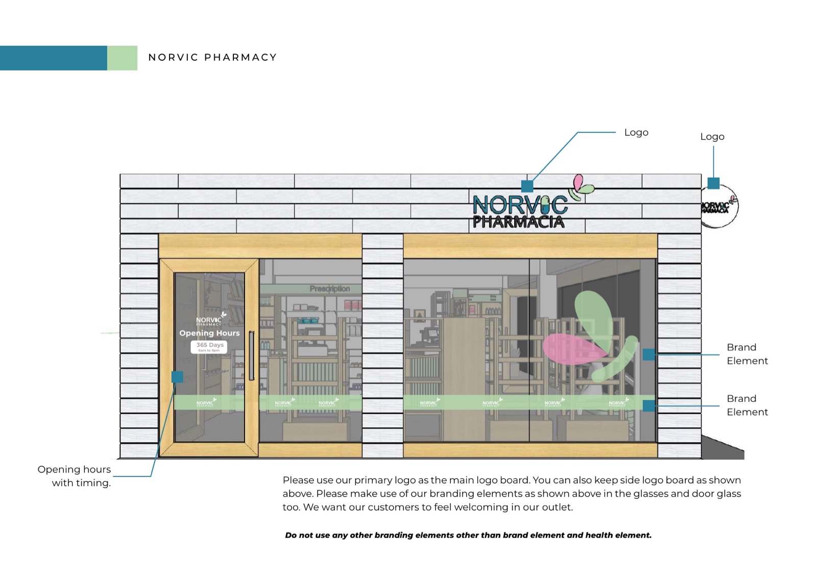
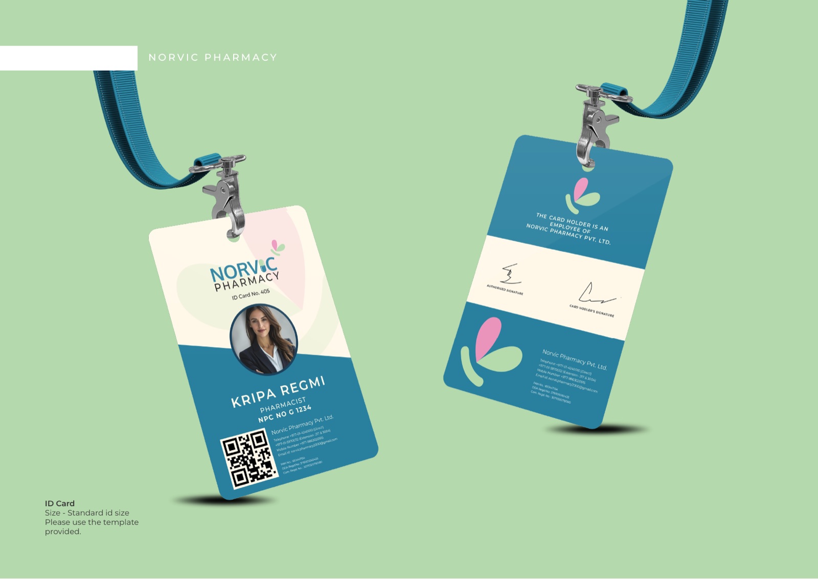
From the storefront to the feed
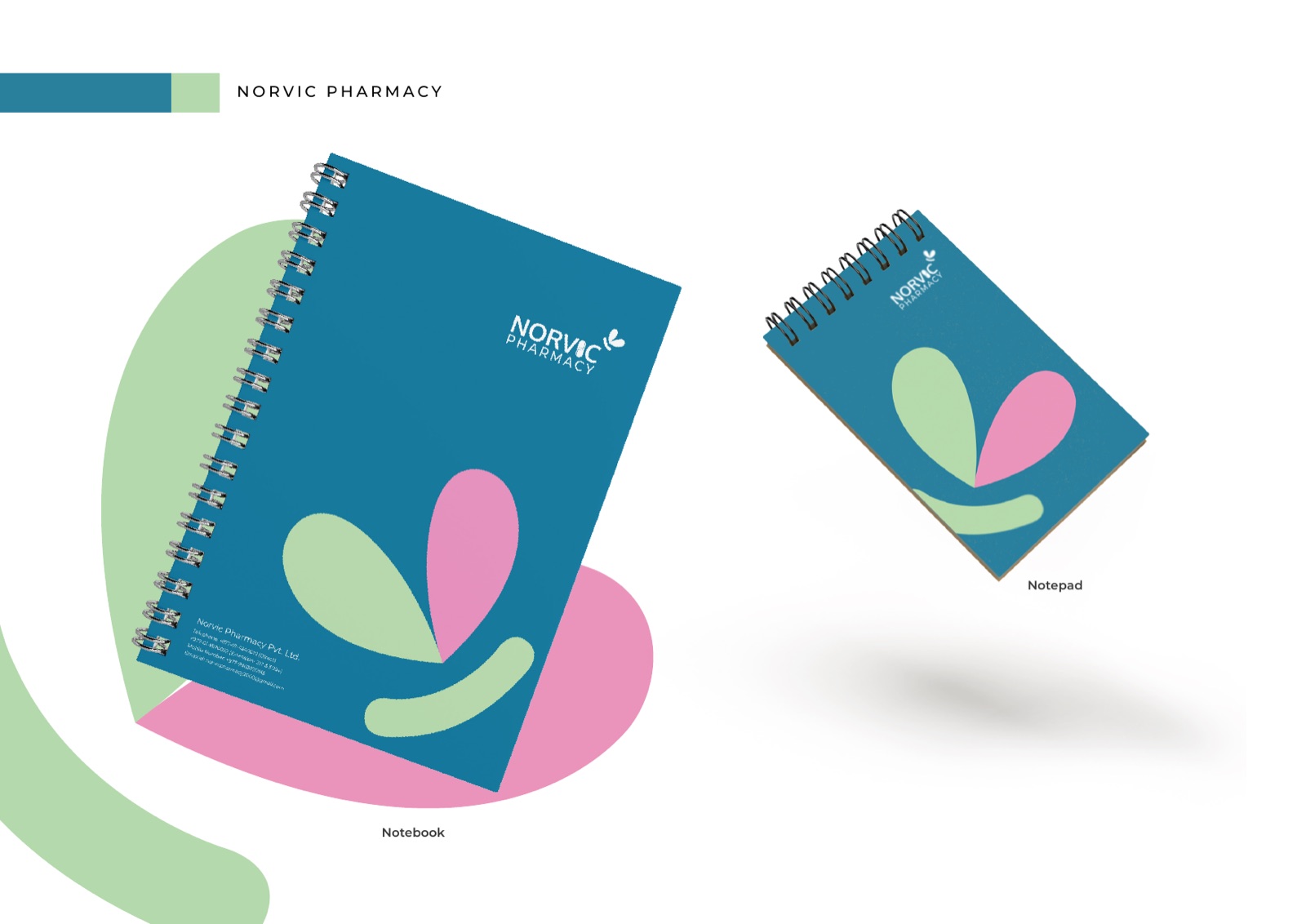
Storefront and signage, ID cards, notebooks and stationery, and a full social system. One soft, dependable feeling, carried across every place a patient meets the brand.
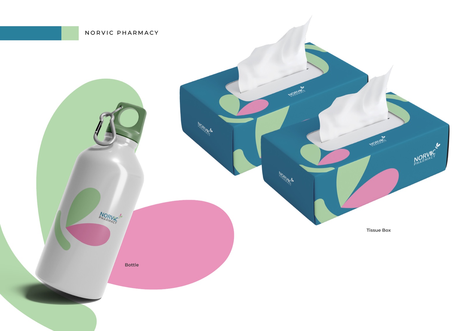
On the floor
The brand, out in the world
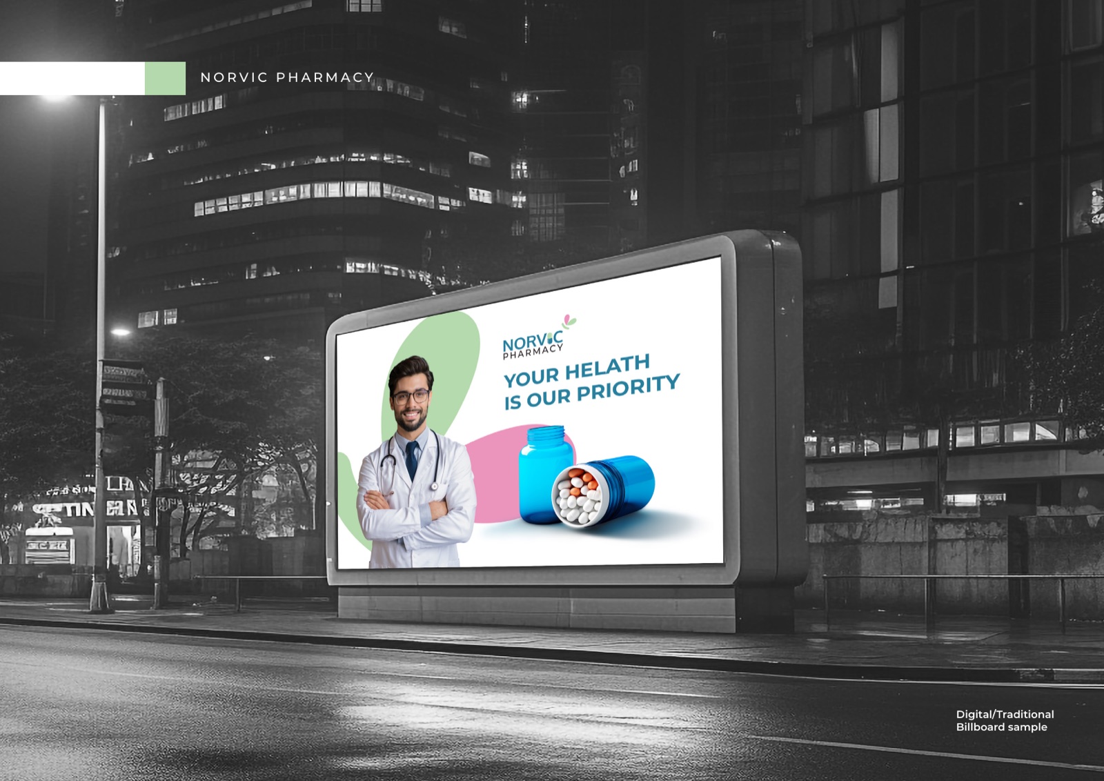
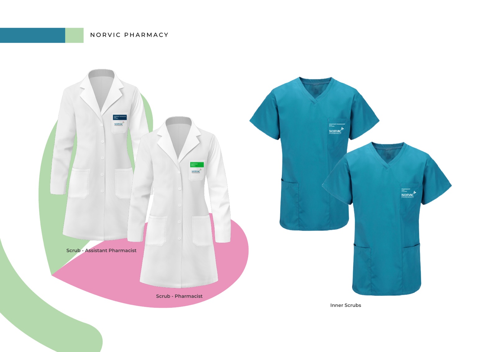
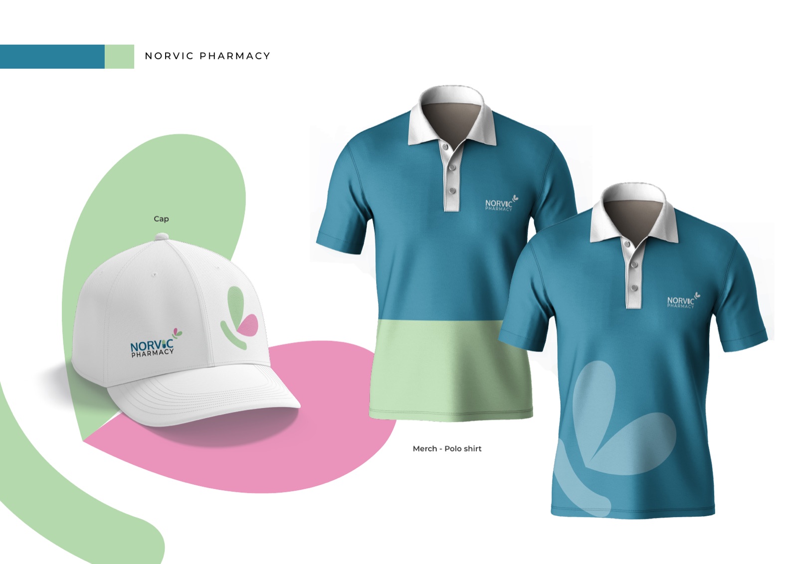
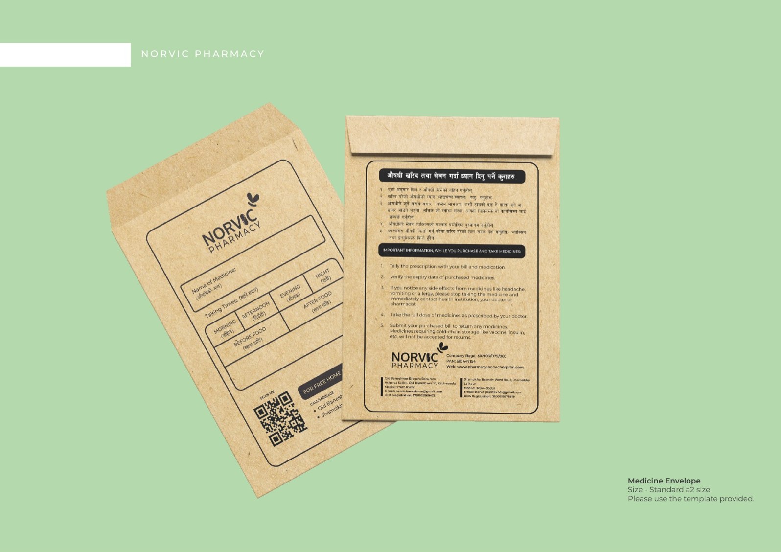
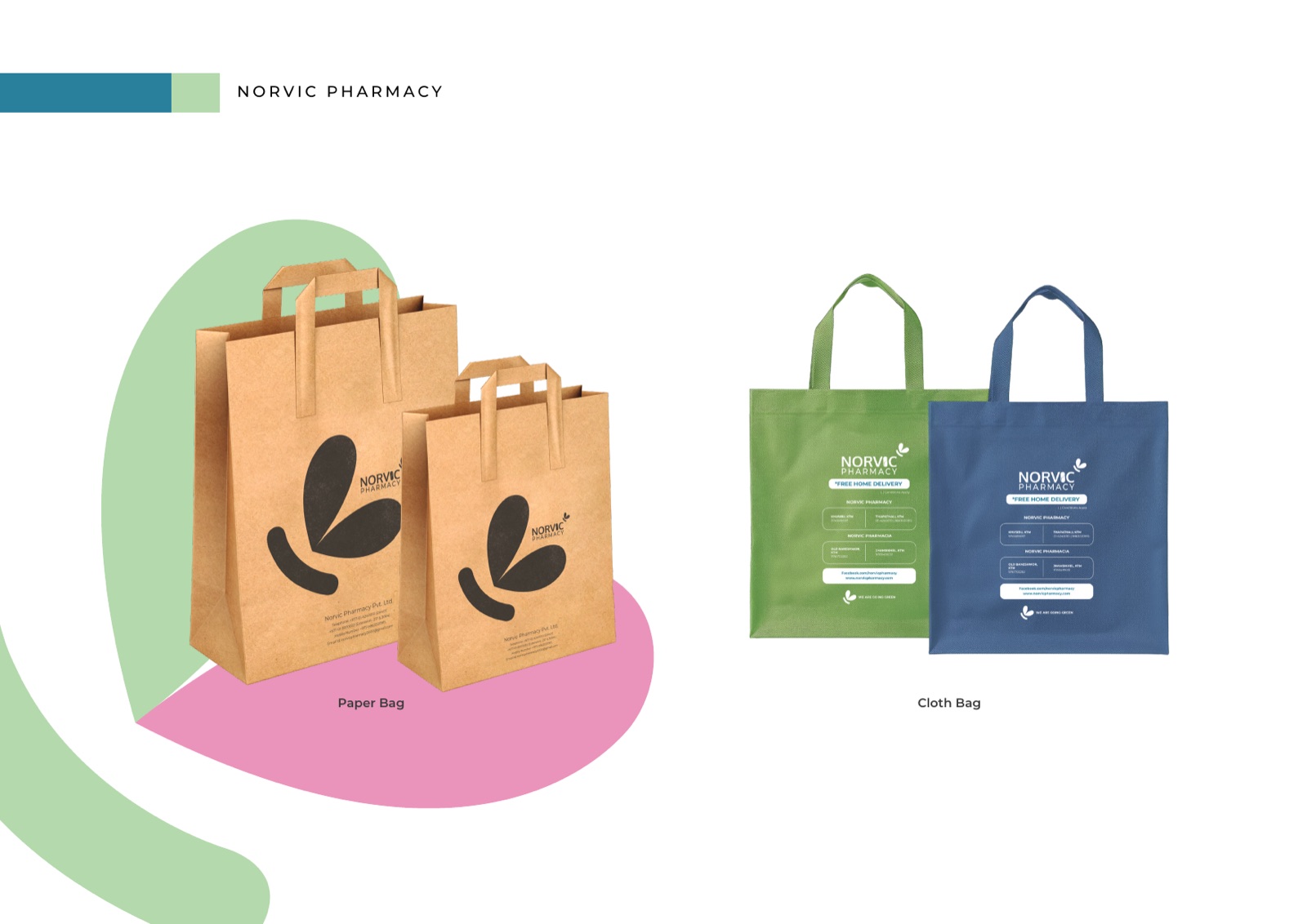
Uniforms, packaging, bags and out of home. The same soft palette and butterfly mark, applied to the things a patient actually holds and passes on the street.
Rolled out across
Every touchpoint a patient meets
How we approached it
Four calls that shaped the system
Make healthcare feel human
Most pharmacy branding is cold by default. Clinical whites, alarm reds, hard edges. We went the other way. Soft colour and a butterfly mark, so someone walking in with a worry feels looked after, not processed.
Trust through consistency
In healthcare, looking consistent is part of looking safe. The guidelines are strict about colour, type and the single approved logo. Every shelf label and every post reinforces the same dependable feeling.
A local build, with TBC
We produced Norvic with TBC, our partners in Nepal. They know the patients, the print trade and the cultural detail an outside agency would miss. We brought the system, they kept it true to Nepal.
Built to move, not just sit
A brand that only exists as a logo sheet is half a brand. We made the film alongside the identity, so Norvic has motion, tone and a story from the start. Ready for screens as well as shelves.
Made with TBC, in Nepal
Norvic was co-produced with TBC, our partners in Nepal. They held the local knowledge, the patients, the print trade and the cultural detail. We brought the brand system. The result is calm, warm and unmistakably Nepali.
Want a brand that feels like care?
Healthcare, wellness, anything where people arrive worried. We build warm, trustworthy identities, and the film to go with them.