Brand identity · Dubai
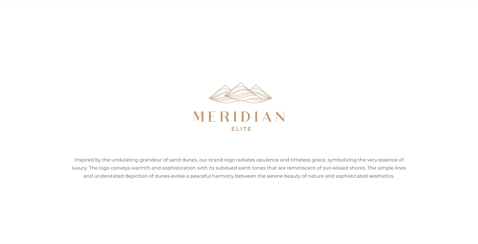
Meridian Elite
A teal and copper identity for luxury living, drawn from the dunes and the water around the homes.
The mark and the thinking behind it
The brief
A residential name that should feel like the address itself
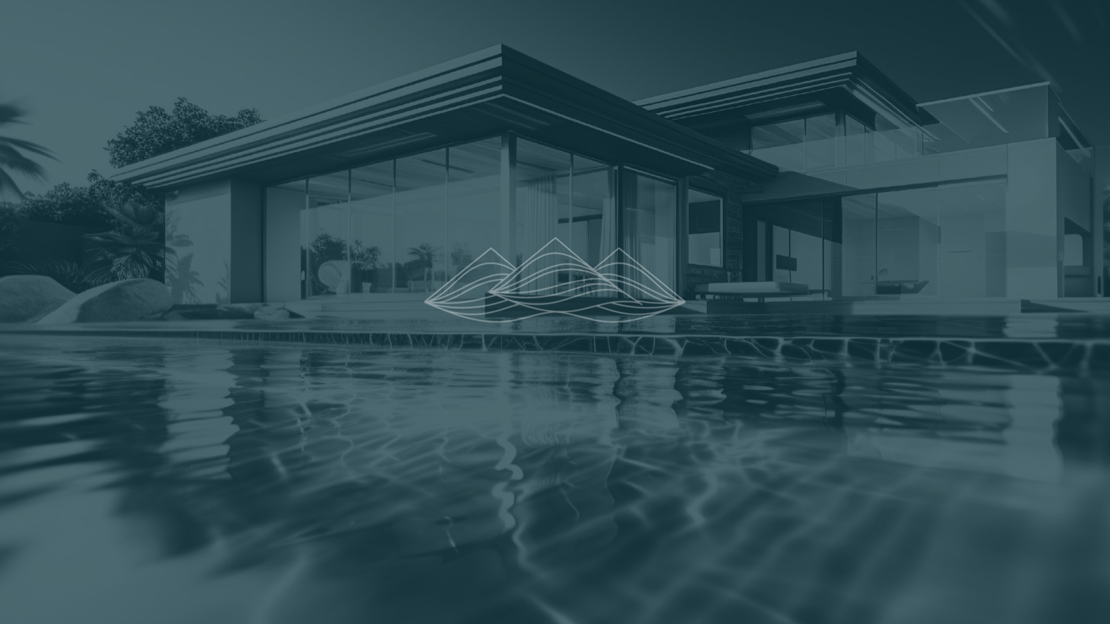
Meridian Elite sells a particular kind of home in Dubai, glass-walled, low and wide, sat between a garden and a pool. The brand had to carry that feeling before a buyer ever sees a floor plan. Calm. Expensive. Sure of itself.
So we started with the setting rather than a typeface. The dunes, the water, the line where the building meets both. Everything else, the colours, the stationery, the signage, came off that single idea.
One
Dune mark, line only
Two
Colours, teal and copper
10
Pieces across the system
Dubai
Where the homes sit
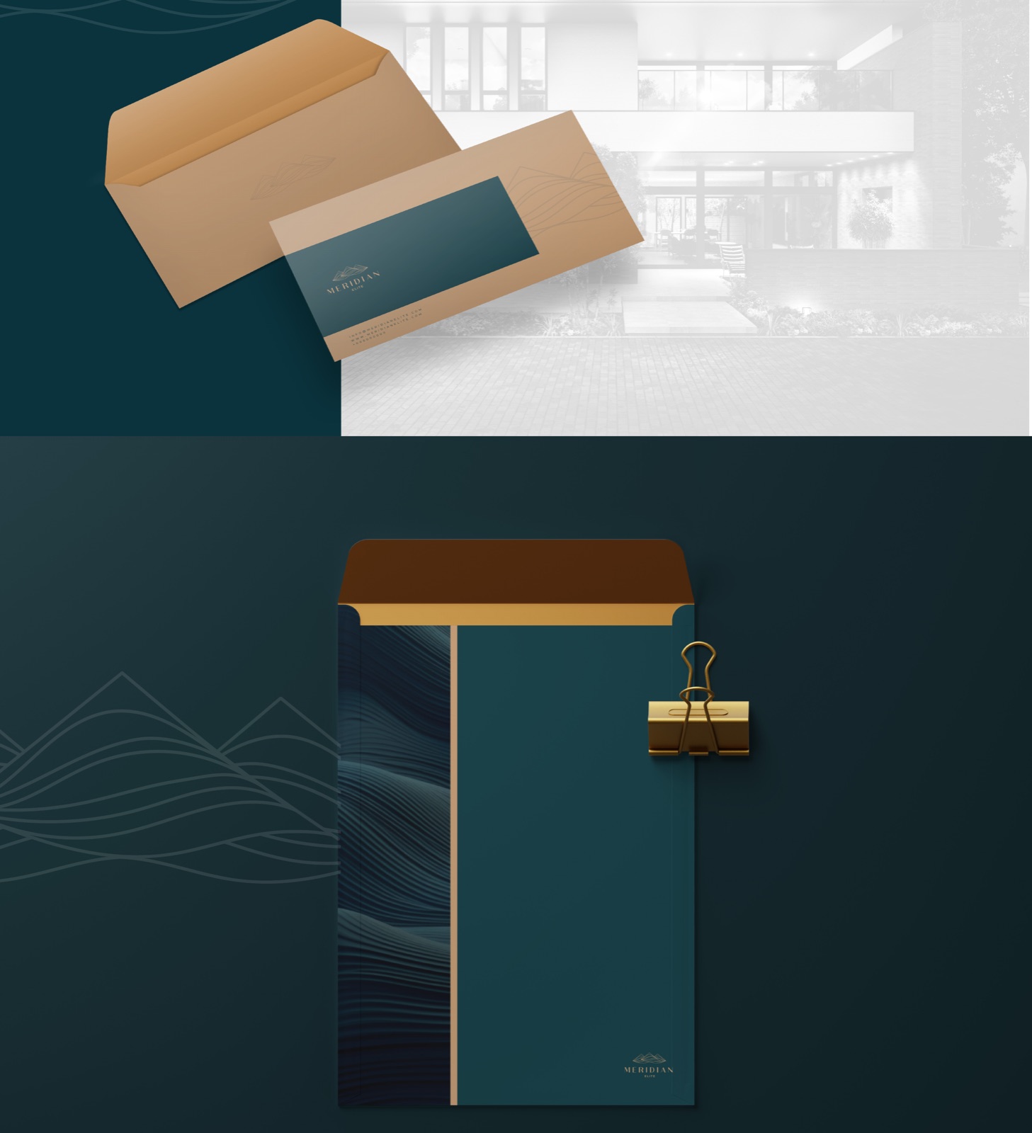
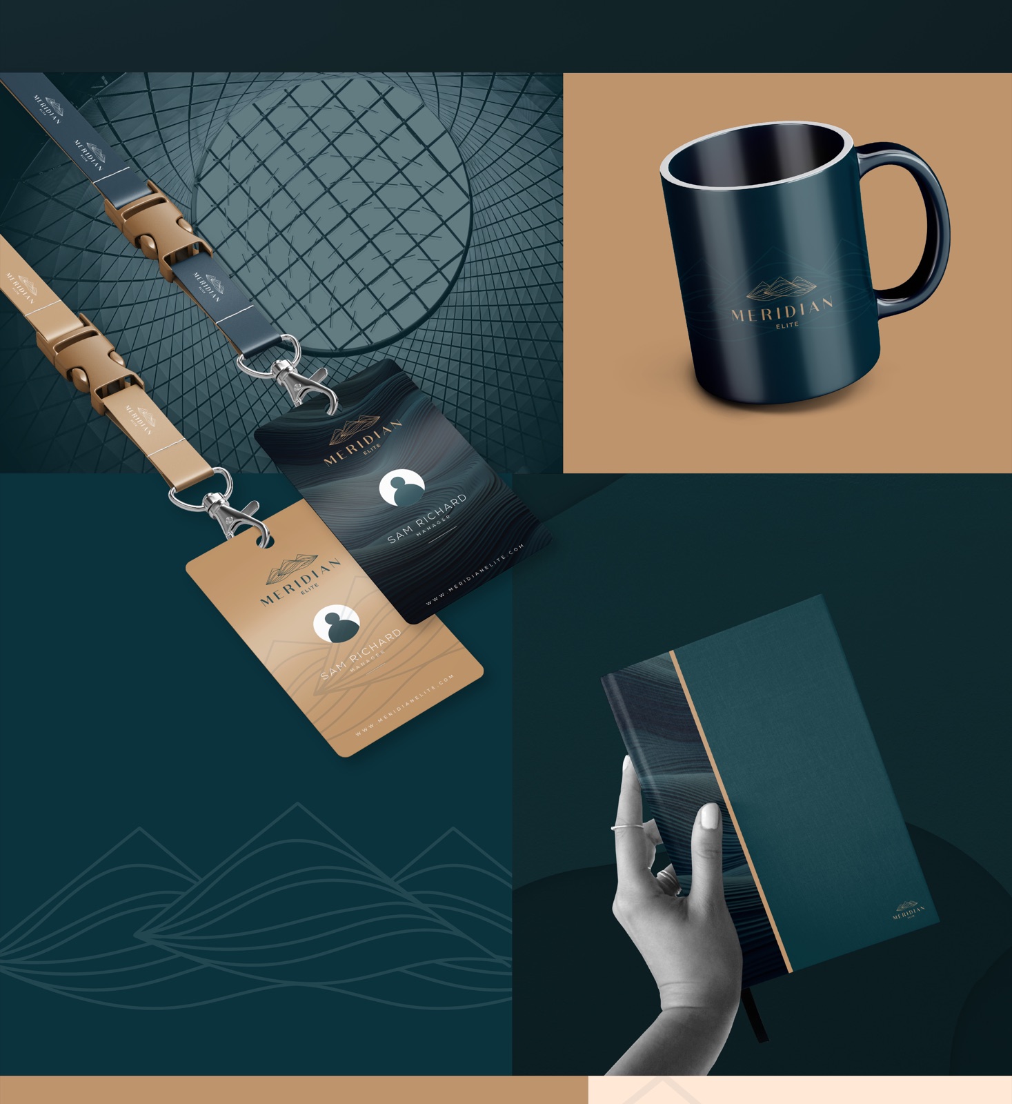
The stationery
Cards and letterhead, two ways round
One card runs teal with the wave texture, the other flips it, copper foil on a clean ground. The letterhead keeps the mark small and lets the page breathe, which is the whole point of the brand.
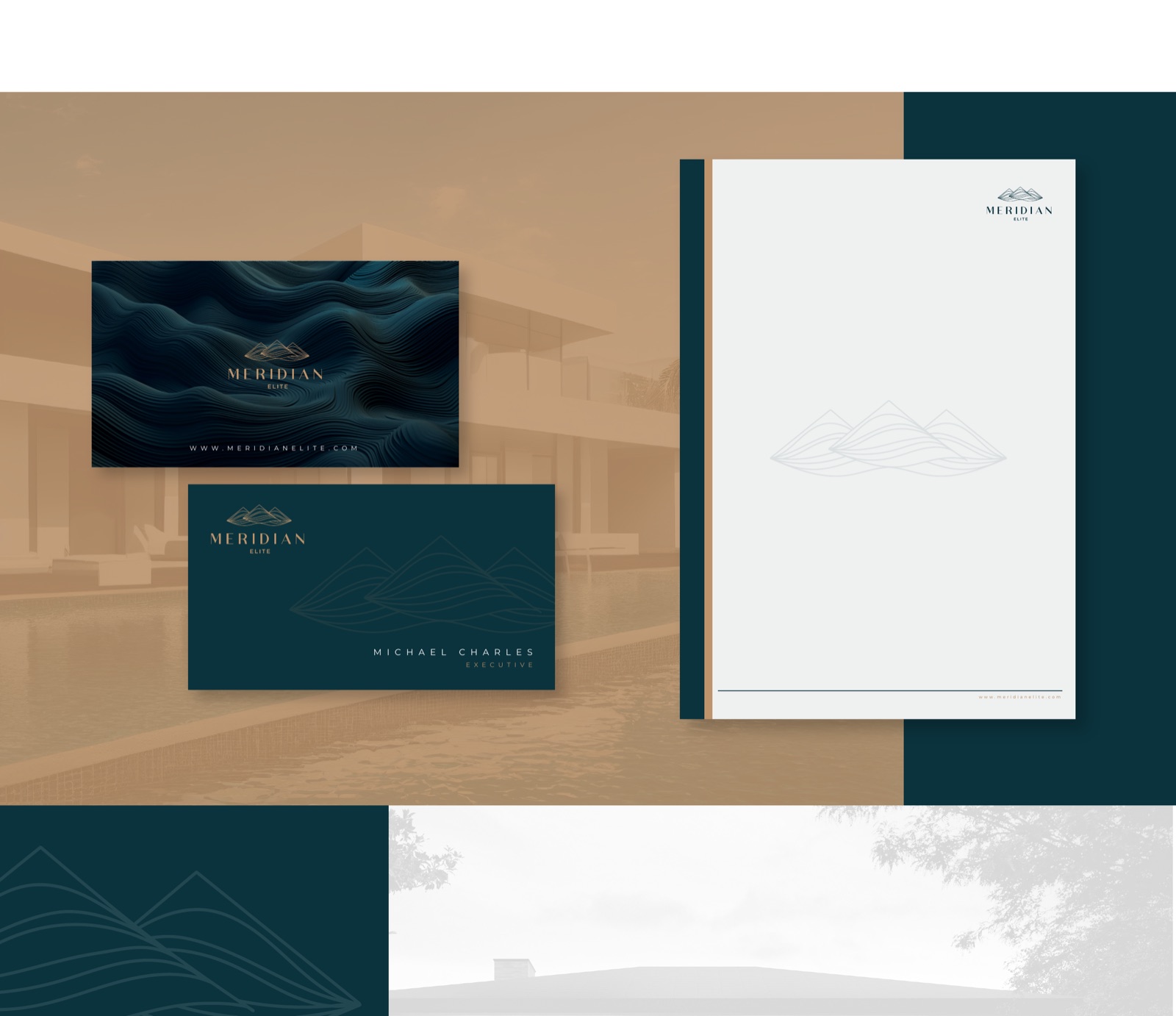
The palette
Two colours, two supporting tones
Deep teal and warm copper carry the brand. Petrol navy darkens it where it needs weight, sand cream lifts it where it needs air. Four values, nothing more.
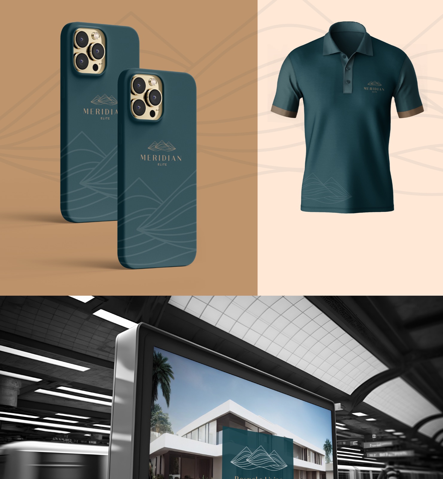
On the things people hold
Passes, a mug, a notebook
Rolled out across
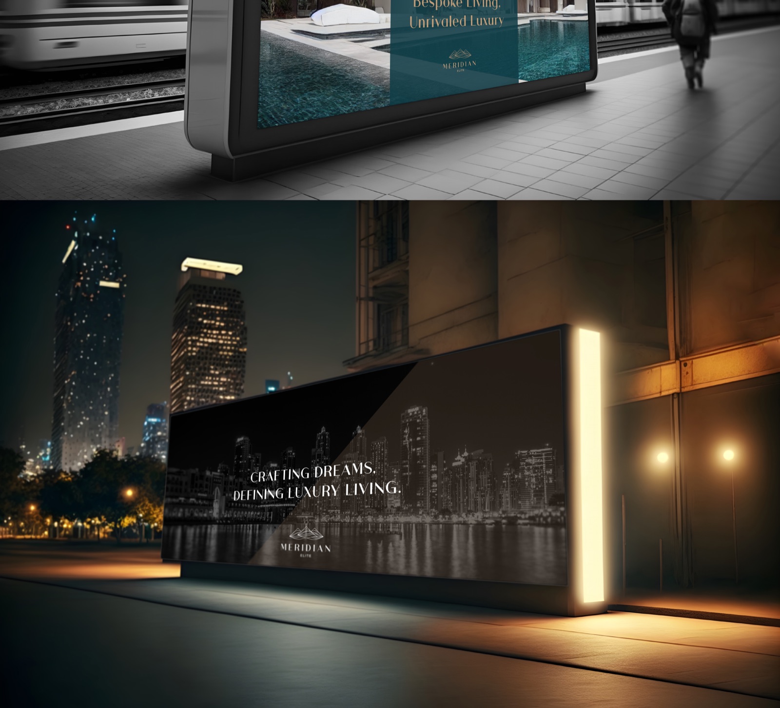
Out in the city
From a station platform to the skyline at night
The last test was scale. A lightbox on a platform, a hoarding lit against the Dubai skyline after dark. The mark holds at that size because it was never busy to begin with.
How we approached it
01
A logo pulled from the landscape
The mark is a few quiet lines that read as dunes and as still water at the same time. It came straight out of where the homes sit, sand on one side, pool on the other. No gloss, no gradient, just line.
02
Two colours doing all the work
Deep teal carries the weight, warm copper lifts it. That pairing runs through every piece, so a business card, a mug and a station billboard all read as the same brand without a style guide in hand.
03
Built to scale up and down
The same identity had to survive being foiled onto a card the size of a palm and projected onto a hoarding across a platform. We tested it at both ends before we signed anything off.
04
Restraint reads as money
For a buyer choosing between villas, loud branding works against you. Meridian Elite leans on space and material instead, the kind of confidence that does not need to raise its voice.
Launching a property brand?
Residential, hospitality, anything sold on how it makes a buyer feel. We build identities that read as premium from a business card to a billboard.