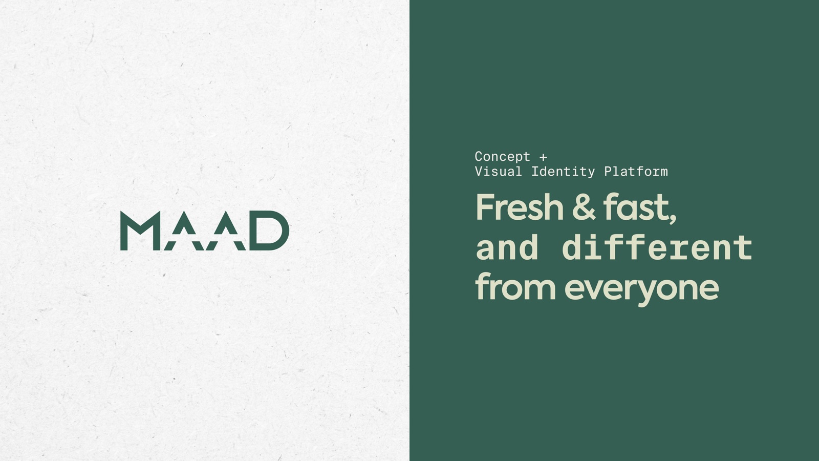
Brand identity · Cafe and juice bar
MAAD
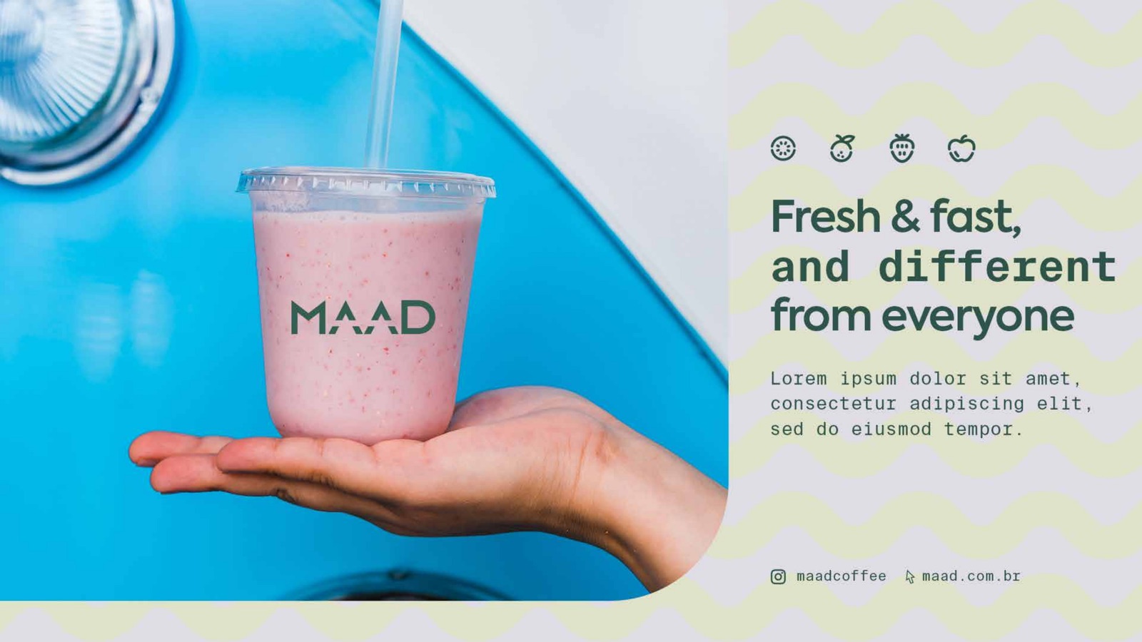
Fresh and fast, and different from everyone. A veggie-friendly coffee, juice and salad bar, given an identity calm enough to let the food do the shouting.
The brief
A grab-and-go cafe that did not want to look like every other grab-and-go cafe
MAAD sells a short, honest menu well: coffee in four styles, juice pressed to order, croissants, breads and salad bowls. It is veggie-friendly, quick, and aimed at people who want something fresh between other things they are doing.
The problem is the category. Independent cafes blur into one chalkboard-and-kraft-paper sameness. The brief was to keep the warmth and the speed, drop the cliches, and build a kit that a small team could run across cups, bottles, a storefront and a daily feed without losing the thread.
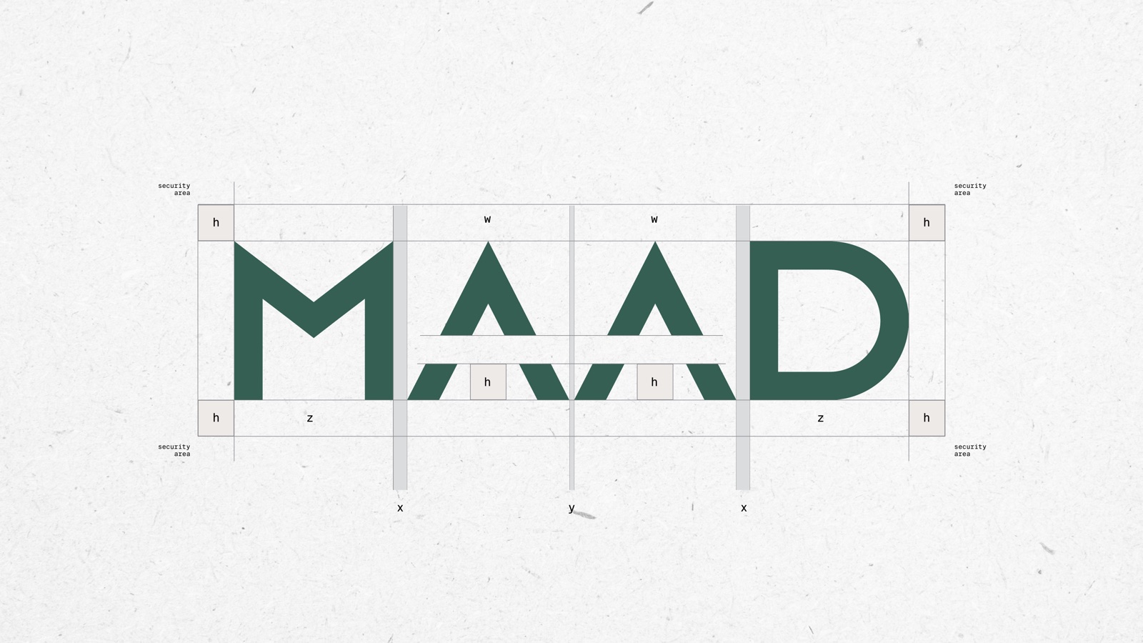
The mark
Two peaks and a rising arm
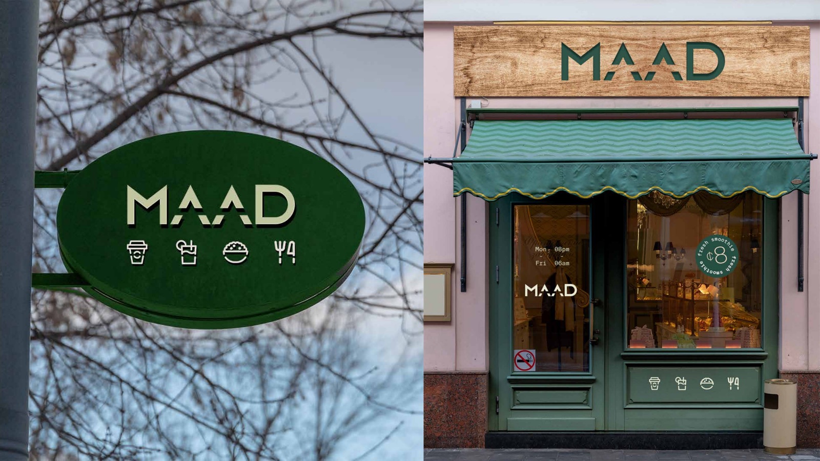
The wordmark is drawn on a tight grid in Axiforma. The twin peaks on the A pair give it a quiet smile; the lifted arm of the D keeps it moving. Simple enough to stamp, distinct enough to own.
Colour and type
One deep green, six soft supporting tones
Forest Green
#335D52
Soft Sage
#EAECD5
Warm Cream
#F7E6CE
Blush
#F5DFDC
Lilac
#DFDCE6
Ice Blue
#E1ECEF
Off White
#F9F5F3
Axiforma handles the headlines and the wordmark. Suisse Int’l Mono runs the labels, prices and small print, which gives menus and packaging a tidy, deli-counter precision.
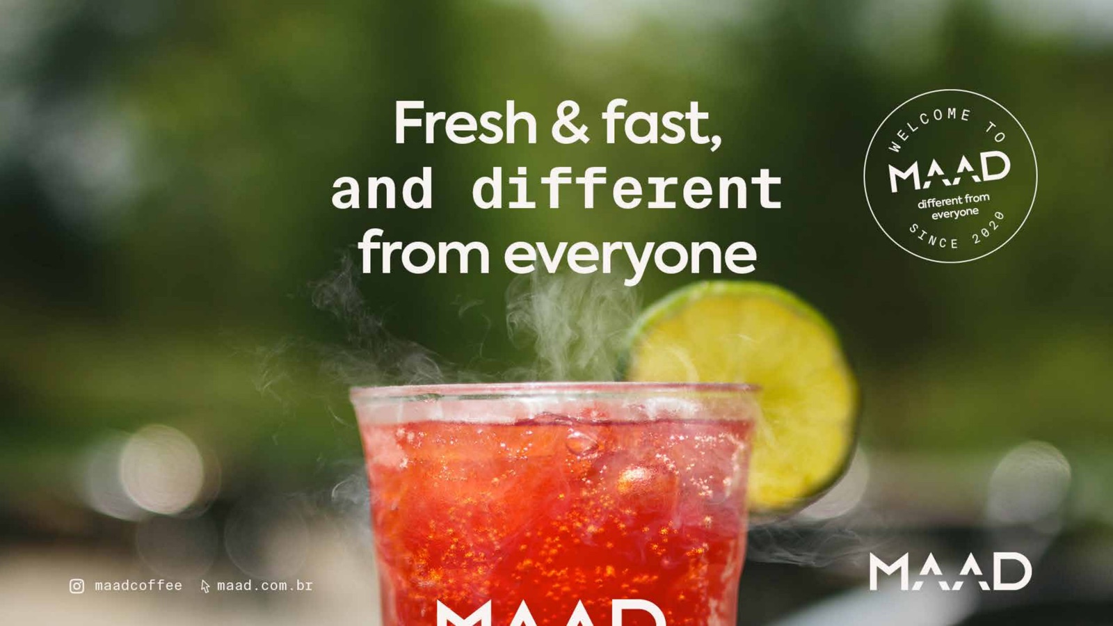
“Fresh and fast, and different from everyone.”
The toolkit
An icon set and a stamp drawer
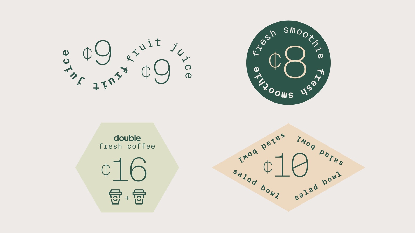
A line-drawn icon set covers the whole menu, and a set of circular stamps and price badges adds the playful, hand-made note that keeps the brand feeling friendly rather than corporate.
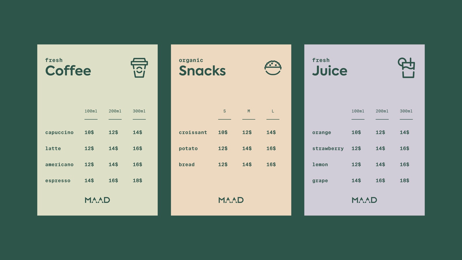
The menu
Coffee
Cappuccino, latte, americano, espresso. Served in three sizes, single or double.
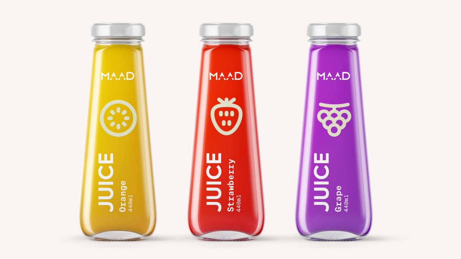
Juice
Orange, strawberry, lemon, grape and watermelon, pressed to order in 100, 200 and 300ml.
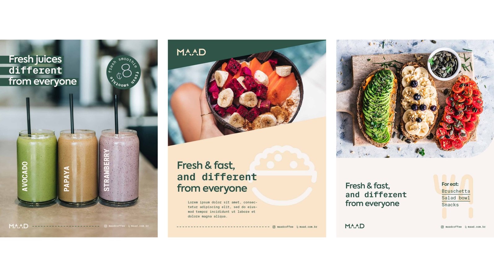
For eat
Croissants, breads, potato, and salad bowls built for a quick, honest lunch.
What we shipped
A wordmark that stays put
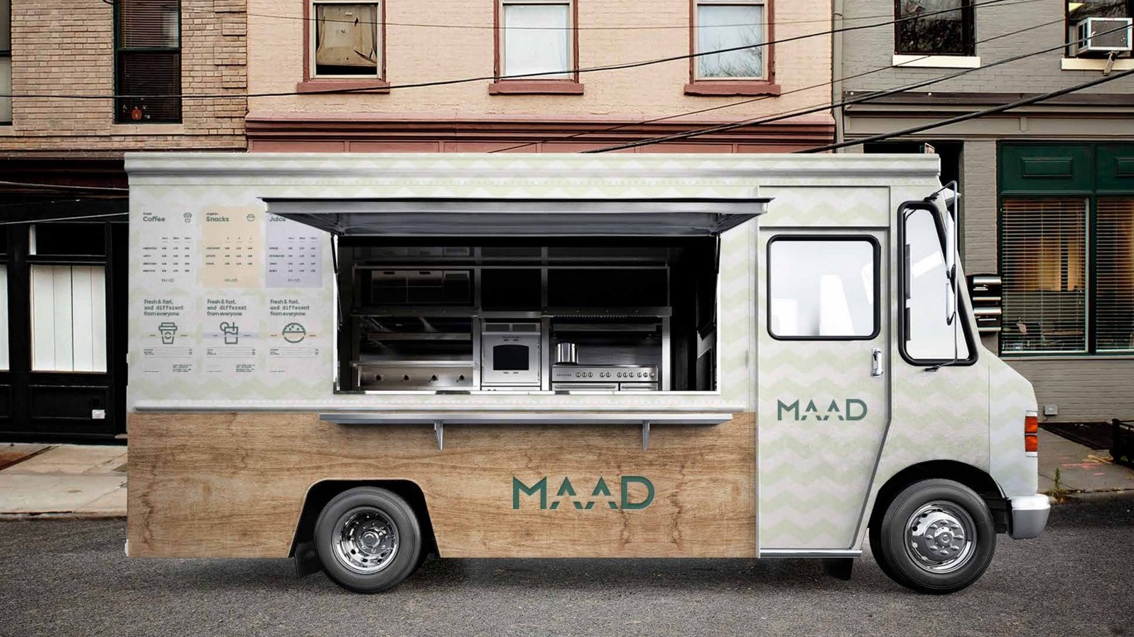
MAAD is set in Axiforma with two sharp peaks on the A and the rising arm of the D. It reads the same at the size of a coffee cup or the side of a food truck. The construction grid keeps the spacing right wherever it lands.
A pastel kit, anchored in green
Seven soft tones sit under one deep green. The green carries the brand on signage and packaging; the pastels do the lighter work behind food photography, menus and social, so nothing ever fights the food.
A system a single shop can run
Icon set, badges, menu templates, cup and bottle labels, business cards and post layouts. The pieces share one grid and one type pairing, so a small team keeps it consistent without a designer on call.
Out in the wild
Where the brand actually lands
Rolled out across
How we approached it
01
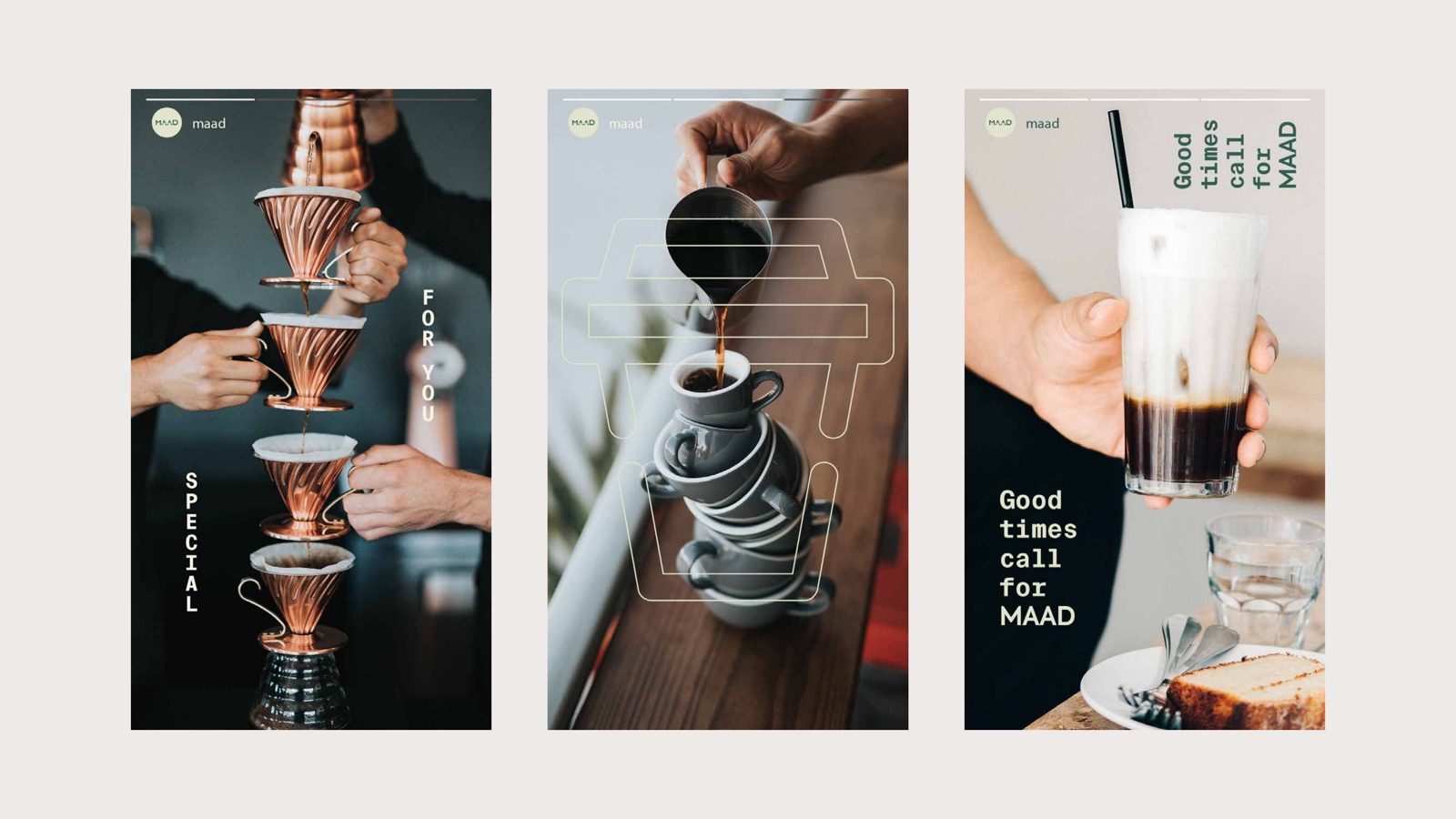
Let the food be the colour
A salad bowl, a strawberry juice and a flat white already carry plenty of colour. The brand sits back into deep green and soft pastels so the produce stays the brightest thing in every frame. Restraint here is a strategy, not a shortage of ideas.
02
Three words carry the positioning
Fresh and fast, and different from everyone. It promises speed without promising junk, and it stakes out a personality in a category full of identical chalkboard cafes. Every menu and label repeats it so the line does real work, not decoration.
03
Built for a counter, not a brochure
This brand lives where people queue: a cup handed across a counter, a bottle in a fridge, a board read in ten seconds. We designed the labels, sizes and price layouts as the primary surfaces, then let the guidelines follow from what the shop actually prints.
04
Friendly, not childish
Veggie-friendly and welcoming, with a hand-drawn icon set and playful stamps, but held together by a disciplined wordmark and a mono typeface. The result feels easy to walk into and still looks like it knows what it is doing.
Opening something people should walk into?
Cafes, food, drink, retail. We build identities and packaging that read fast at the counter and hold up across a whole shop.