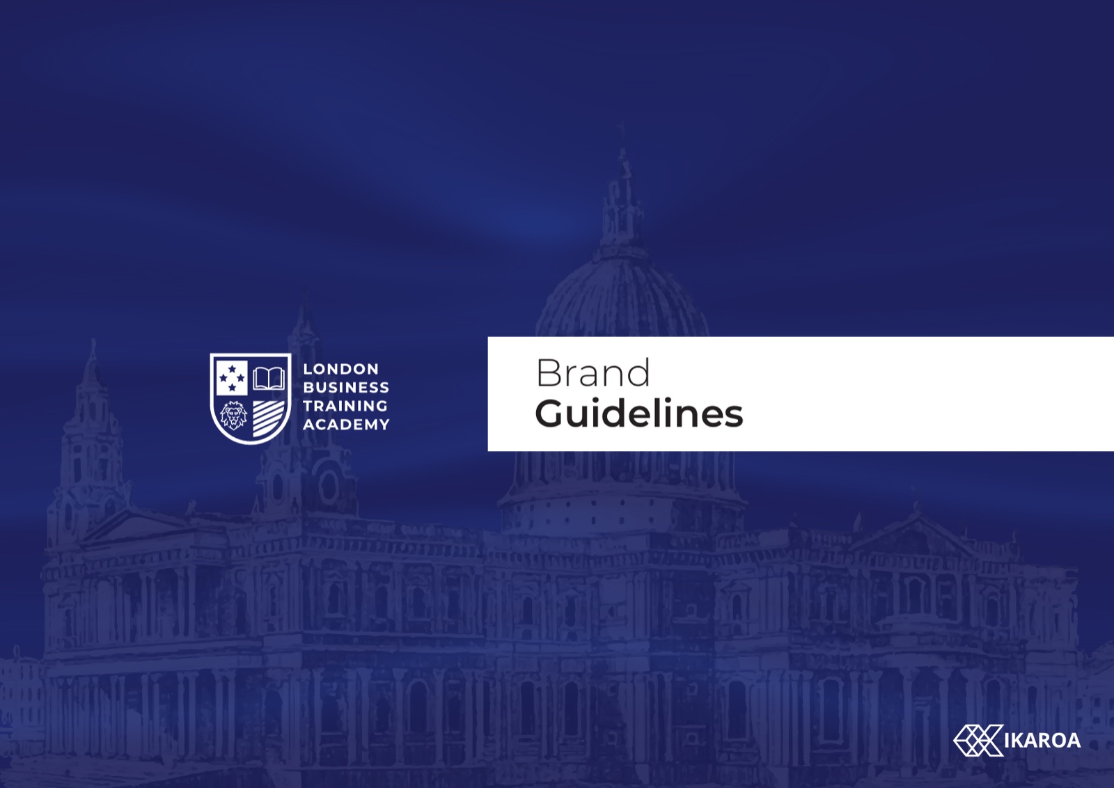
London Business
Training Academy
A heraldic identity for a London college inside the BMC professional education group. One crest, drawn from scratch. A navy and red colour system. A rollout built to hold across a network of campuses.
Become More
The brief
A training college that needed to look the part
London Business Training Academy teaches professional courses to working people and to organisations that send their teams to train. In that market, credibility is the whole game. A prospective student is choosing who to trust with a career. A procurement team is choosing who to put on an invoice.
The job was an identity that earns trust on sight. Something that looks like an established London institution, sits comfortably inside the wider BMC education group, and holds together whether it lands on a lecturer’s card or the side of a bus.
The crest
Three marks on one shield
The open book
Learning, the thing a student actually pays for. It sits centre because the credential is the product.
The key
A career opened. Professional training is a door, and the mark says so without a slogan.
The tower
London, and permanence. A city skyline read as one silhouette, so the academy looks rooted.
Drawn over a construction grid, with a minimum size baked in, so the shield never turns to mush on a favicon or a lanyard.
The palette
Ocean navy, Phoenix red
Two colours carry the brand. Navy does the serious work, the ground everything sits on. Phoenix red is rationed, used where the eye needs a marker. A thin gold rule and parchment white round it out. Named, fixed, and written into the book so a campus cannot drift.
Ocean navy
Primary ground
Deep ocean
Type and shadow
Phoenix red
Accent and call
Parchment
Paper and light
Display, Times serif
Aa
Become More
The serif carries the headings. It is where the gravity lives, the part of the system that says this place has been here a while.
Body, Montserrat
Aa
Clear at every size
Montserrat runs everything a student actually reads. Timetables, forms, signage, the web. Modern, plain, and easy on a screen.
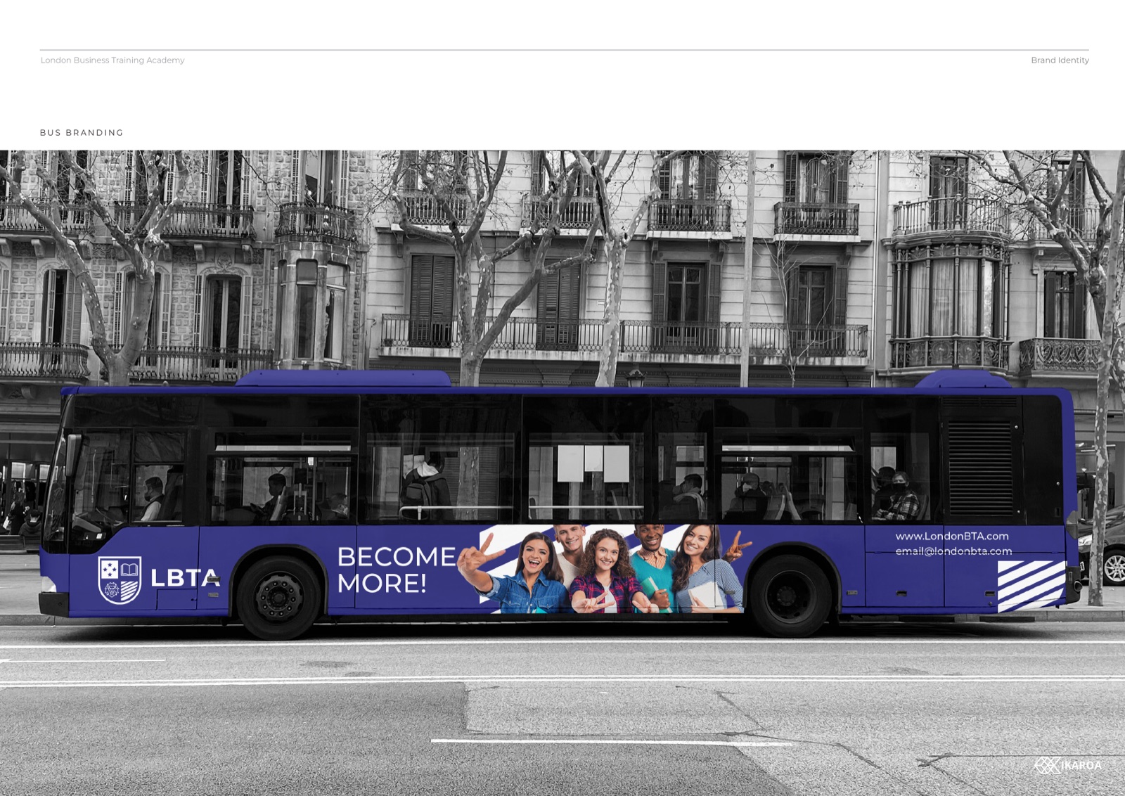
The rollout
One institution, head to toe
Lecturer cards and ID
The crest at pocket size, foiled, legible down to a lanyard.
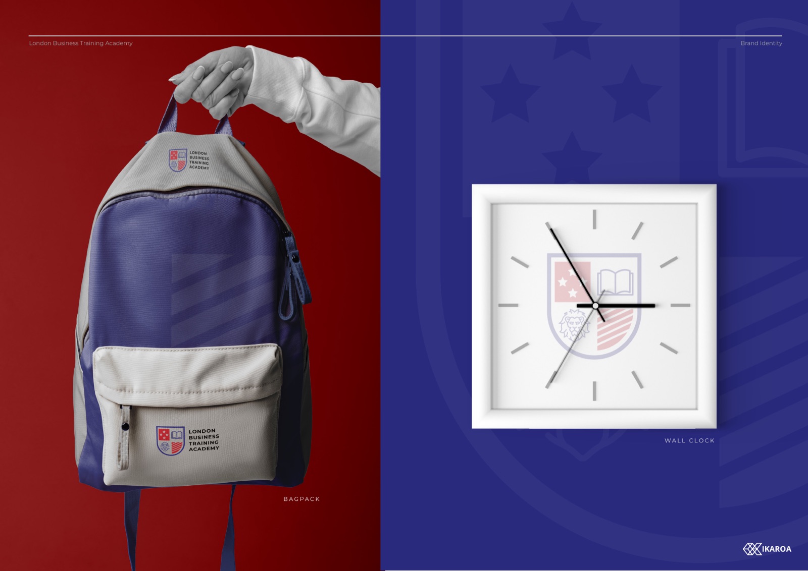
Merchandise
Backpacks and wall clocks. The brand on the things people keep.
Campus signage
Wayfinding and front-of-house, navy ground, gold rule, red marker.

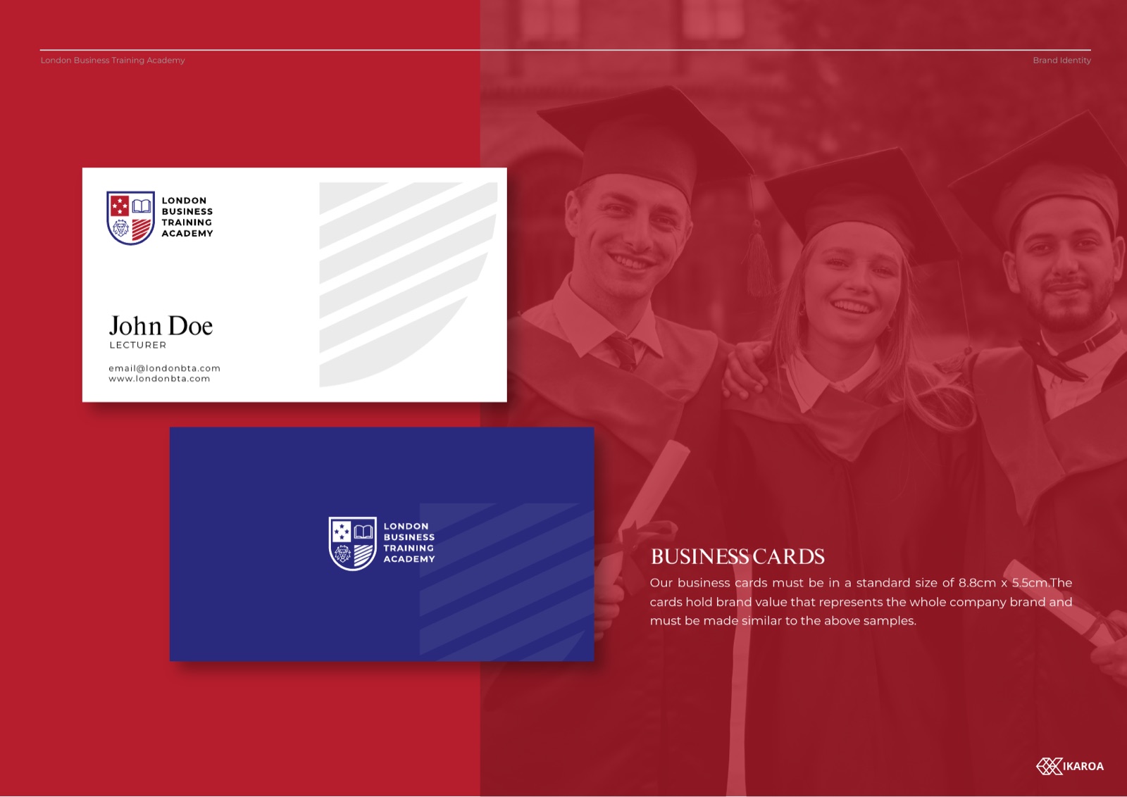
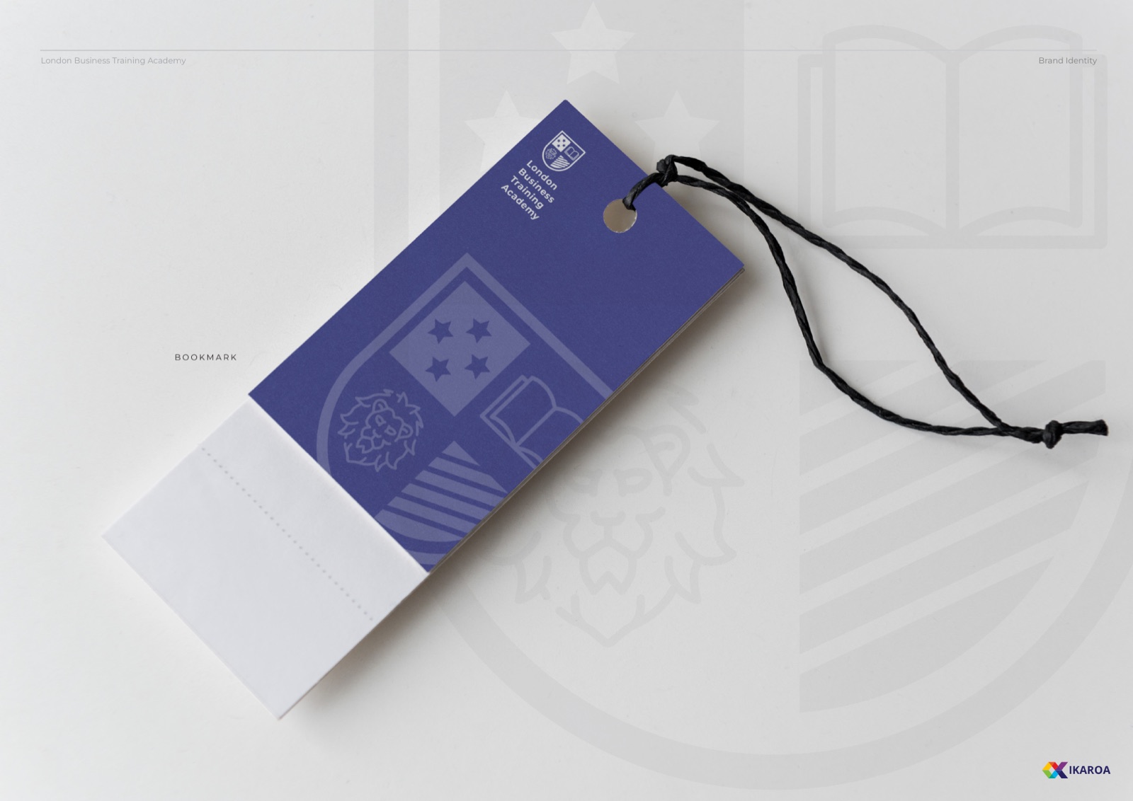
The collateral
Down to the pen and the lanyard
A credential is a promise, so the materials around it have to look the part. Every surface a student touches was drawn to the same rulebook, from the certificate they frame to the bottle they carry to class.
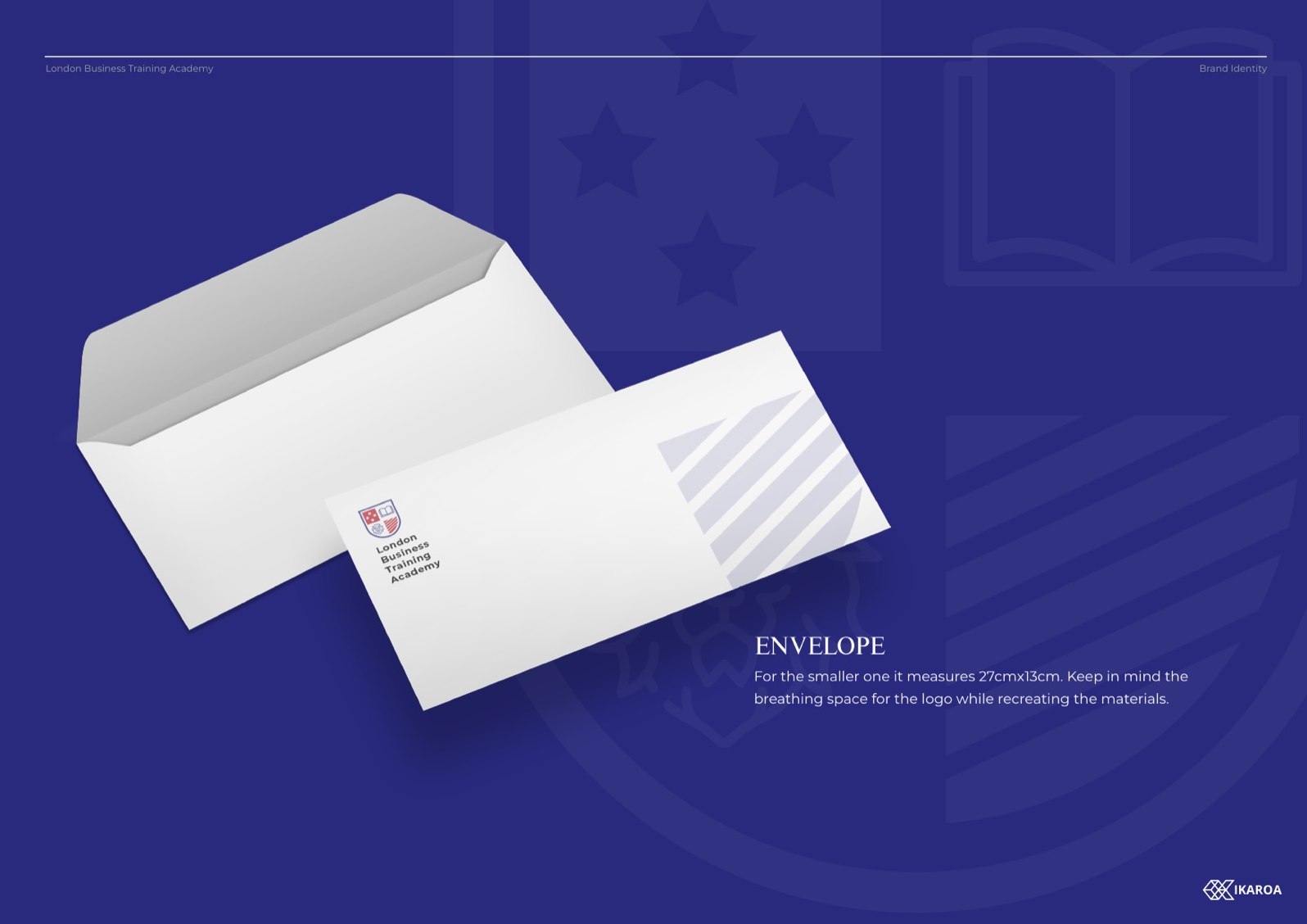
Letterhead and envelopes
The crest at the head of every letter, the wordmark on the flap. Stationery that reads as a real institution.
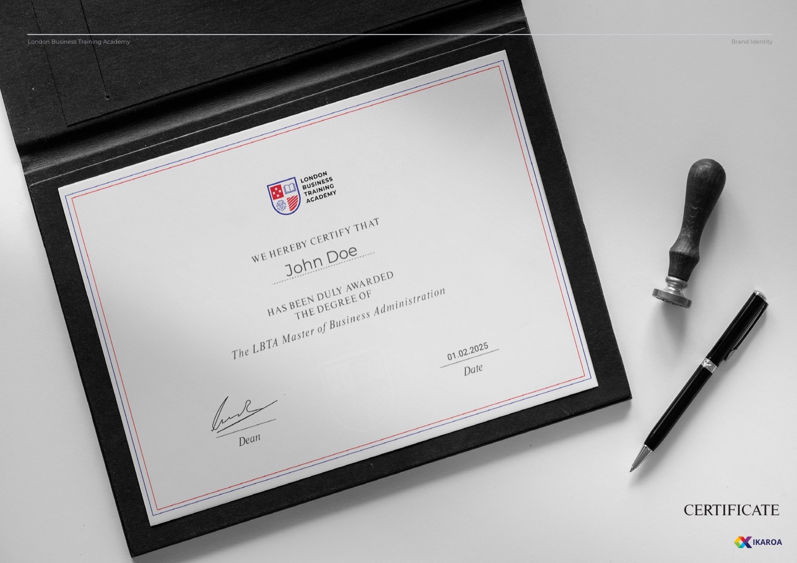
Course certificate
The document a student frames. Foiled crest, a signature line, the weight a credential is supposed to carry.
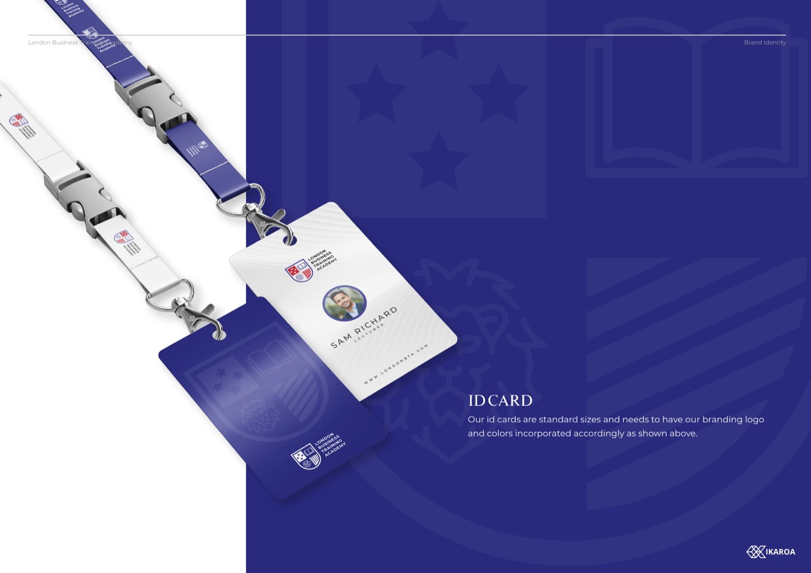
Staff ID and lanyard
Photo card on a branded lanyard. The crest small, the colour blocks doing the recognition work.

Campus backpack
Navy on red, the crest embroidered. The brand on something a student carries every day.
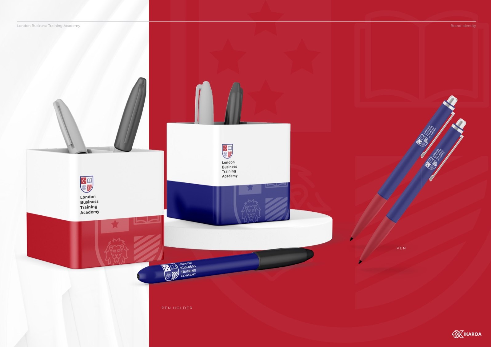
Pens and notebook
The everyday giveaways. Branded down to the barrel of the pen, packed in a crested box.

Water bottle and tags
Powder-navy bottle, a luggage tag for open days. Small surfaces, same rulebook.
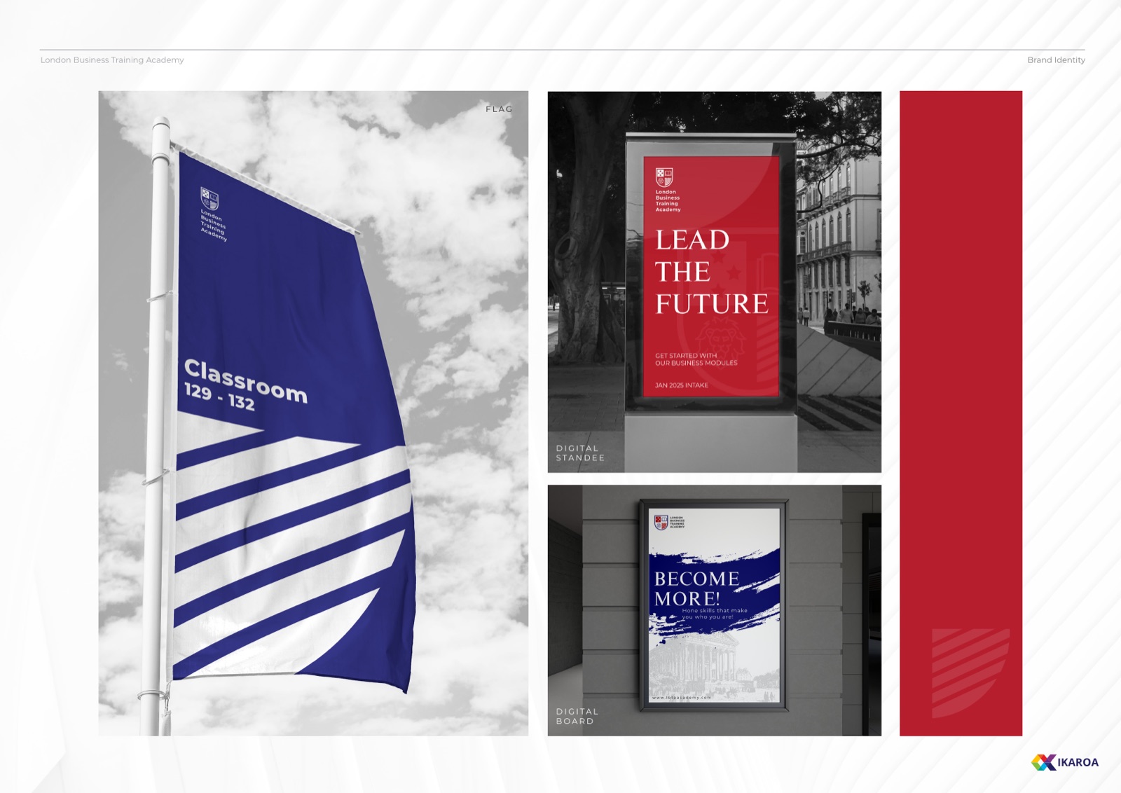
Pull-up banners and posters
Lead the Future, front of house. Tall formats for open days and recruitment fairs.
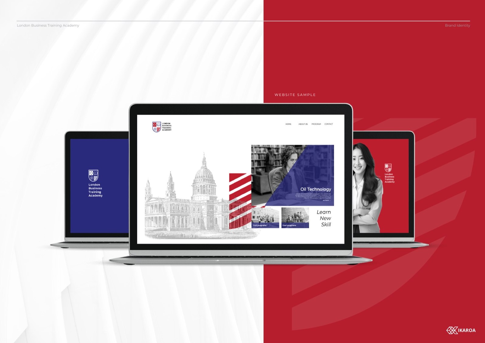
Web and email signature
The system carried onto the screen. A campus skyline, the crest, a signature block that matches the print.
Rolled out across
How we approached it
Four calls that shaped the system
Authority you can read across a room
Education is a trust purchase. People hand over money and time on the promise of a credential, so the brand has to look established before it looks modern. The crest carries that weight on its own. It signals heritage and seriousness before anyone reads a word.
One academy, many campuses
LBTA sits inside the BMC group, which runs professional training across several cities. The system was built to scale. A crest and a rulebook tight enough that a campus in one country reads as the same institution as a campus in another.
Modern where it counts
A traditional crest can tip into stuffy fast. Montserrat keeps the everyday materials clean and current, so the brand reads as a working academy, not a museum piece. The Times serif is used sparingly, for gravity, never for nostalgia.
Built to be applied, not interpreted
A network this size cannot have every campus reinventing the brand. The guidelines are prescriptive on purpose. Named colours, fixed type, clear prohibited uses, so consistency survives across teams and borders.
Part of the BMC group
Built to sit inside a global education network
London Business Training Academy is part of BMC, a professional education group that delivers courses across several cities. That parentage shaped the work. The identity had to feel like its own academy while still belonging to something larger.
So we built for a network, not a one-off. A crest and a rulebook tight enough to travel, flexible enough to front a campus anywhere the group operates, consistent enough that a student in one city recognises the same institution in another.
Need a brand that earns trust on sight?
Education, professional services, anything where credibility closes the sale. We build identities that look established from day one and scale across a network.