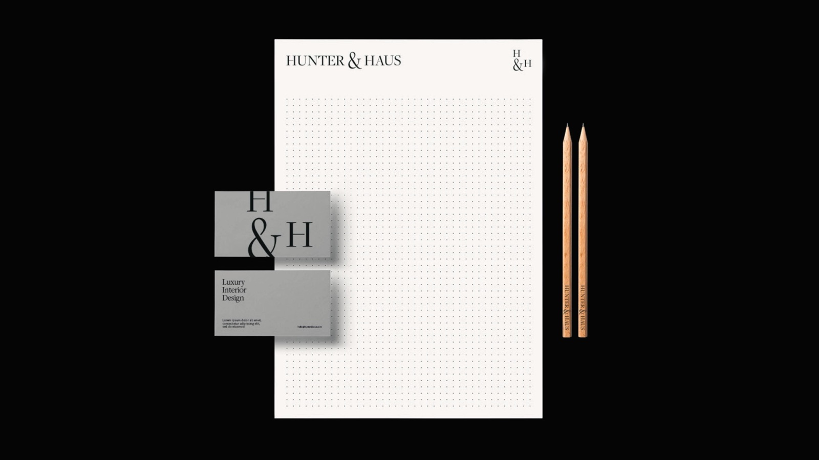
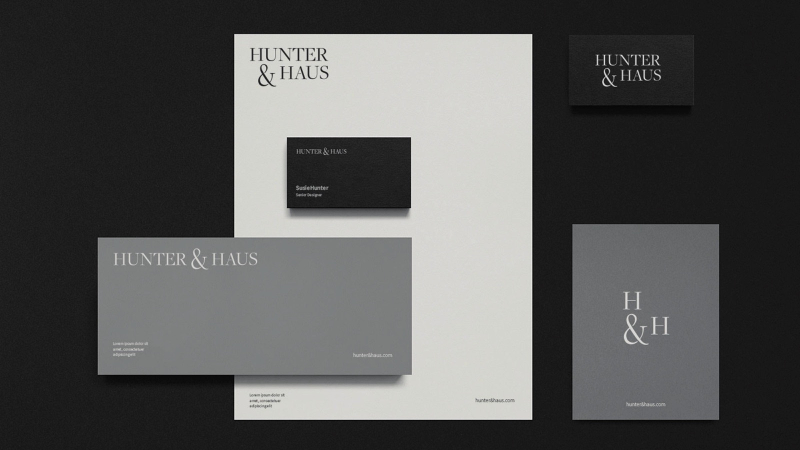
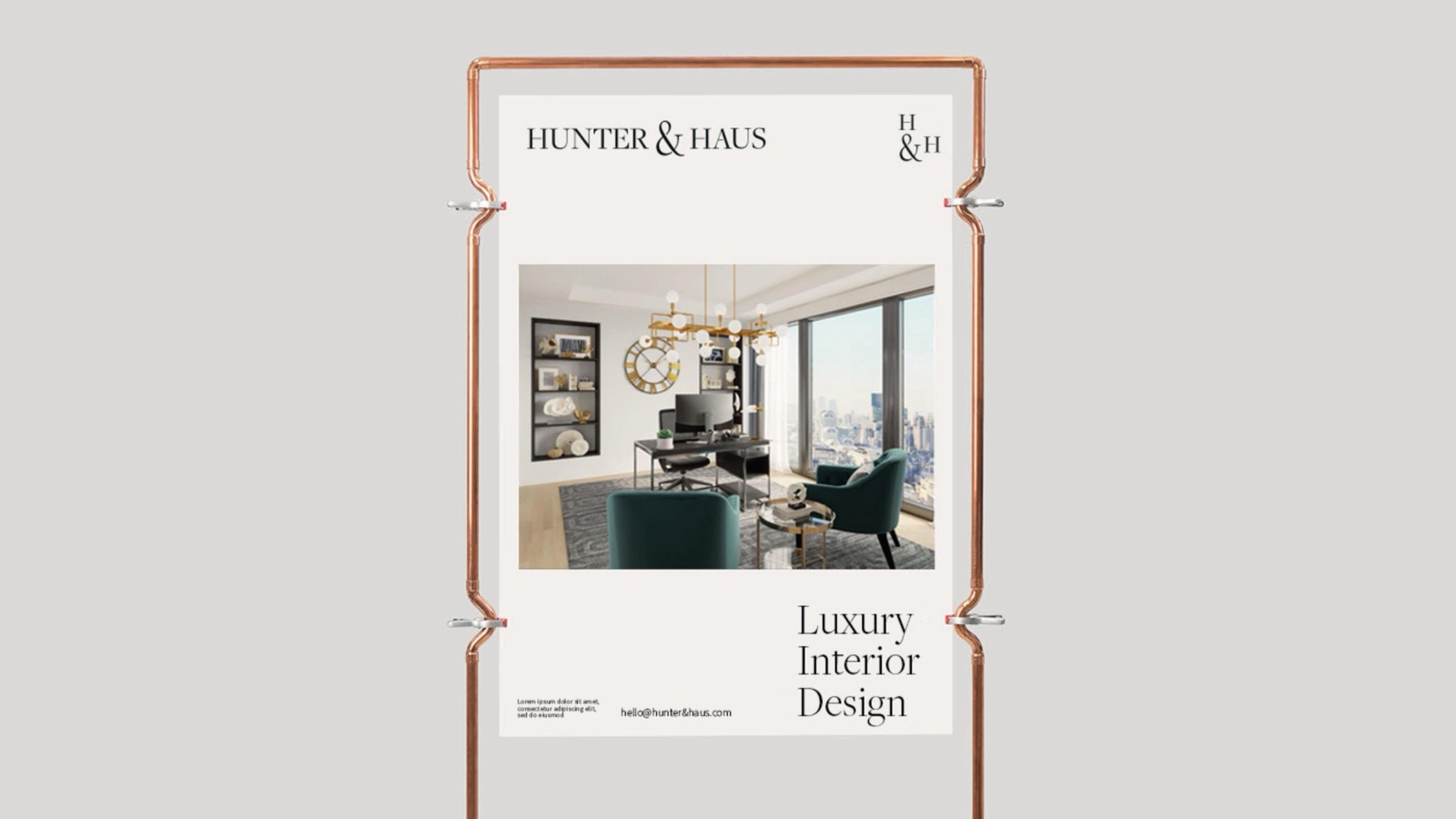
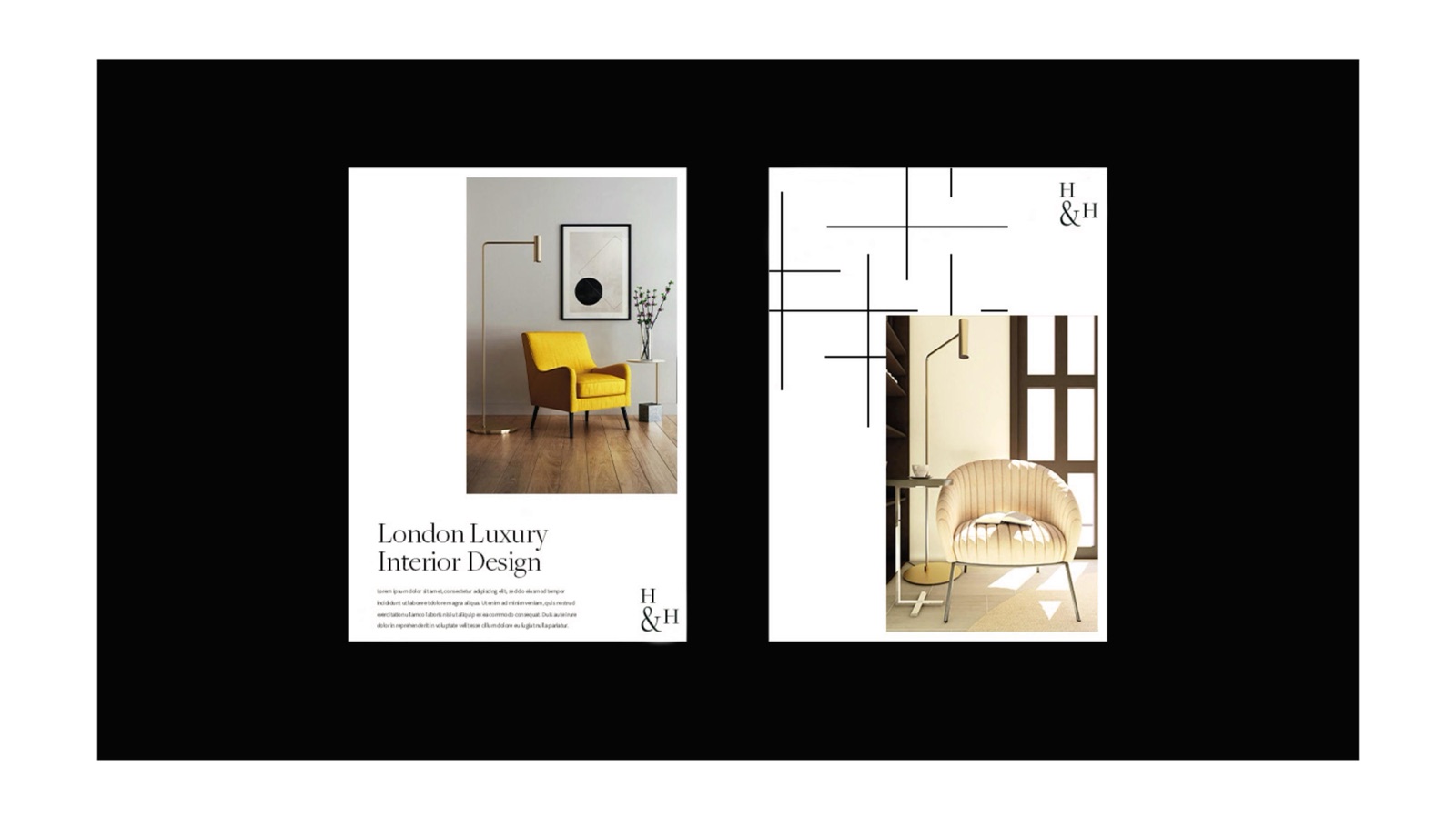
Hunter & Haus is a luxury interior design studio. We gave it a serif wordmark, an H&H monogram and a warm neutral palette, then carried the whole thing across stationery, brochures, signage, packaging and a mobile app. The brand stays quiet so the rooms can speak.
The wordmark, set wide and calm
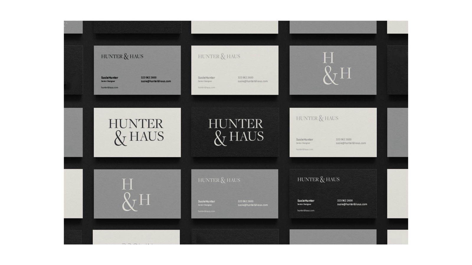
H&H
One monogram
Freight
Display serif
Source Sans
For the body
05
Neutral tones
Wordmark, monogram, type

Palette
On paper
Off paper
How we approached it
01
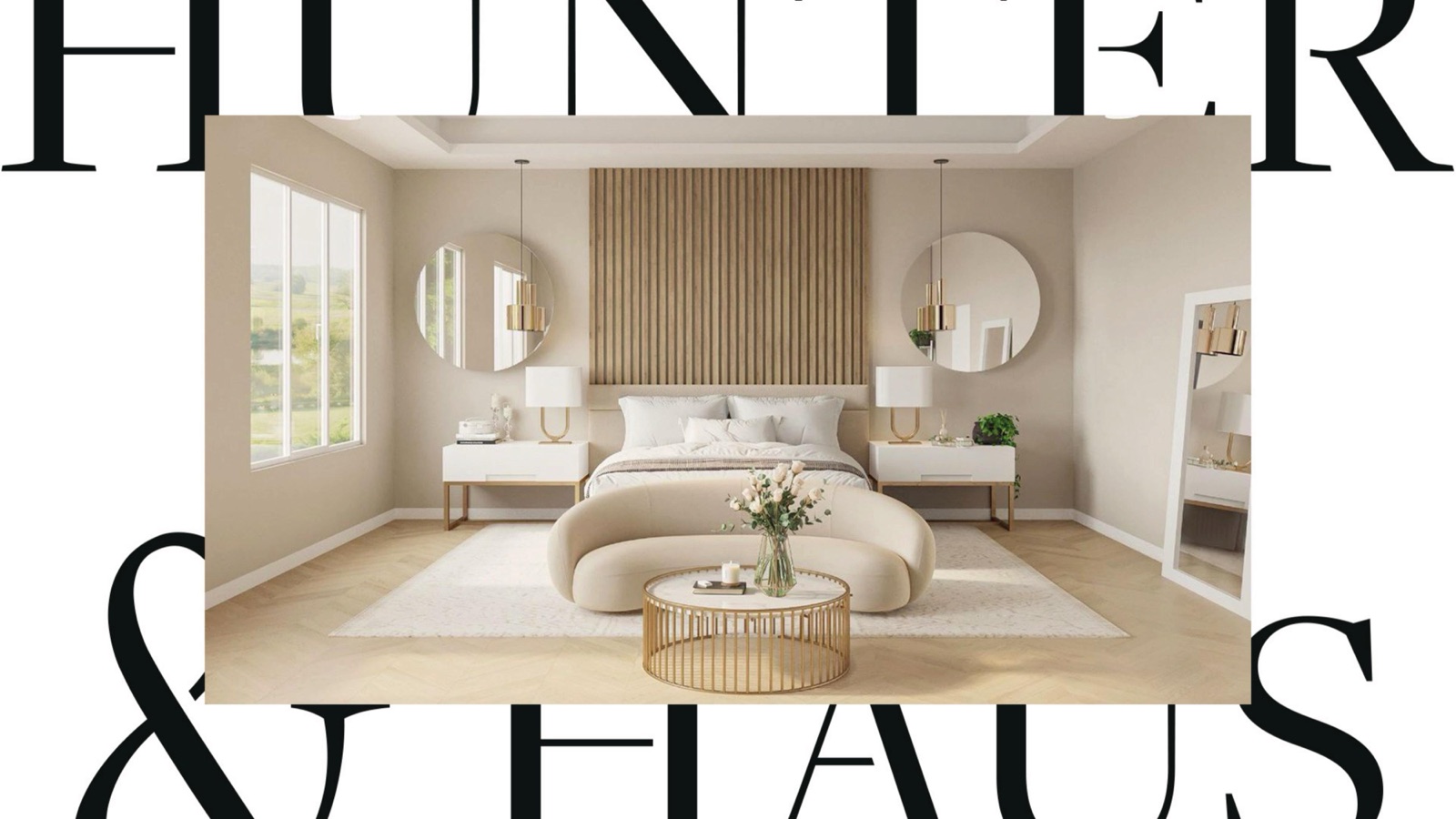
The serif does the talking
Interior clients buy taste before they buy a floor plan. A Freight Display wordmark, set wide and calm, signals an editorial sensibility on the first glance. The studio sounds expensive before anyone reads a word.
02
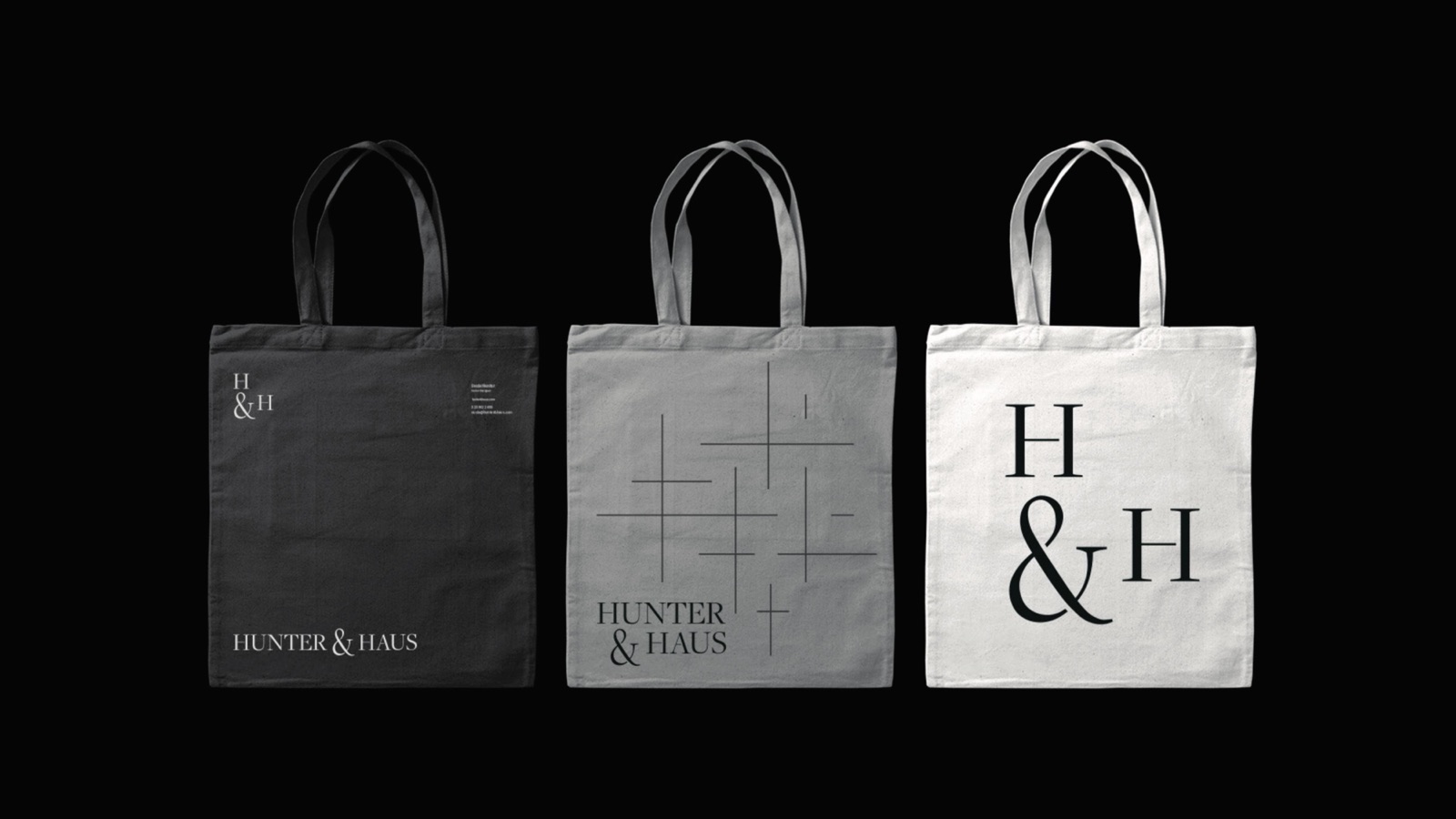
A monogram for the small spaces
The full name needs room to breathe. The H&H monogram exists for everything the wordmark cannot fit: a business-card corner, an app icon, an embossed folder, a label sewn into a tote. One mark, two scales.
03
Neutral, never bland
Ink, charcoal, a warm taupe and a soft cream. The palette stays out of the way so the rooms in the photography carry the colour. A studio that designs interiors should not fight its own work for attention.
04
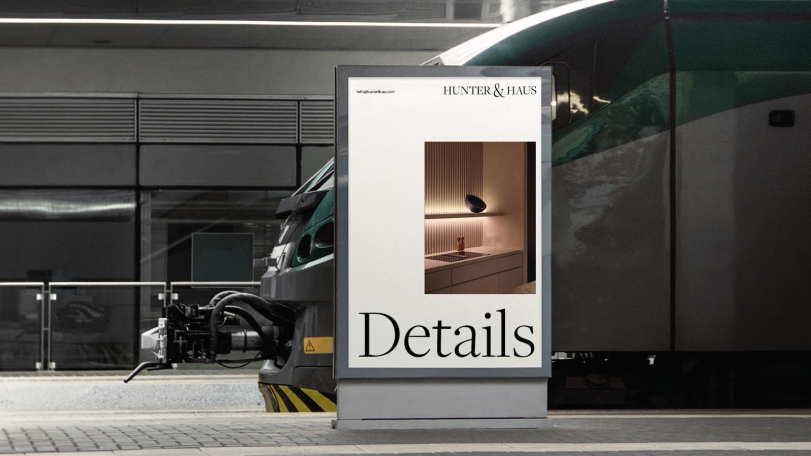
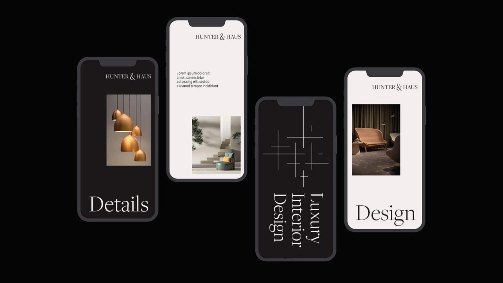
Built to live on paper and screen
The system was drawn to hold up in print, where a luxury studio still lives, and on a phone, where new clients now find one. Letterhead and a mobile app from the same set of rules.
Opening a studio that lives on taste?
Interiors, architecture, hospitality, anything where the brand has to read as considered before the first meeting.