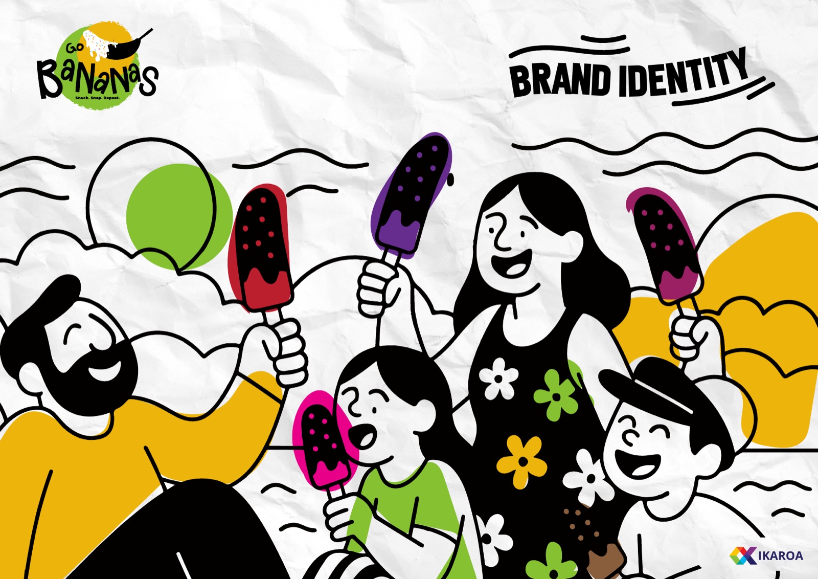
Go Bananas
A loud, hand-drawn identity for a Dubai kiosk selling chocolate-dipped frozen bananas. One idea runs all of it: a snack you photograph before you eat it.
1
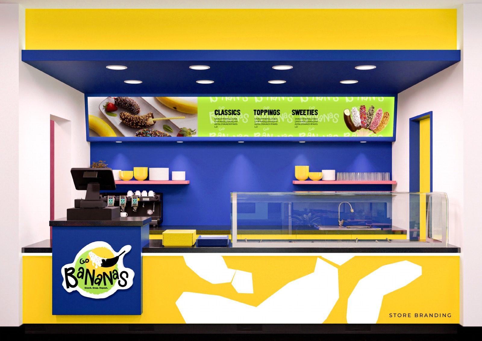
Kiosk, built to be photographed
3
Words that run the brand
4
Colours, no more needed
34
Pages in the brand book
A simple snack that needed to be impossible to scroll past
Go Bananas sells one thing brilliantly: frozen bananas dipped in chocolate and rolled in whatever you want. It is cheap, it is fun, and in a city full of dessert concepts fighting for the same Instagram feed, it needed a brand that could shout.
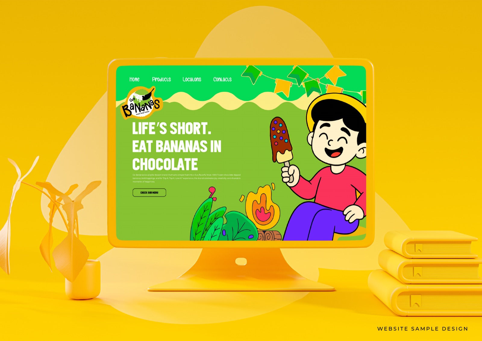
The brief was not subtle. Make it look like more fun than the kiosk next door. Make it work on a phone screen first. And give a small team a kit they can actually run on their own, every day, without calling an agency for a single post.
Drawn by hand, on purpose
A wonky wordmark in a paint-splat circle, with a banana and a spoon. There are rules underneath the chaos, so it stays recognisable wherever it lands.
Four colours, turned up to full
Banana Green
#87C231
Golden Yellow
#EEB50B
Ink Black
#000000
Paper White
#FFFFFF
A brand built to be posted
A hand-lettered logo
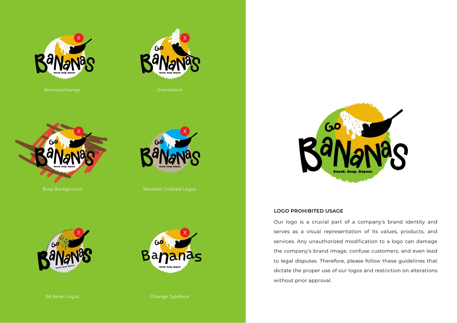
The wordmark is drawn, not typed. Wonky, friendly letters sitting in a paint-splat circle with a banana and a spoon. It looks like the product tastes: messy, fun, and impossible to take too seriously.
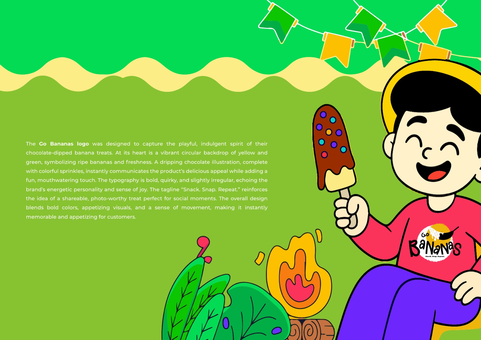
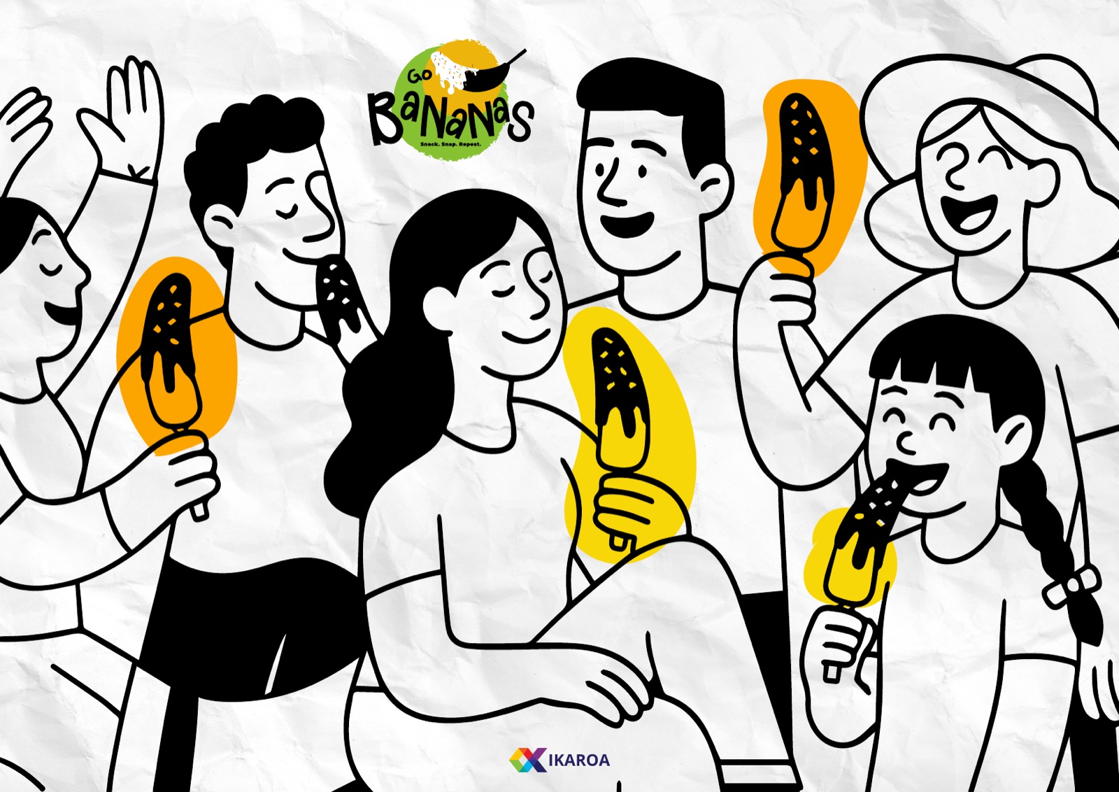
An illustrated world
A cast of black-line characters, flowers and frozen treats that can stretch across a wall, a cup, a sticker or a story. It gives the kiosk far more to play with than a logo alone, which matters when you post every day.
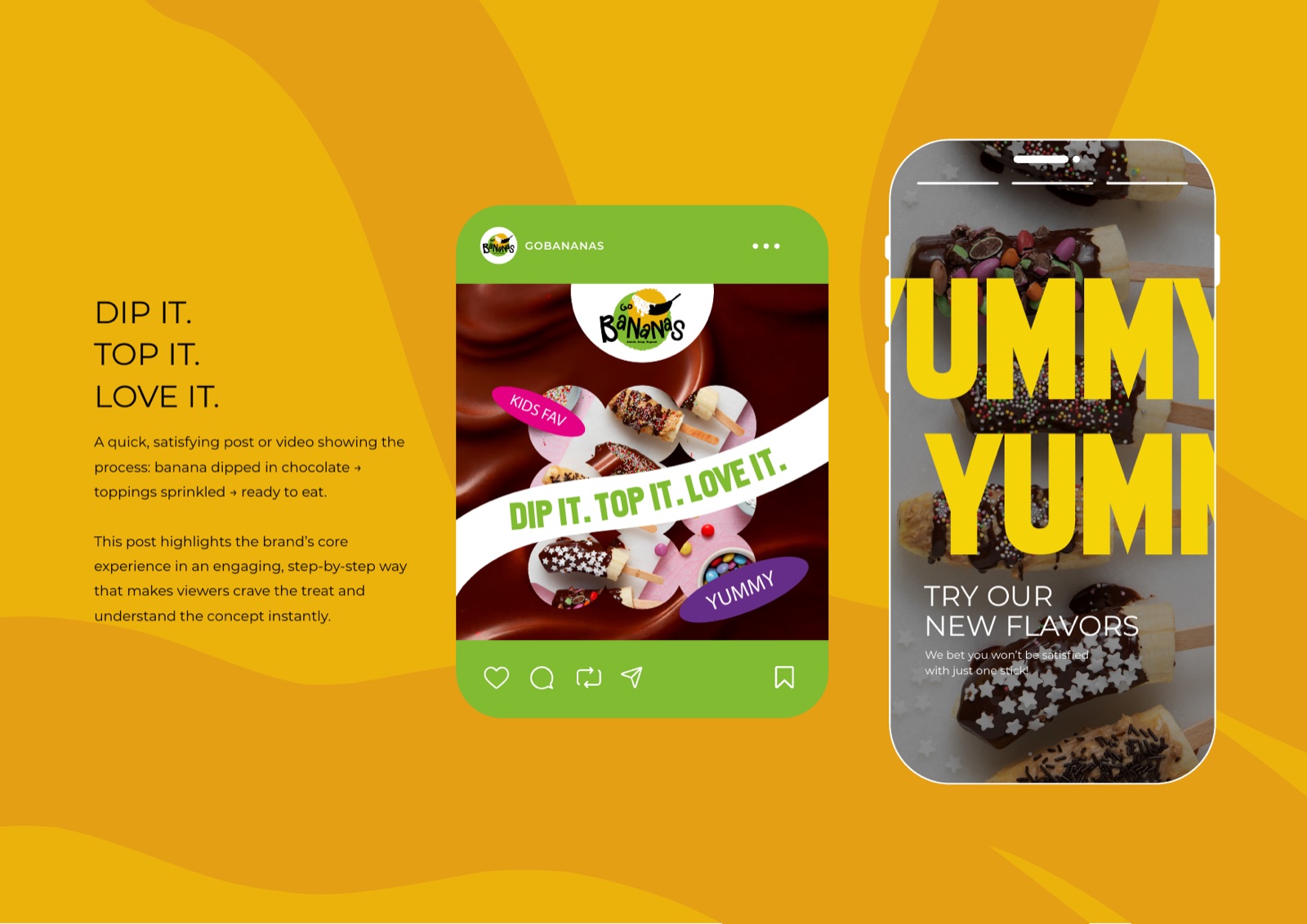
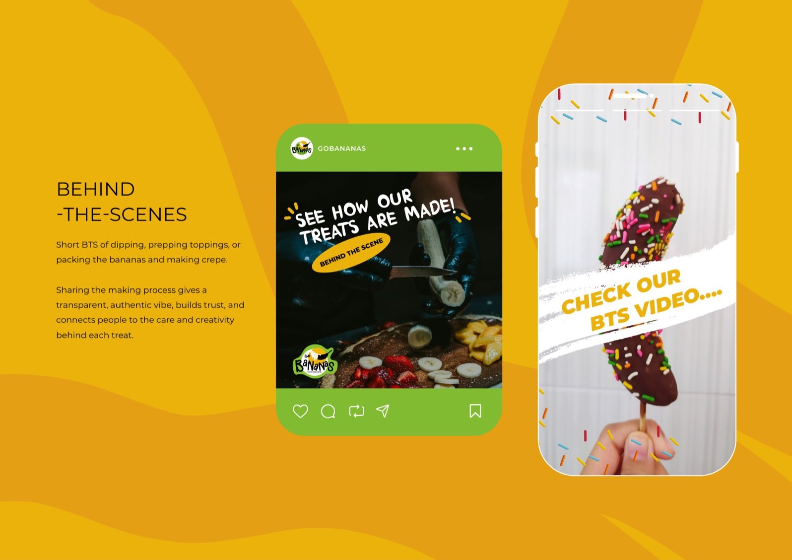
A social-first system
Built for the phone before the shopfront. Post templates, story layouts, sticker packs and a content rhythm around Snack. Snap. Repeat., so the brand is as strong in a feed as it is on the street.

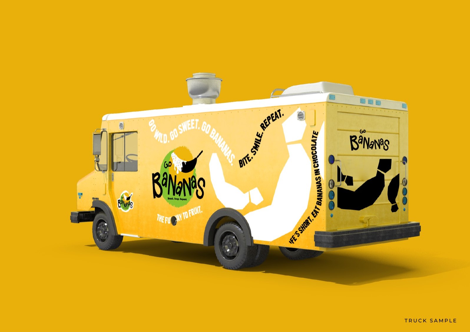
Where the brand actually lands
A kiosk you can read from across the food court, a truck that doubles as a billboard, and packaging built to end up in someone’s hand on camera.
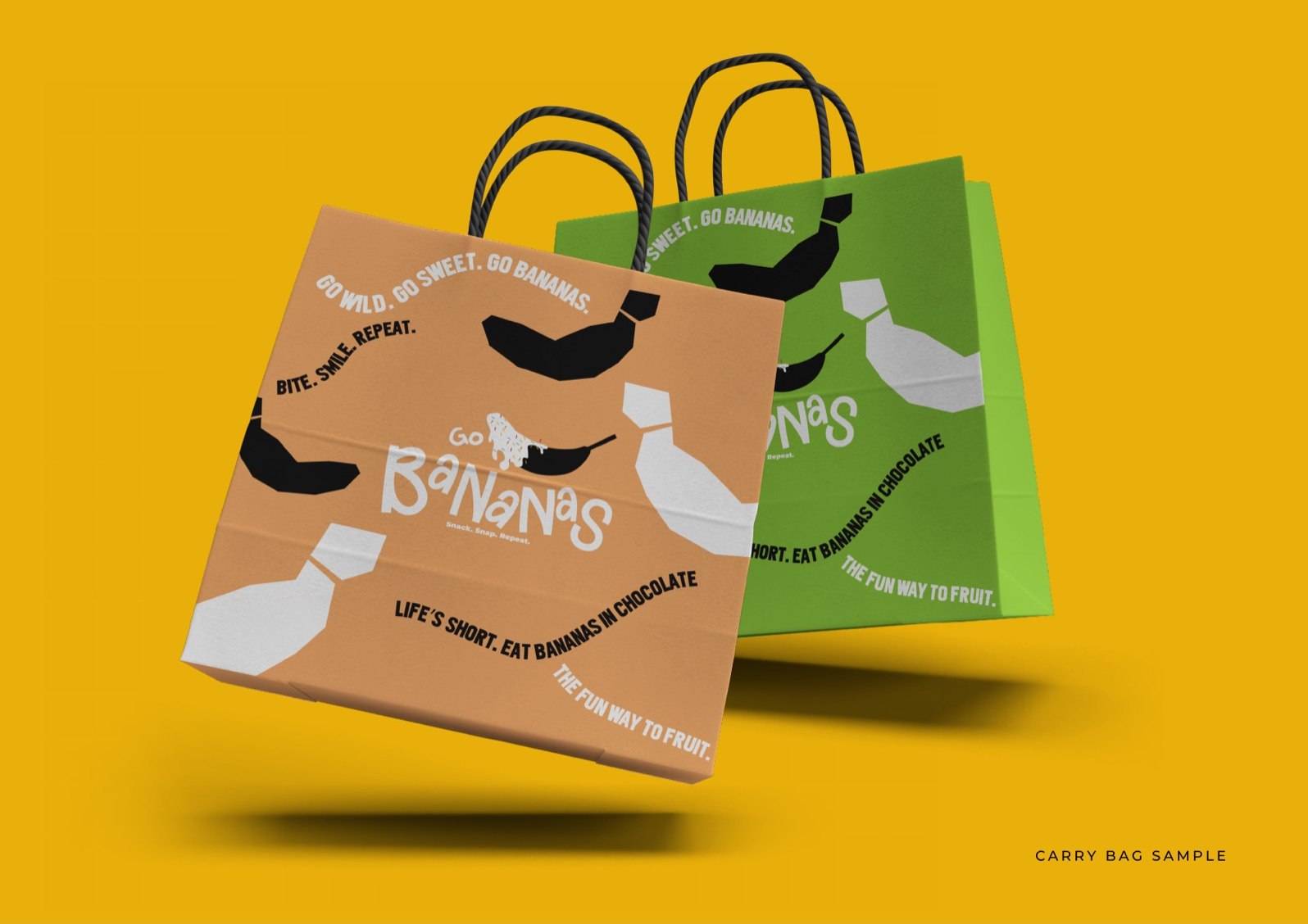

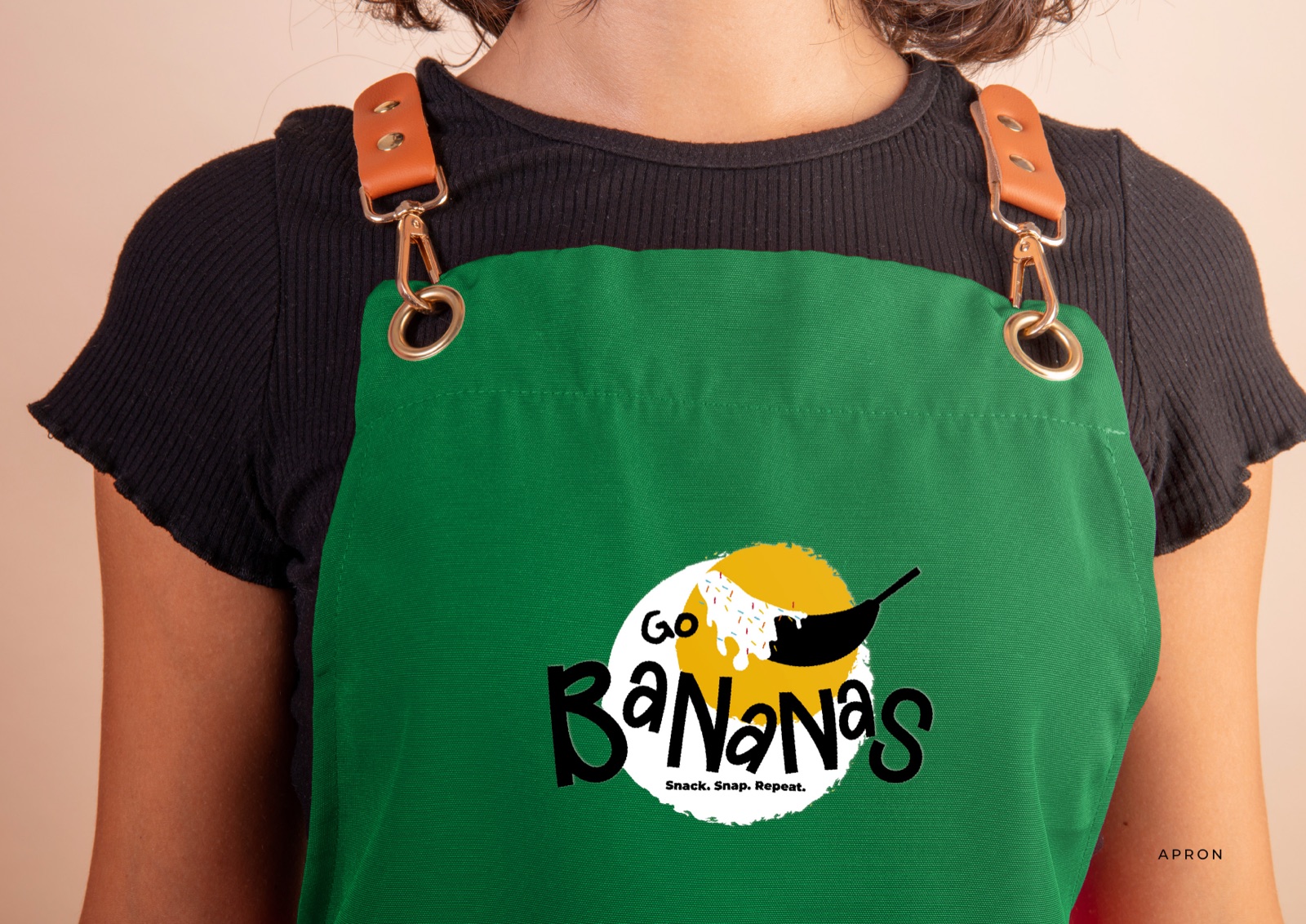
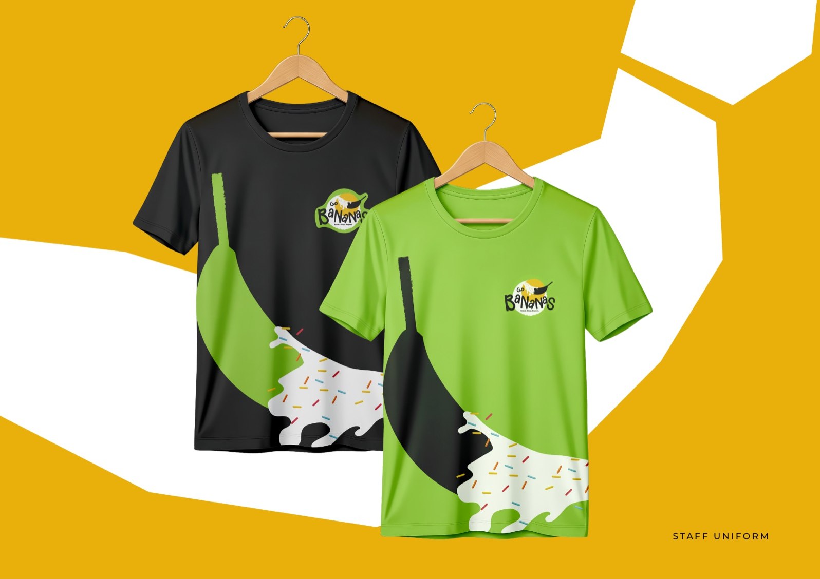
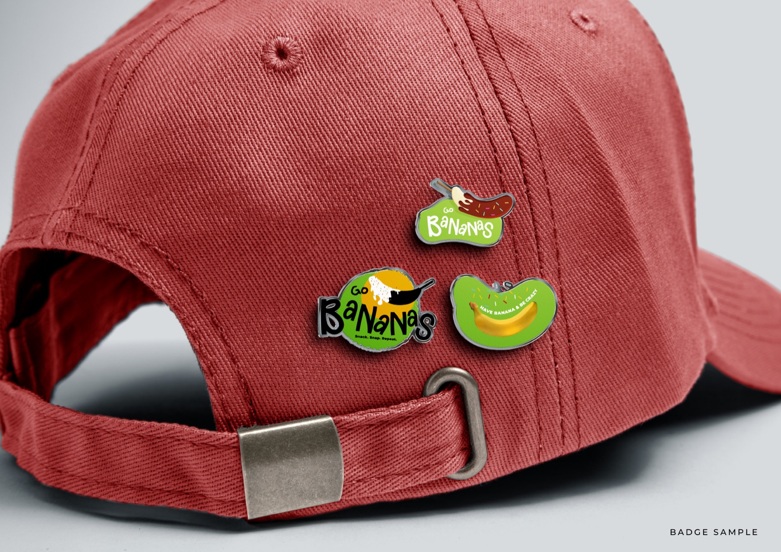
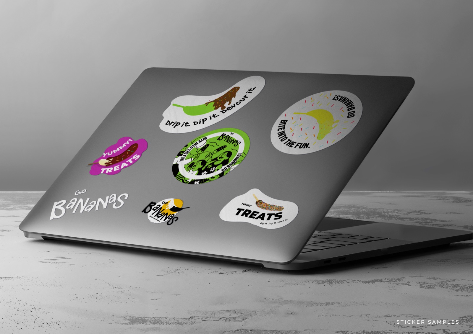
Stuff the team wears, stuff fans stick
The kit reaches past the counter. Aprons and tees for the crew, caps and stickers for everyone else, and a cast of characters that holds the whole thing together.
From the kiosk to the camera roll
Four calls that shaped the whole thing
Built for the photo, not the brochure
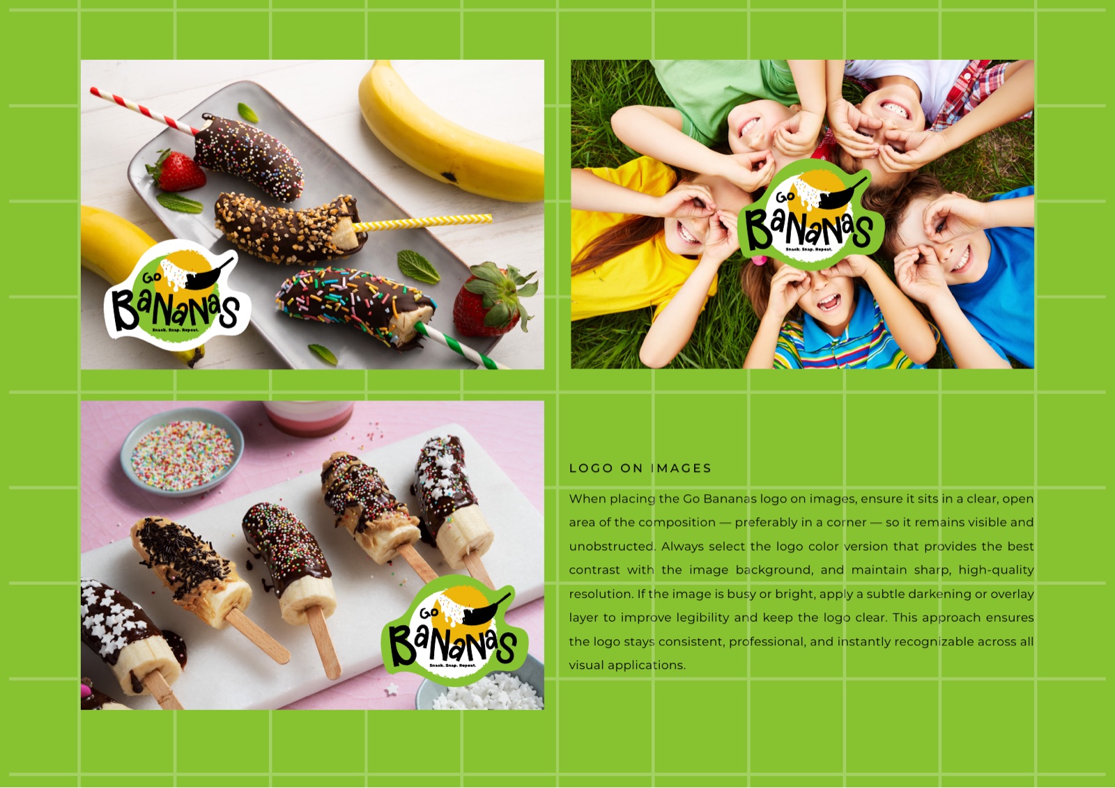
Frozen bananas live or die on how they look in a story. Every brand decision, the colour, the splat, the characters, was made to frame the product and make someone want to post it. The kiosk is the set, the phone is the channel.
Loud on purpose
In a Dubai food court full of polished, samey logos, the fastest way to stand out is to look hand-made and a bit unhinged. The acid green and the wobbly lettering are a deliberate refusal to look corporate.
Three words do the heavy lifting
Snack. Snap. Repeat. is the whole strategy in three beats. Eat it, photograph it, come back. Every template and caption is built to push someone through that loop, not just to look pretty.
A kit a small team can run alone
No agency on retainer to make a Tuesday post. The illustrated assets, templates and rules are simple enough that one person at the kiosk can keep the brand consistent and keep posting.
Got a concept that should be loud?
Food, retail, anything that lives on social. We build identities made to be photographed and shared, not filed in a brand book.