FIT.LIVE
A community of instructors and members streaming live classes across seven disciplines. We gave it a black, white and red identity that flexes into seven colours, from the app icon to the shopfront.
What FIT.LIVE is
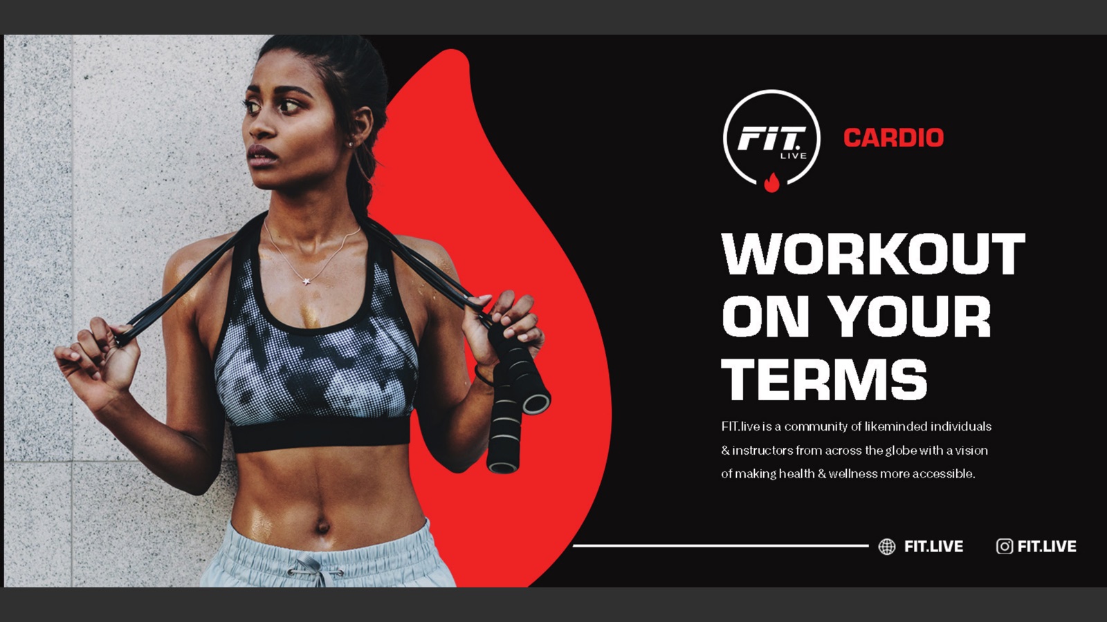
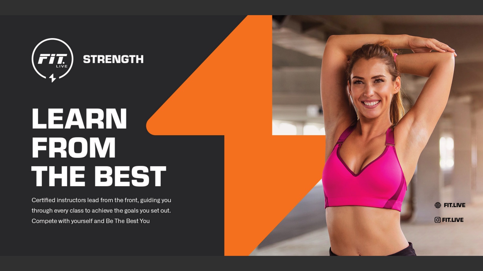
Workout on your terms. Learn from the best.
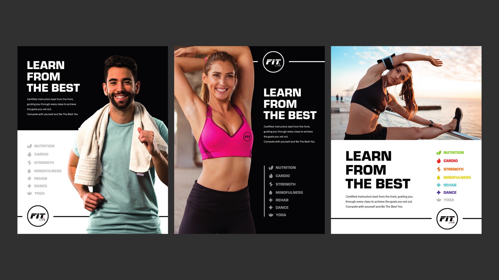
FIT.LIVE is a platform for live and on-demand classes, run by certified instructors who lead from the front. Members pick a discipline, join a class, and train wherever they are. The promise printed across the brand is plain: be the best you.
That meant an identity that could carry a class library, not just a poster. The mark had to work as a tiny app badge and as a wall of icons on a city storefront, and hold its nerve in both places.
07
Disciplines, one system
01
Mark, ring lockup
Live
Classes, on demand
B/W/R
Core palette
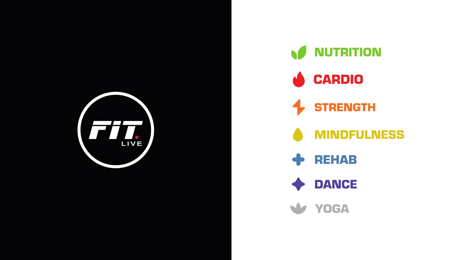
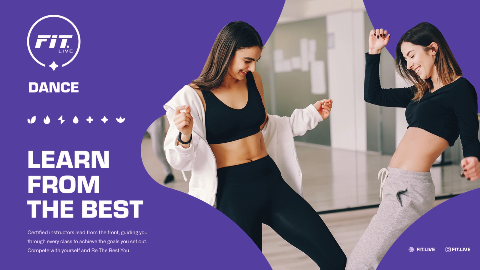
Seven disciplines.
Seven identities.
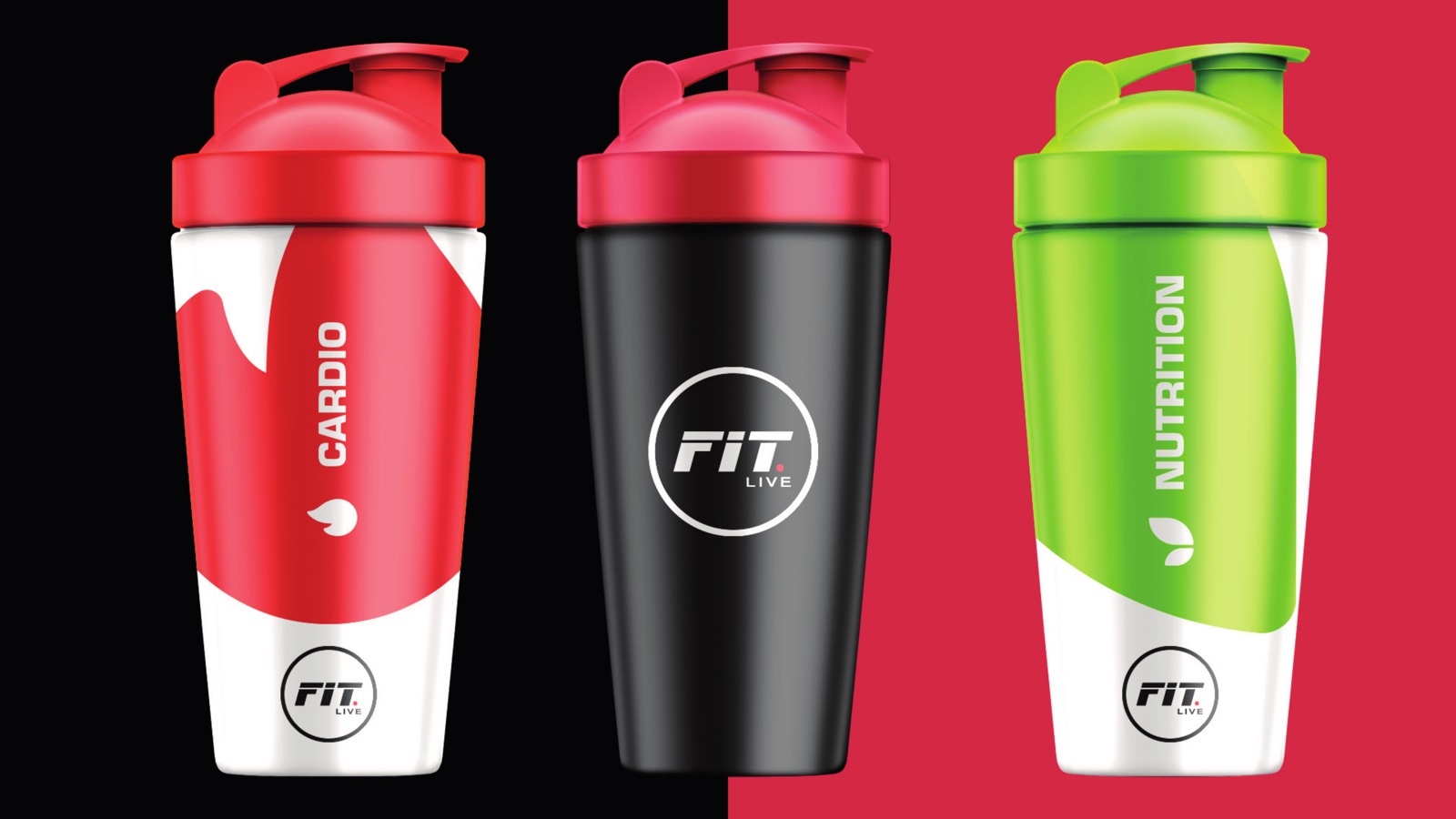
Each discipline gets its own colour and symbol. The class, the shaker, the social tile and the wall all carry it, so a member always knows exactly what they are looking at.
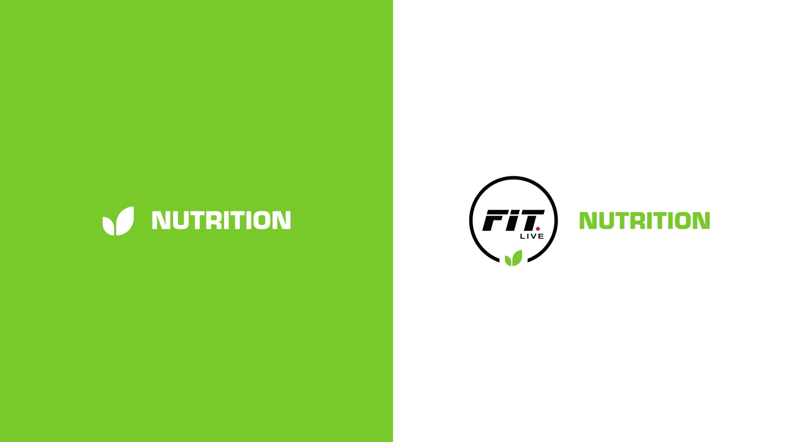
Nutrition
#78CA2A
Cardio
#ED2023
Strength
#F4701F
Mindfulness
#D9C716
Rehab
#4C7EB1
Dance
#553FA1
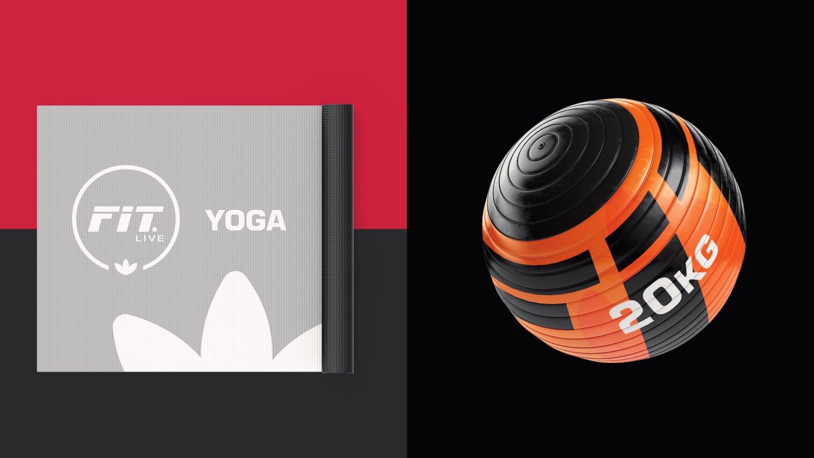
Yoga
#B0AFAD
Black and white hold the system together. The colour only ever signals the discipline.
What we built
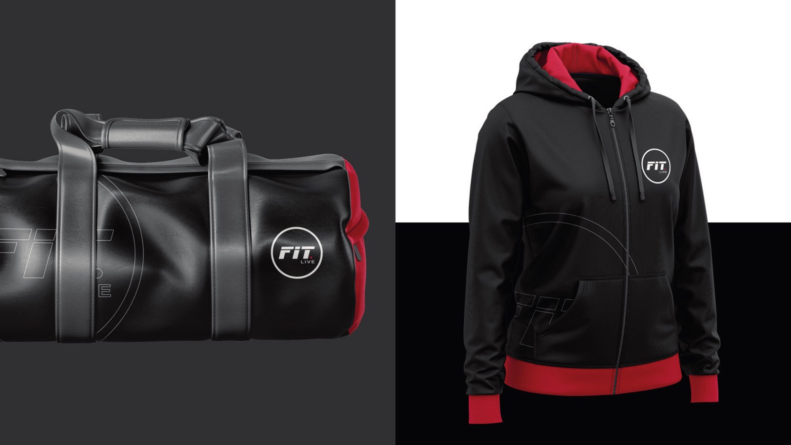
The mark
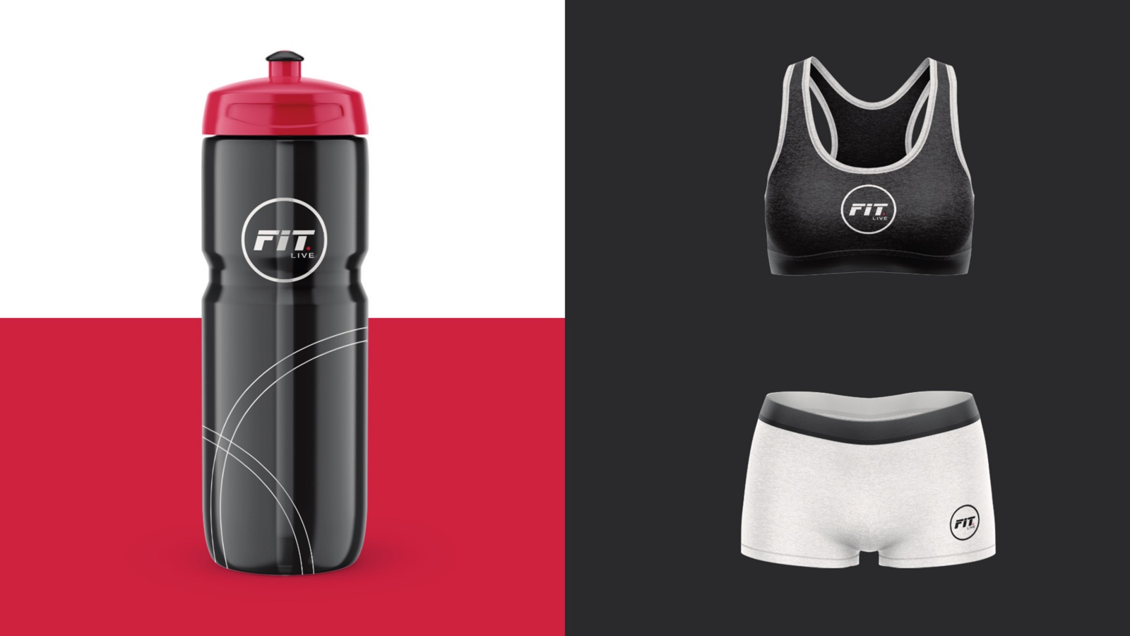
A FIT. wordmark with a red full stop and LIVE set under it, locked inside a clean ring. It reads at the size of an app icon and at the size of a shopfront.
Discipline colour system
Seven activities, seven colours, seven icons. Nutrition green, Cardio red, Strength orange, Mindfulness yellow, Rehab blue, Dance purple, Yoga grey. Every class inherits its colour.
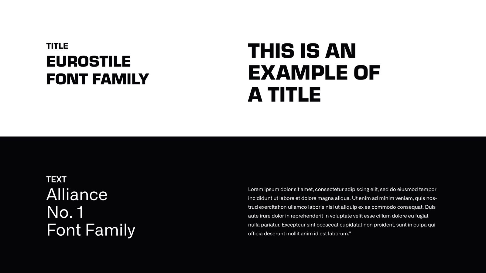
Typography
Eurostile carries the headlines, wide and athletic. Alliance No.1 handles body copy, so longer reads stay calm under the loud titles.
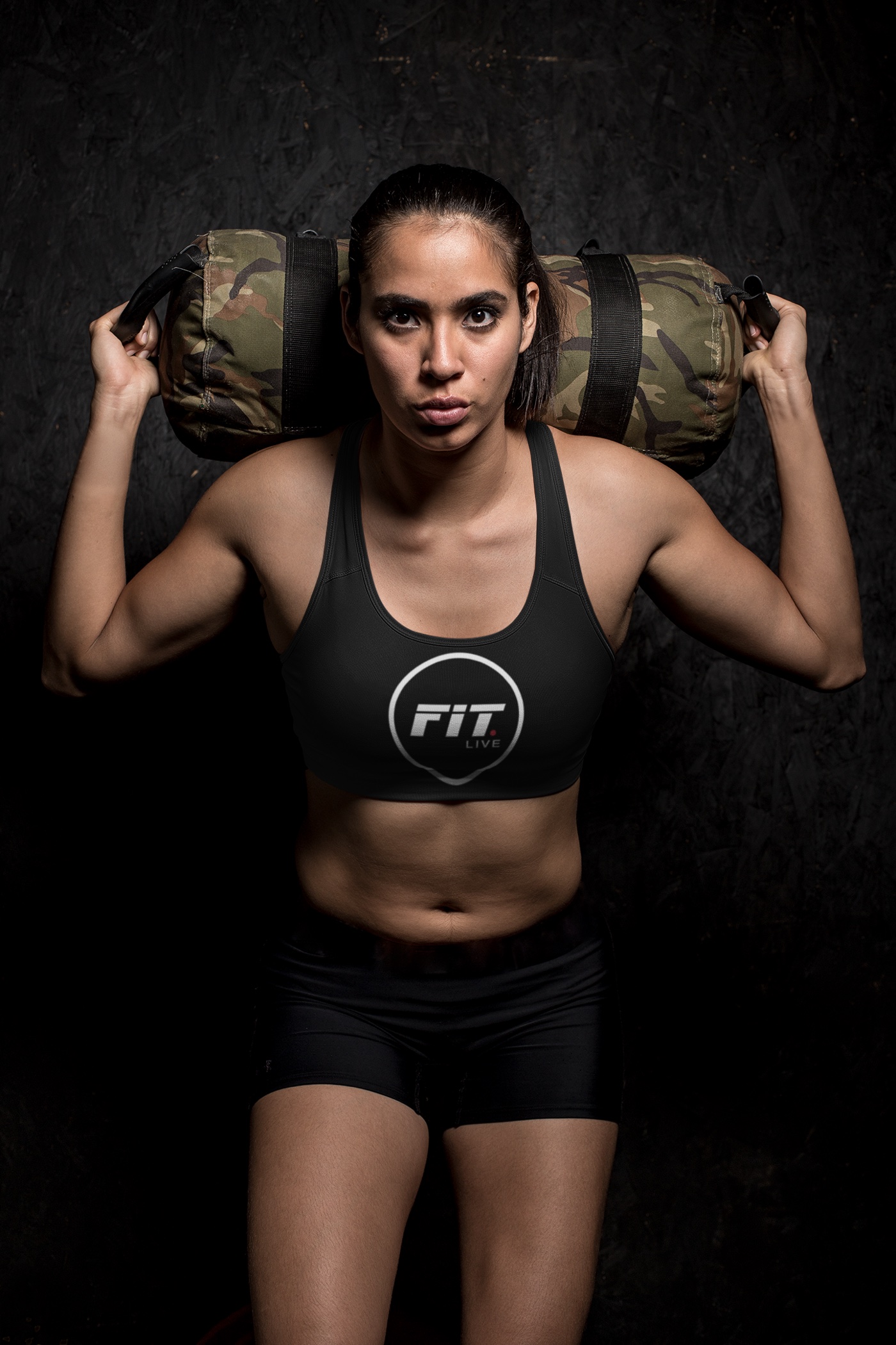
Apparel and kit
Sports bras, shorts, hoodies, kit bags, bottles, shakers, bands and weights, all carrying the ring mark and, where it helps, the discipline colour.
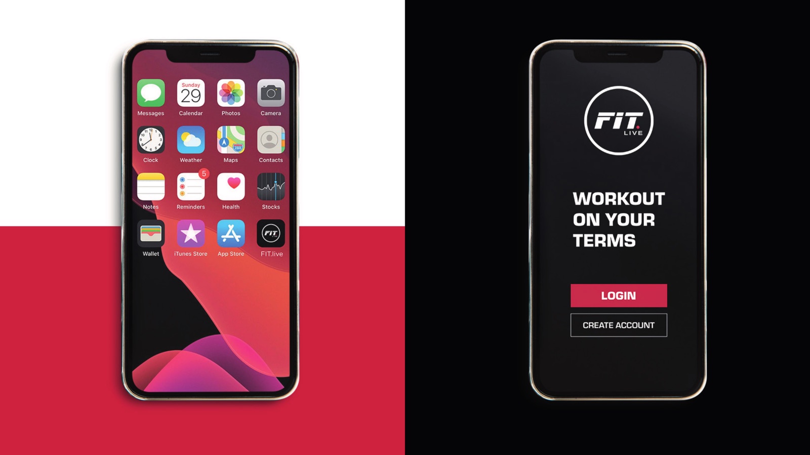
The app
A dark login built around two lines members already know: Workout On Your Terms and Learn From The Best. The class library sits behind it.
Social and storefront
A poster template that flexes across all seven colours, plus shopfront graphics that line the icons up in a row so the whole offer reads in one glance.
The system,
head to toe
// mark to storefront
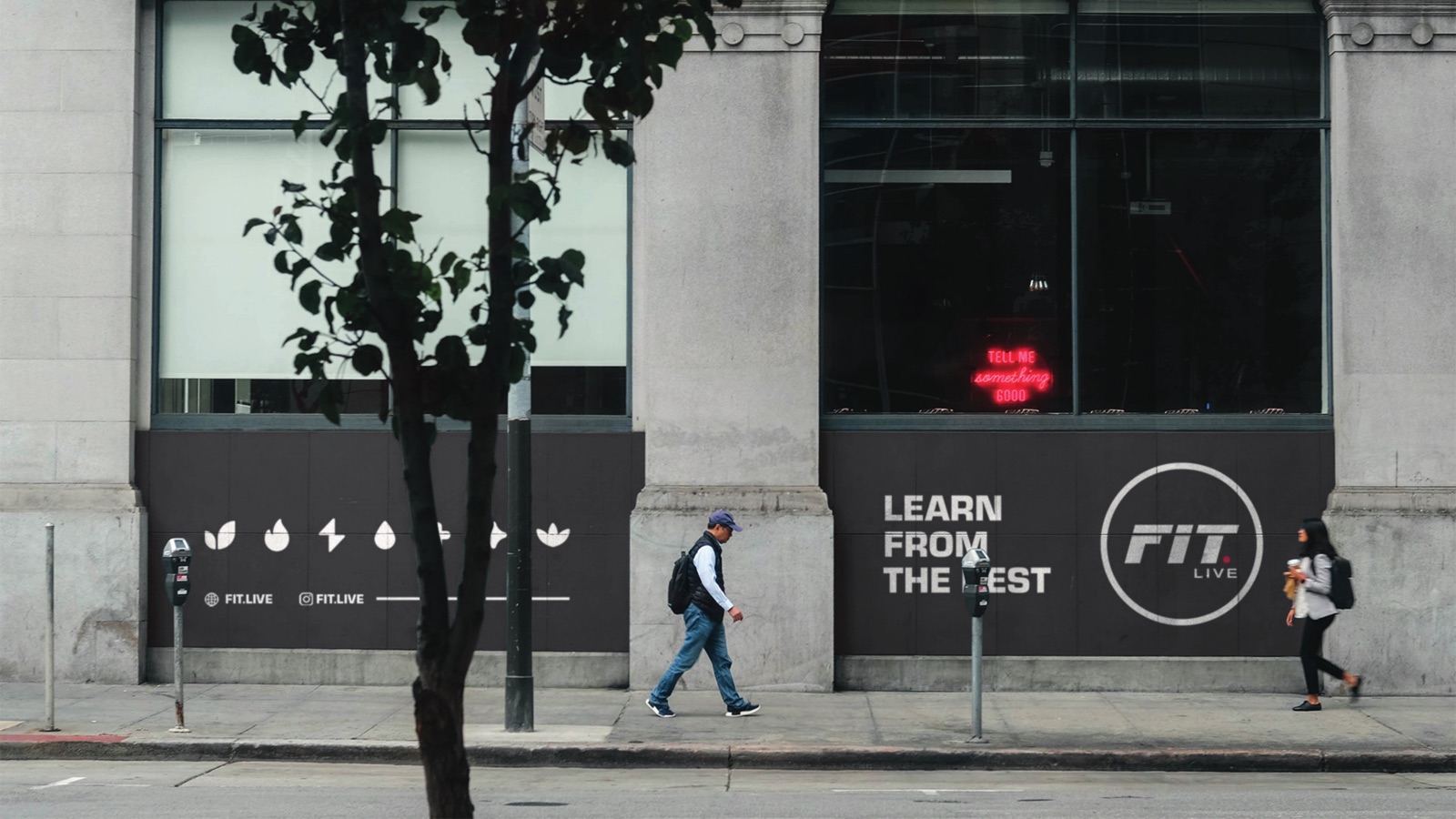
On the street the icons line up in a row and the ring mark anchors the corner. A member walking past reads the full offer, all seven disciplines, before they read a single word.
The line that runs through it
Workout on your terms.
Learn from the best.
Those two lines do the positioning work, so the visuals are free to be loud. One promise is about freedom, train where and when you want. The other is about trust, real instructors leading every class. The brand sits in the space between them.
How we
approached it
One brand, seven moods
A fitness platform is rarely one thing. Cardio and yoga want very different energy. The colour system lets each discipline feel like itself while the ring mark keeps the whole thing reading as FIT.LIVE.
Built to scale to a screen
Most of this brand lives in an app and a feed, not on a billboard. We tested the mark small first. If it survives an app icon and a 9:16 story, the shopfront looks after itself.
Photography does the heavy lifting
Black, white and red is a confident base, but it can go cold. Real people mid-class, shot warm, keep the brand human. The colour blocks frame them rather than replace them.
A community, not a logo
FIT.LIVE is instructors and members from across the globe with a plain goal: make health and wellness easier to reach. The identity had to feel open and earned, not like a luxury club gate.
Be the best you.
Got a brand
to build?
Studios, apps, platforms, clubs. We build identities that hold up from the app icon to the storefront.