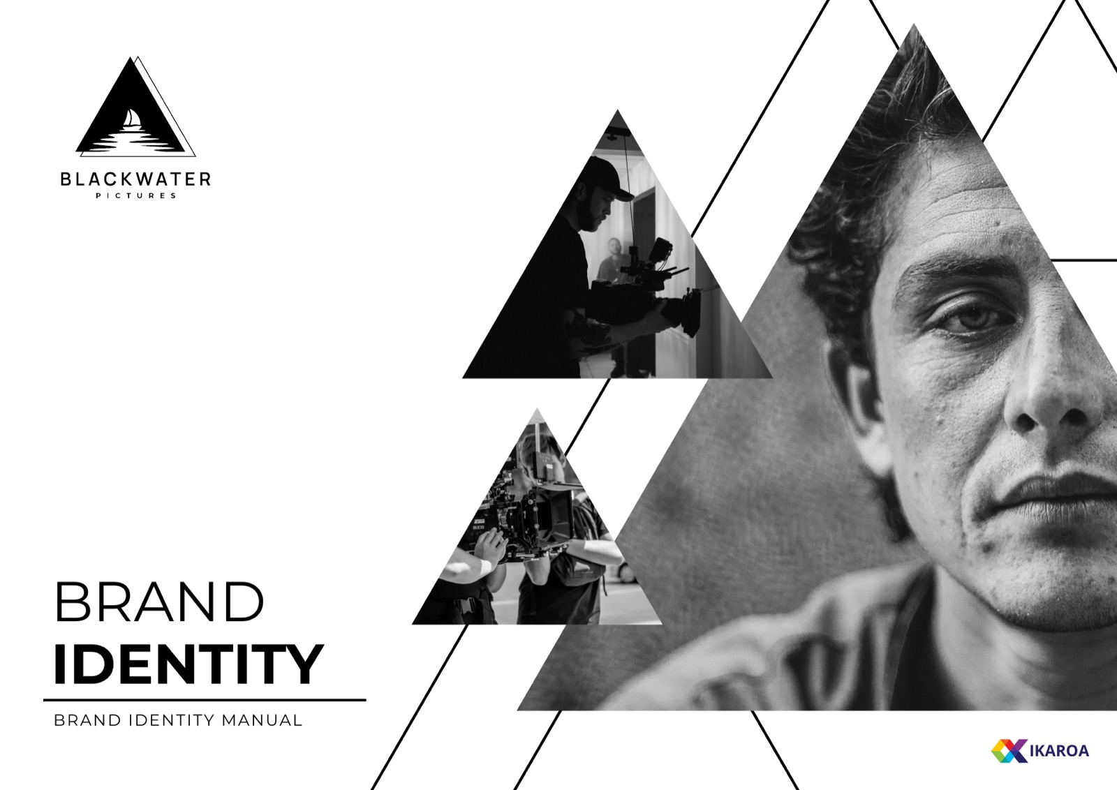
BLACKWATER
Pictures
A monochrome identity for the film production company founded by Antoine Dixon-Bellot and Kevin Harvey. One triangle, one body of still water, and a framing system that runs from the opening title all the way to the billboard.
DIR.
Antoine Dixon-Bellot
DIR.
Kevin Harvey
PROD.
Ikaroa
FORMAT
B / W, 2.39 : 1
The brief
A new studio that needed to look like it meant it
Antoine Dixon-Bellot and Kevin Harvey started BlackWater Pictures to make films with a certain weight to them. They came to us before the first festival run. That is the right moment to settle a brand, early enough that every poster, title card and crew shirt pulls the same direction from day one.
A production company brand has an unusual job. It cannot shout, because the films are the stars. It has to sit on a poster next to wildly different artwork, film after film, and still read as the same studio every single time.
So we built something quiet and structural. A single shape. A strict monochrome palette. A framing system that does the recognising, so the logo never has to.
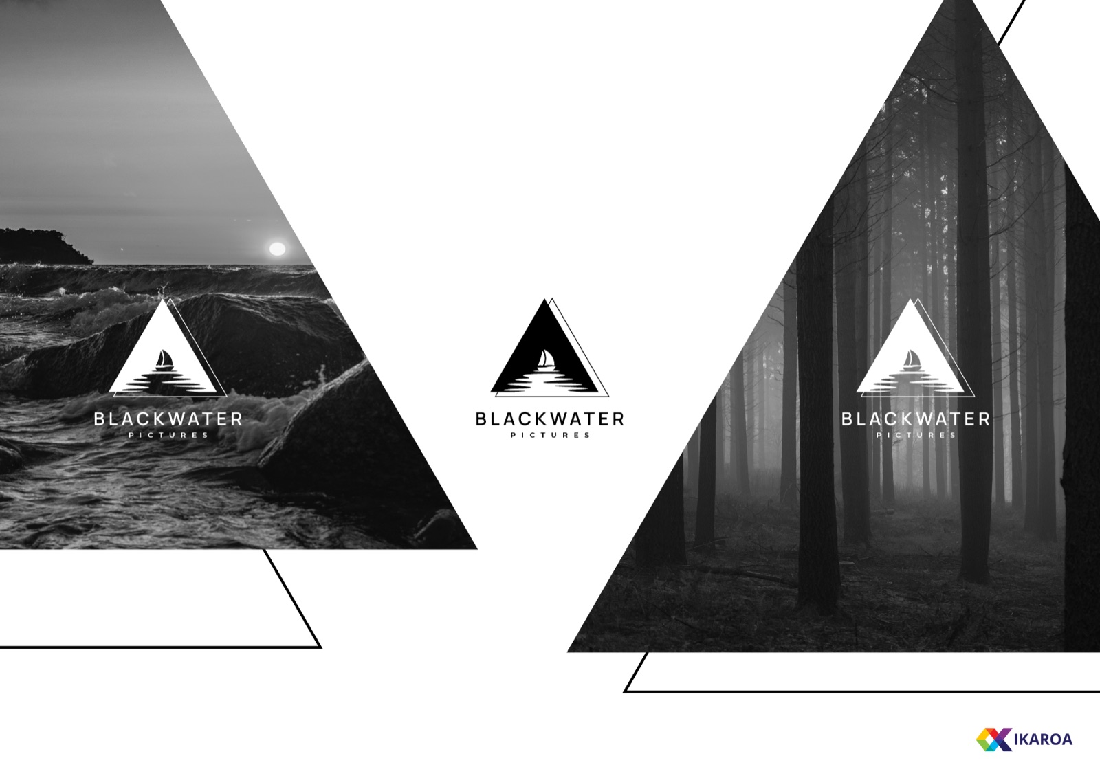
A triangle, a body of water, a single sail
The logo carries three readings at once. A triangle is the most stable shape there is, and it points up, which is what you want under a studio that means to last. The three sides stand in for past, present and future, the timeline of a film and of the company making it. Inside sits calm water with one reflected sail, the black water of the name made literal.
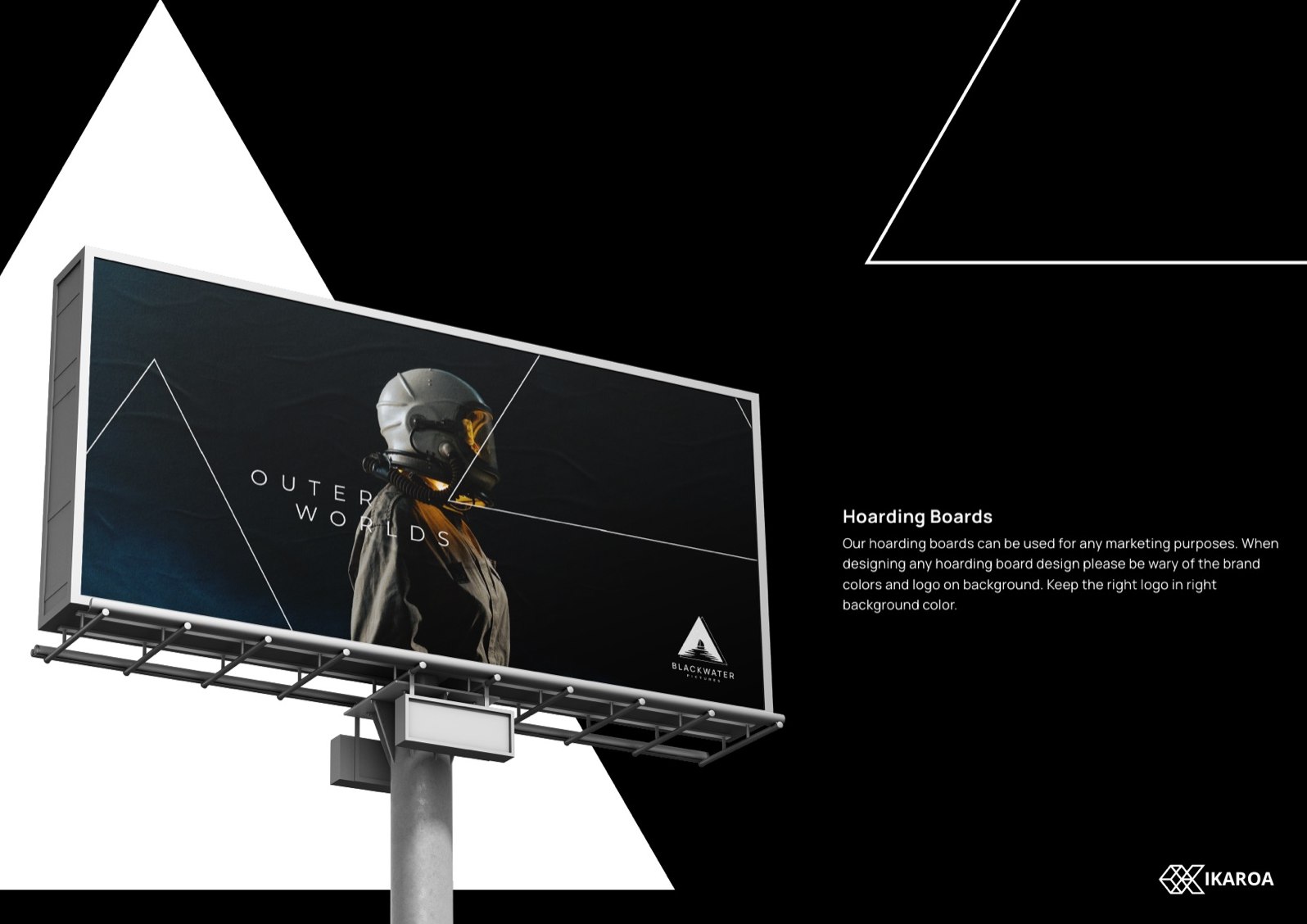
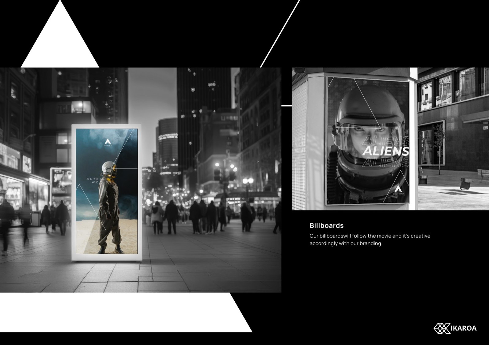
One shape, used to crop the world
The same triangle becomes a framing device. It cuts photography into sharp, screen-like shapes, so a BlackWater poster reads as BlackWater from across a room, before anyone gets close enough to read the name. The frame does the recognising. That frees the logo to stay small and quiet.
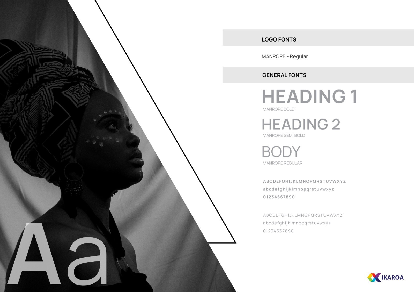
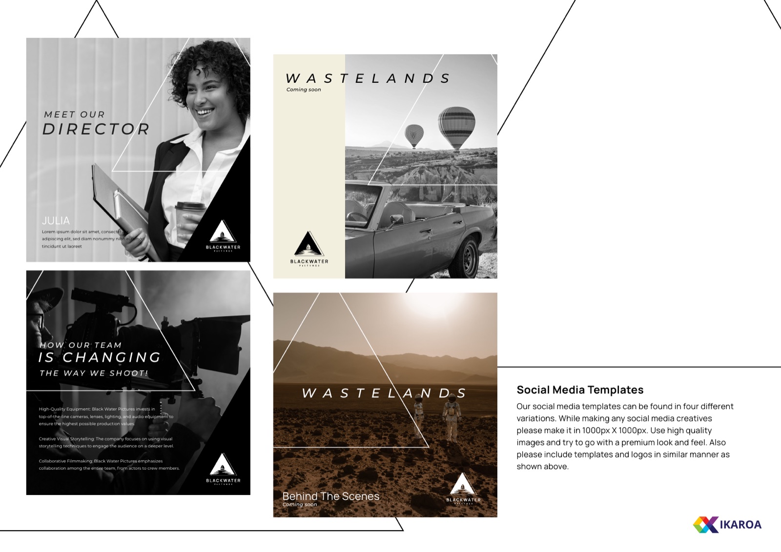
Manrope, set with room to breathe
One family, top to bottom. Bold for the titles, regular for the body, nothing decorative anywhere. Manrope holds the line between a credit roll and a contract, which is exactly the register a working studio lives in.
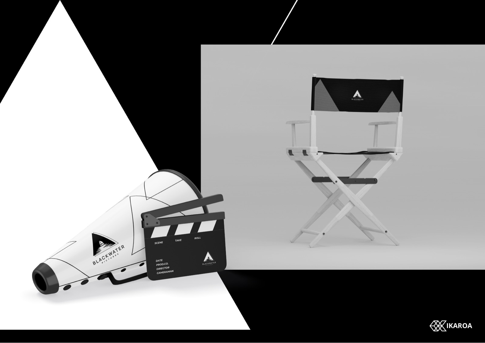
The kit a crew actually touches
The brand had to hold up on the things people pick up on a shoot. So the triangle runs onto the clapperboard, the megaphone and the back of the director chair. Same shape, same rules, no compromise once it leaves the screen.
What we shipped
01
Logo and framing system
The triangle mark plus a triangular crop that turns any still into a BlackWater still. The single device that makes a poster recognisable before the name is even read.
02
A monochrome rulebook
Pure black, pure white, the grayscale between. Manrope throughout. Measurement, clear space, minimum sizes, prohibited uses and background rules, all 23 pages of it, built to survive real production deadlines.
03
Production-ready collateral
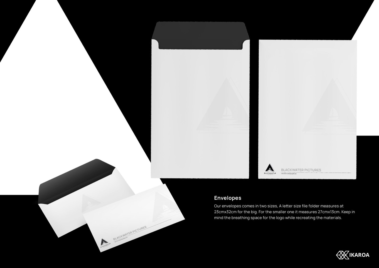
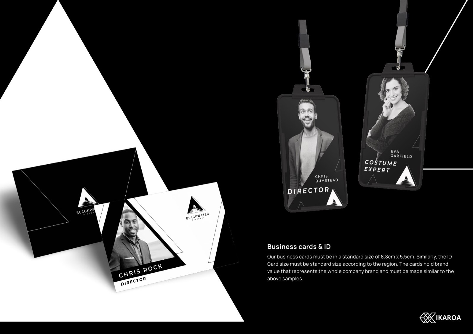
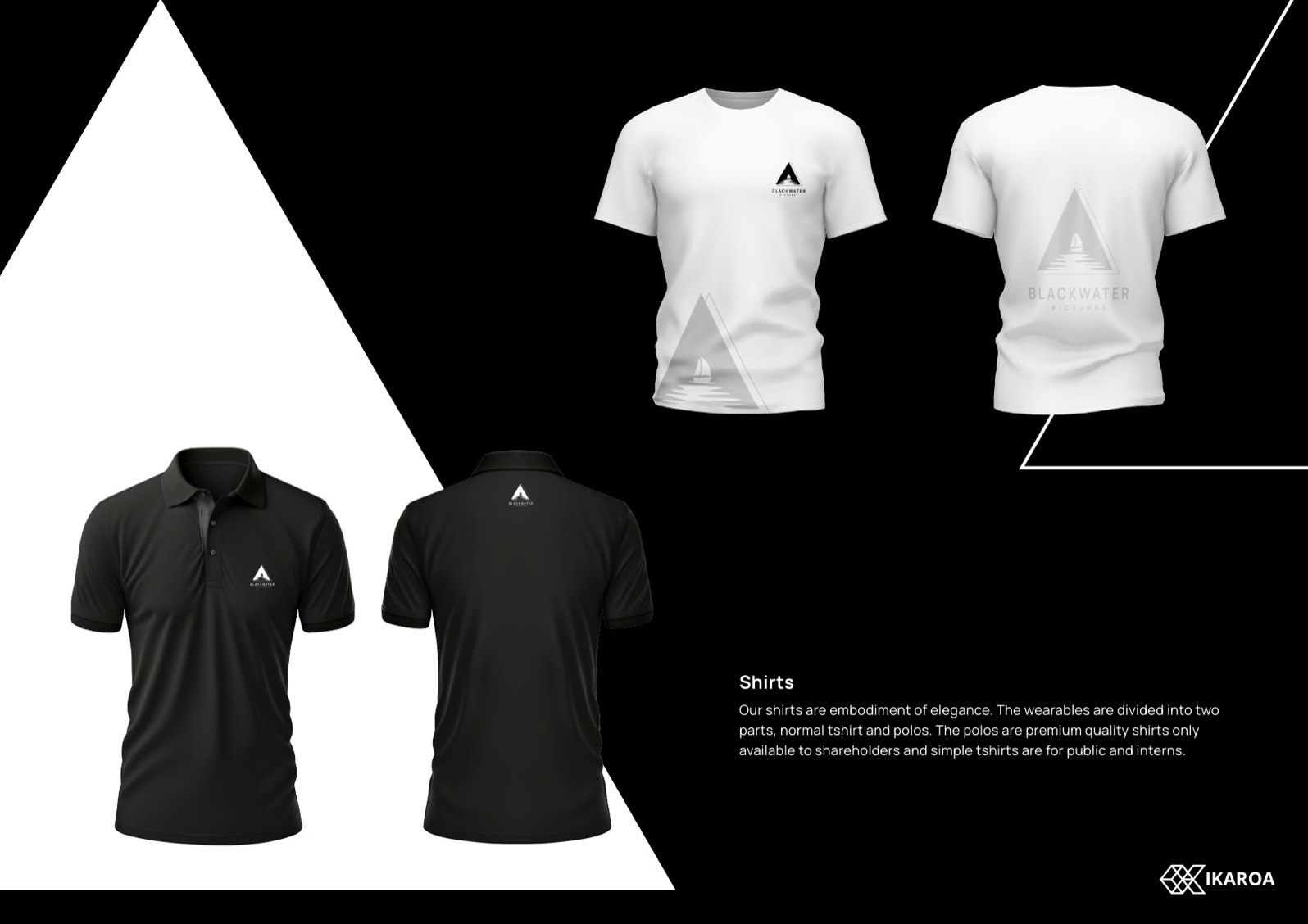
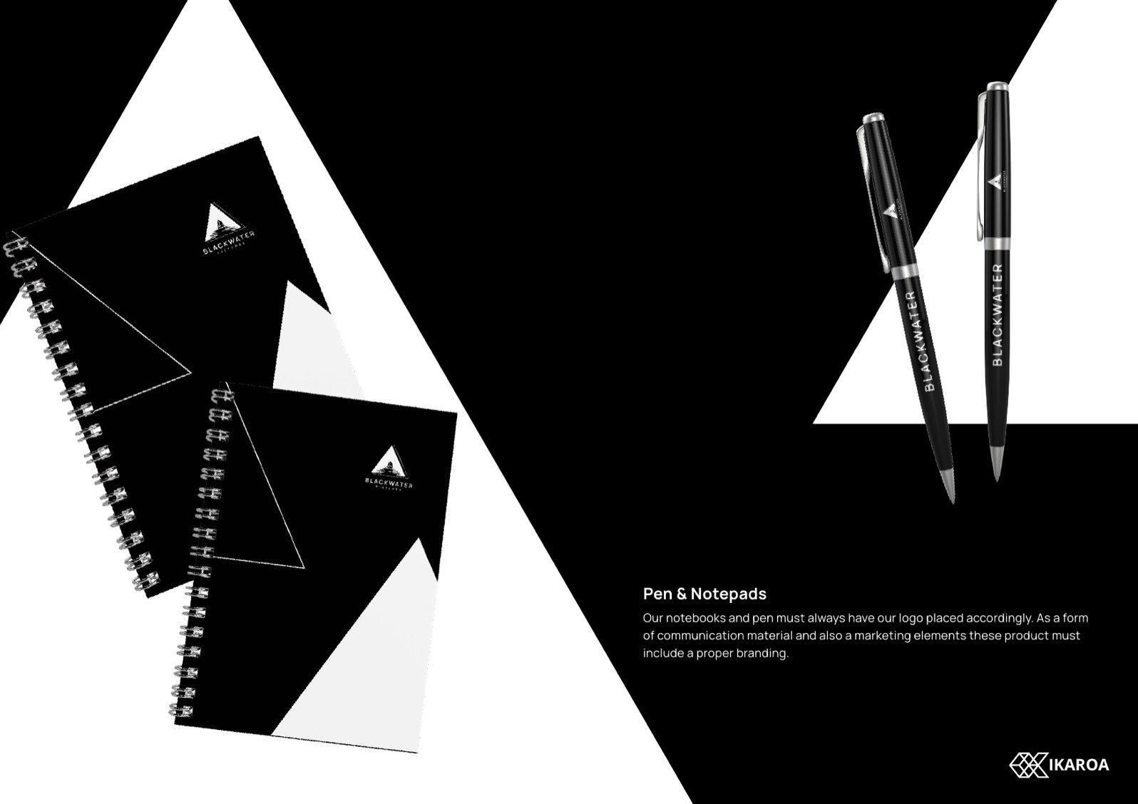
Letterhead, envelopes, business cards and crew ID, email signatures, shirts and polos, notebooks and pens, plus the on-set pieces a film crew actually touches: clapperboards, megaphones, director chairs.
Rolled out across
Director’s notes
Four calls that shaped the whole system
The brand serves the film, never the other way round
A production logo that fights the poster is a bad logo. We kept BlackWater restrained on purpose, so the studio mark frames the creative and then steps back.
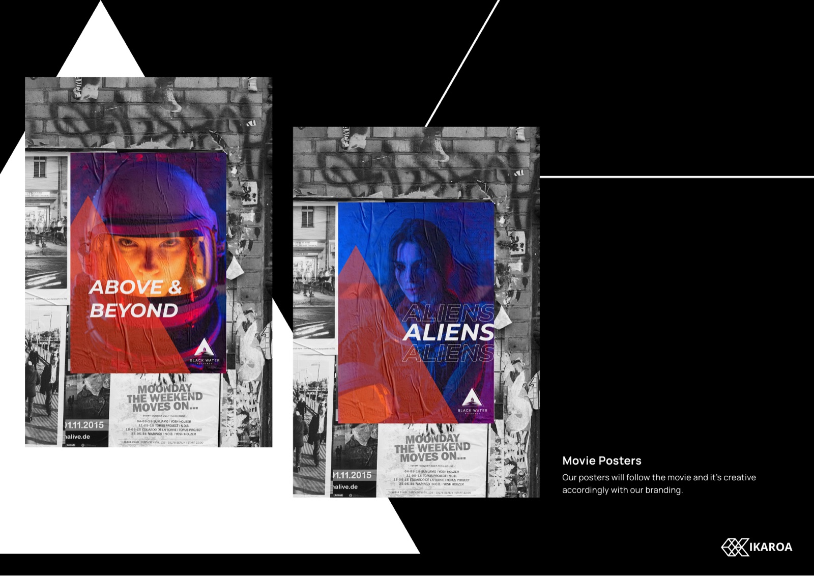
Black and white is a decision, not a limit
Take the colour out and everything else has to work harder: composition, contrast, type, the cut of the triangle. The result reads as film, not corporate, and it never clashes with a frame of cinematography.
One shape, used everywhere
The triangle is the logo, the photo crop, the layout grid and the motif on the director chair. Repeating one strong idea across every surface is what turns a mark into a brand.
A system two founders can run
Antoine and Kevin needed something they could hand to a printer, a poster designer or a new crew member without the look drifting. The manual is built for exactly that, hard rules and clear examples.
End card
Launching something, and want it to look the part?
We build identities that hold up under real-world use, from the logo down to the smallest piece of kit. If you are starting a company, this is the right moment to talk.