Brand identity · Dental, Nepal
Allora
A full brand identity for one of the oldest names in Nepali dentistry. New mark, new palette, Montserrat type, a 40-year anniversary system and a complete rollout across print, signage, merchandise and social. Built with our Nepal partners, TBC.

1985
Founded, in April, in Kathmandu
40
Years held in the anniversary mark
5
Values, the S.M.I.L.E framework
62
Pages in the finished guidelines
The brief
Four decades of reputation, no brand to show for it
Allora by Oral and Dental Clinic was founded in April 1985 by Dr. Raj Tilak Basnyat, the first Nepali to earn a master’s in Prosthodontics. He started it because Nepal had almost no quality dental care to speak of. Forty years on, the clinic has treated everyone from ordinary families to the royal household, and trained a large share of the country’s working dentists. The reputation is enormous. The brand had never caught up to it.
Now run by Dr. Gaurav Basnyat, the clinic wanted an identity that could carry the legacy and the next 40 years at once. The name says it plainly. Allora is a fusion of “All” and “Oral”, a clinic that does everything for your mouth, for everyone.
We built this with TBC, our partners in Nepal, who know the local market, the print trade and the patients far better than any outside agency could. We handled the brand thinking and the design system. They kept it honest to Nepal.
The mark
Three curves that read as a tooth
The logo is three abstract curved lines. From across a waiting room they read as a single tooth. Up close they suggest a wave, or a smile.
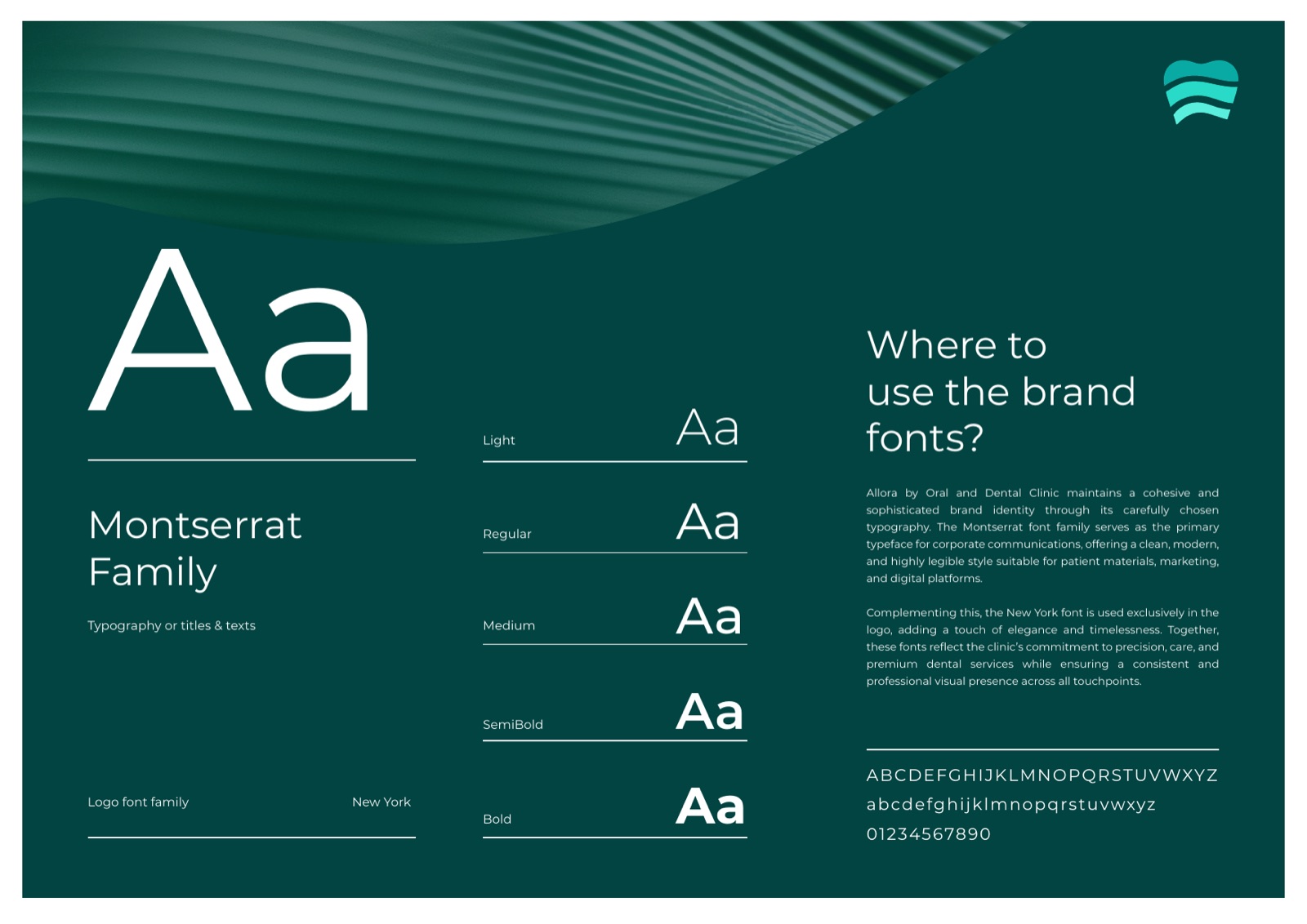
It is minimal, premium, and strict about its own geometry. We built it on a clear-space and measurement system so it holds at the size of a business card and the size of a clinic facade.
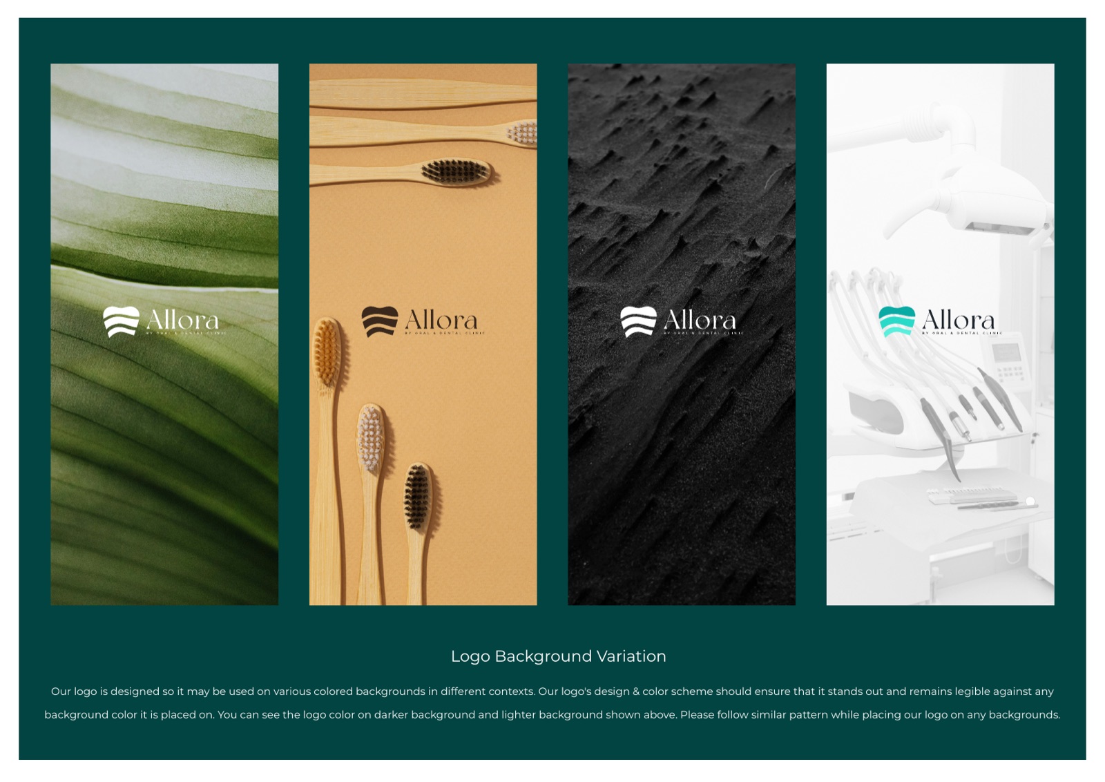
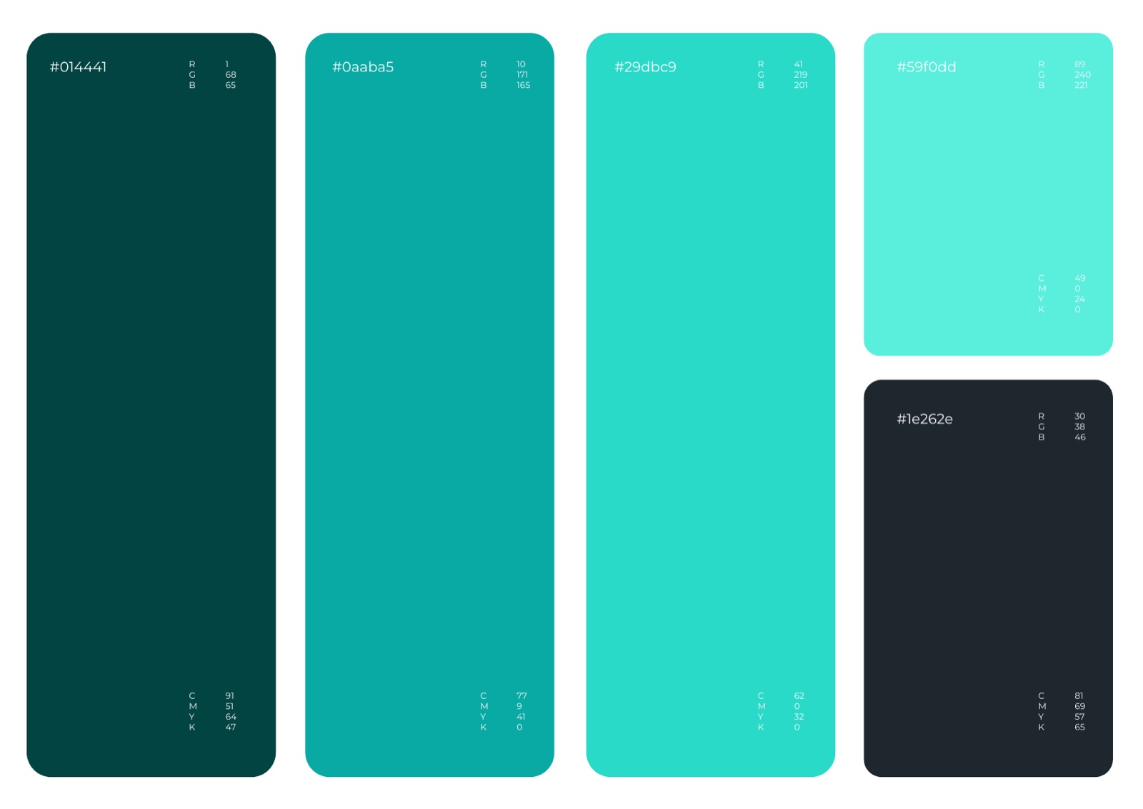
Colour and type
Emerald for the legacy, turquoise for the energy
Deep Emerald
#014441
Clinic Teal
#0aaba5
Bright Turquoise
#29dbc9
Mint Highlight
#59f0dd
Ink Charcoal
#1e262e
The framework
S.M.I.L.E, the spine under the brand
Five values the clinic actually runs on. We turned them into the structure of the identity, so every design decision traces back to something real rather than a mood board.
Service to All
Quality dental care that stays within reach. Over four decades the clinic has treated ordinary families, the royal household and sitting prime ministers under one roof. The brand had to greet all of them in the same calm voice.
Mentorship and Industry Growth
Allora trains a large share of the dentists working in Nepal today. We let the identity carry that teaching role, not only a service offer. That is a rare thing for a clinic brand to say out loud.
Integrity and Trust
Forty years of honest, dependable care. The visual language stays precise and quiet rather than loud, because trust is the real product on sale here.
Long-Term Preventive Care
A prevention-first, biomimetic philosophy. The brand talks about keeping teeth healthy for life, not patching problems once they have already arrived.
Excellence in Comprehensive Care
Periodontics, endodontics, prosthetics, orthodontics, all in one address. The system reads as a single clinic with deep range, not a list of separate departments.
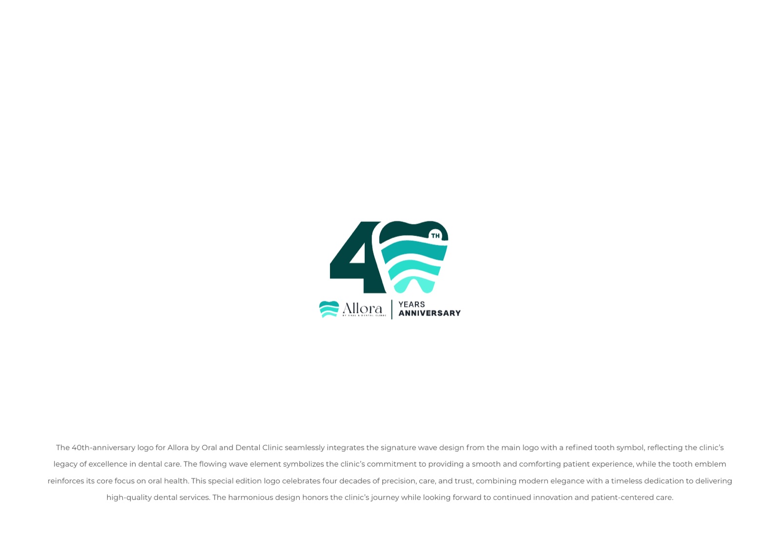
The anniversary
Forty years, folded into one symbol
The milestone deserved more than a sticker. We drew a dedicated mark that builds the wave and the tooth into a numeral 40, with its own measurement rules and clear guidance on when to use the anniversary lockup instead of the primary logo.
It is a second front door for one identity. The celebration shares the brand’s DNA, so it never looks bolted on, and the primary system keeps working long after the anniversary year has passed.
In the hand
The whole system at pocket size
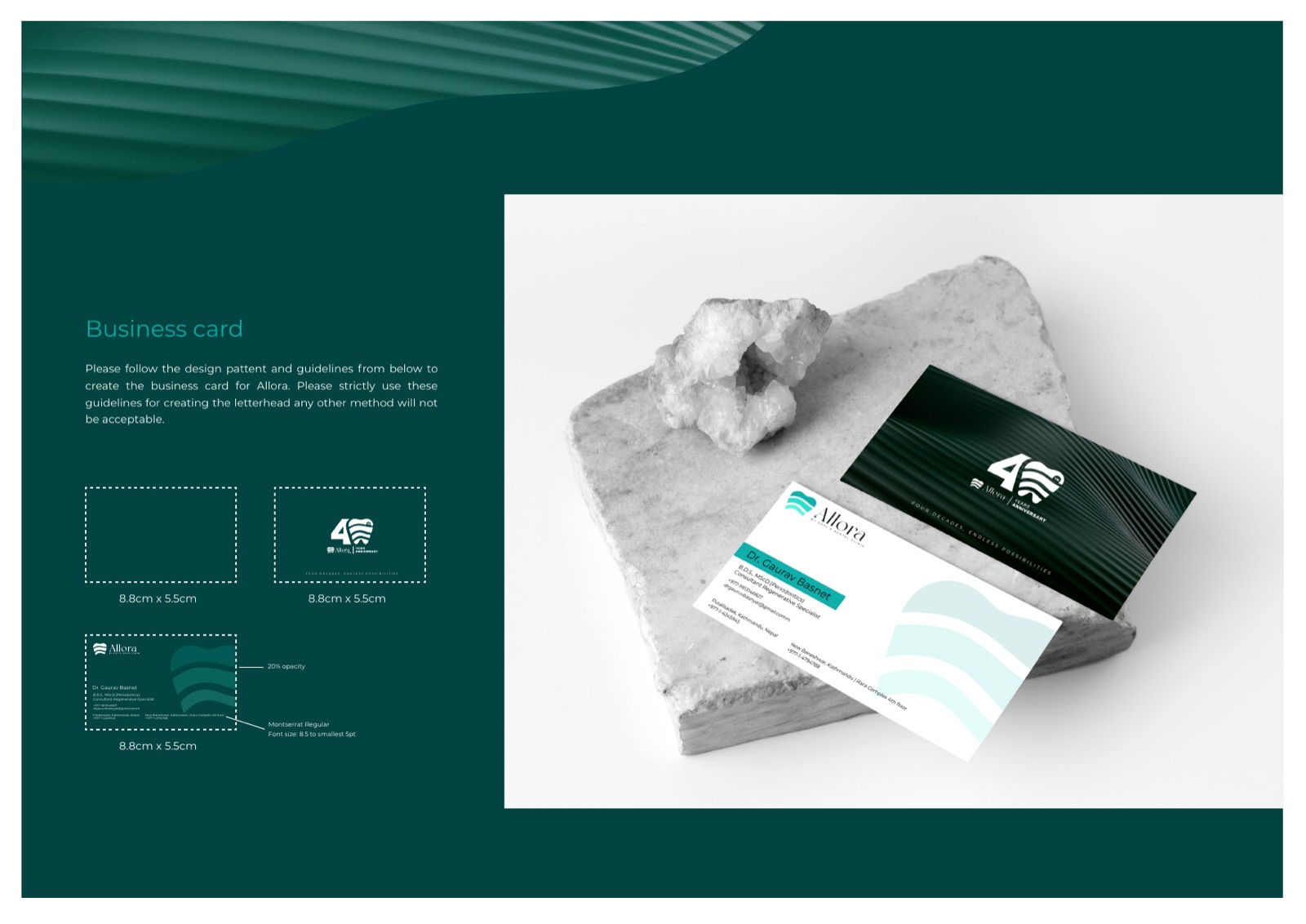
A business card is where most patients first hold the brand. The mark, the emerald, the type and the spacing all had to survive a 90mm by 55mm rectangle without losing the calm that runs through the rest of the system.
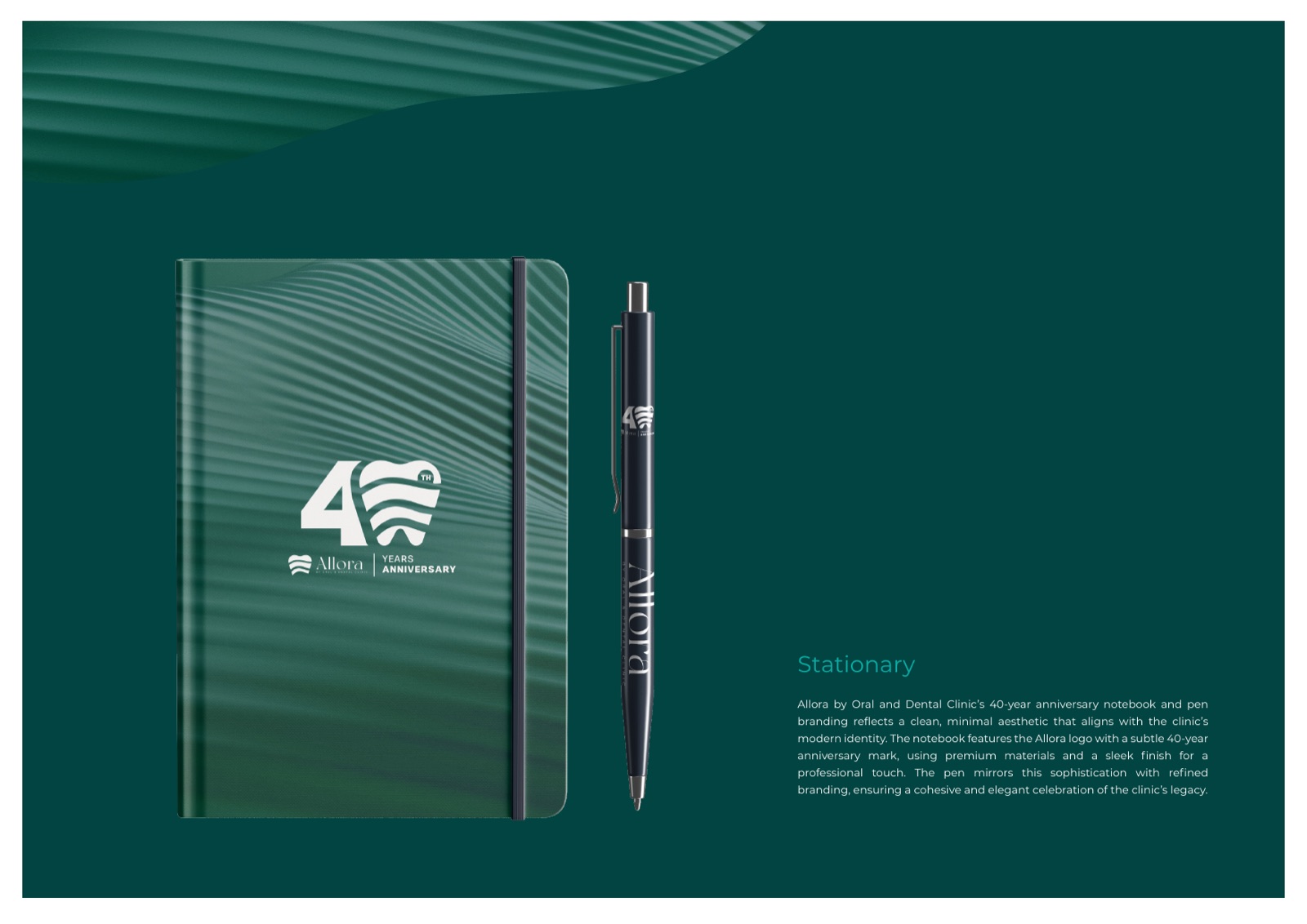
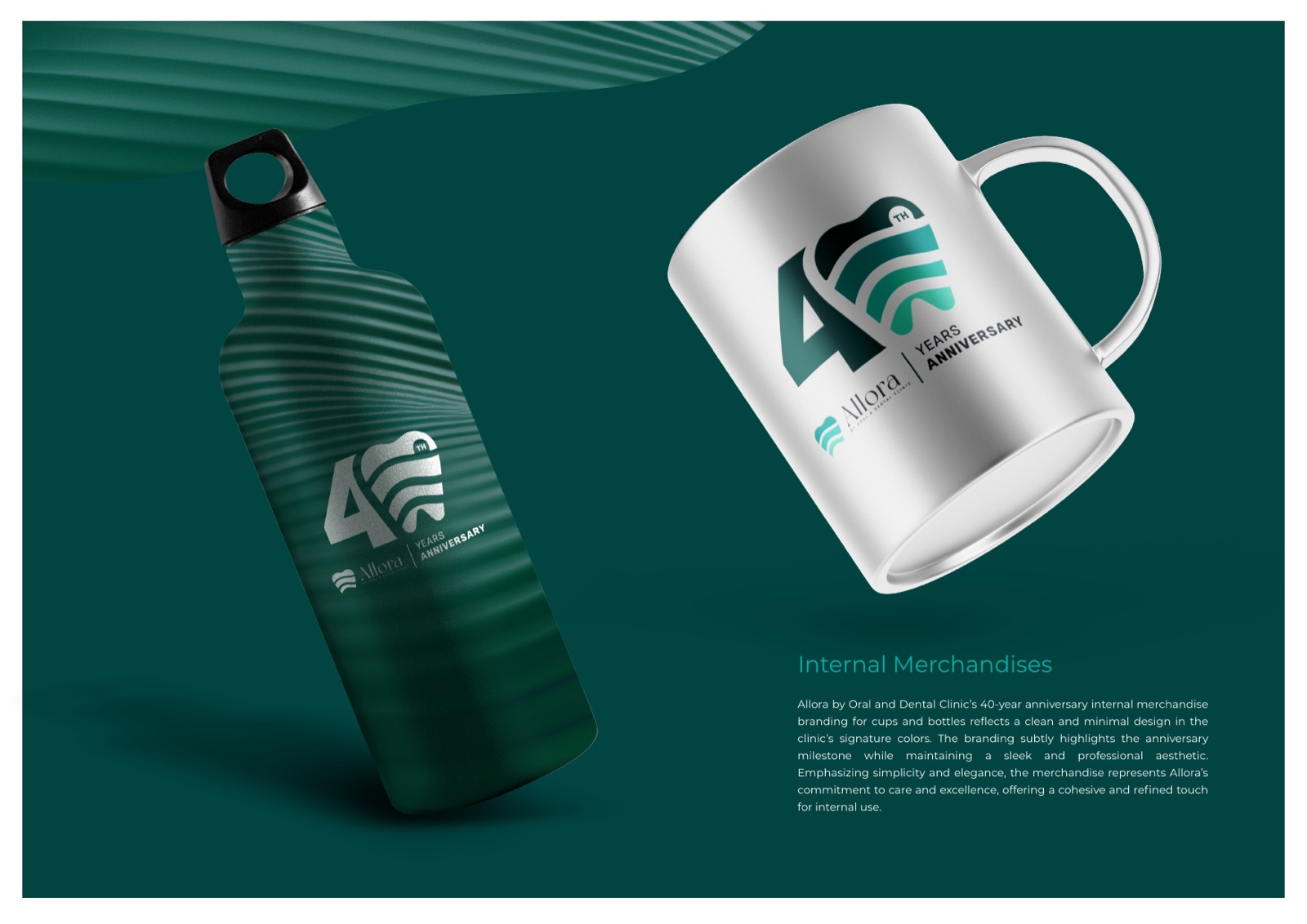
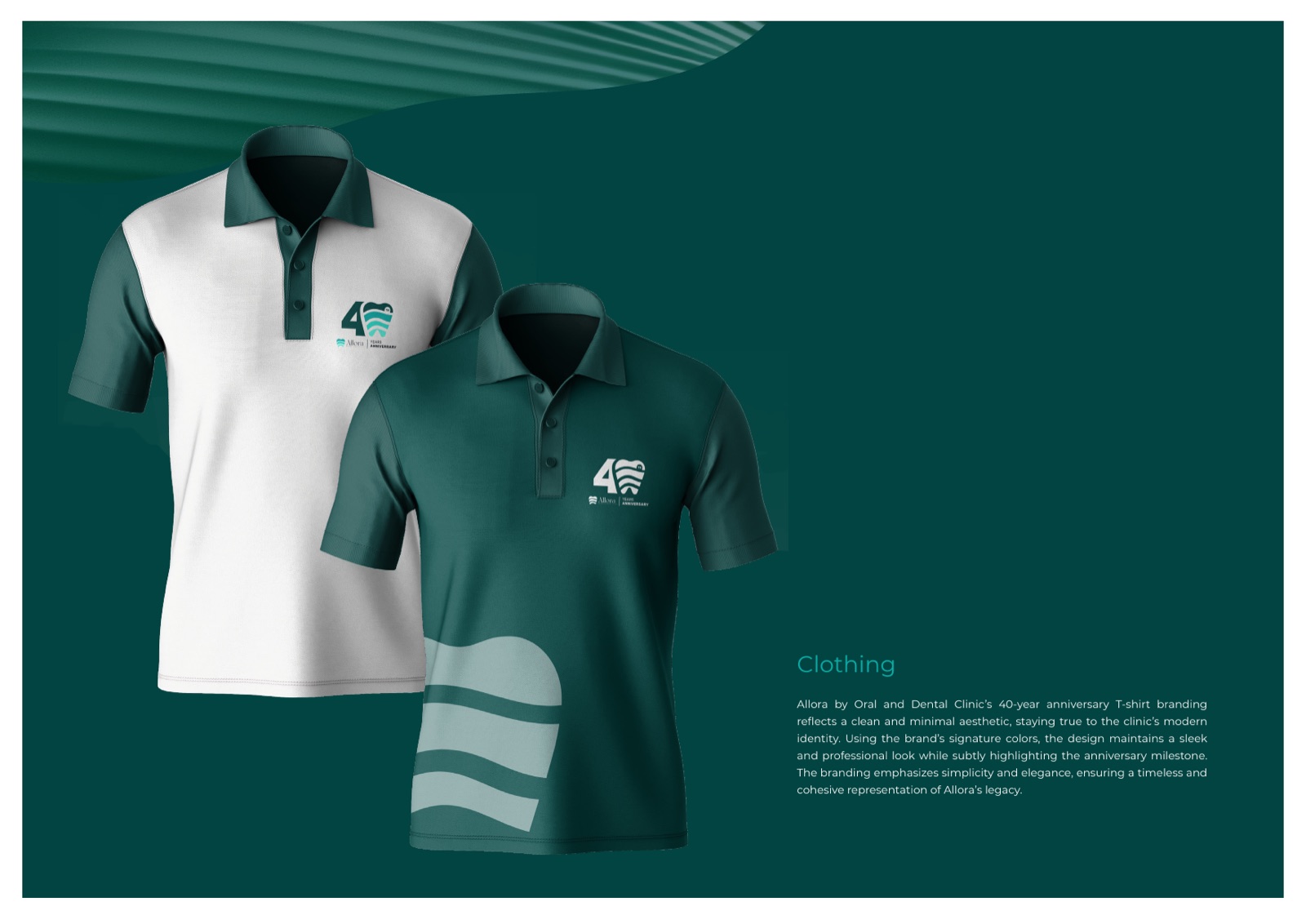
On paper, on people, in the hand
The mark, mocked up on real things
Out in the city, out on the feed
Where most patients actually find the clinic
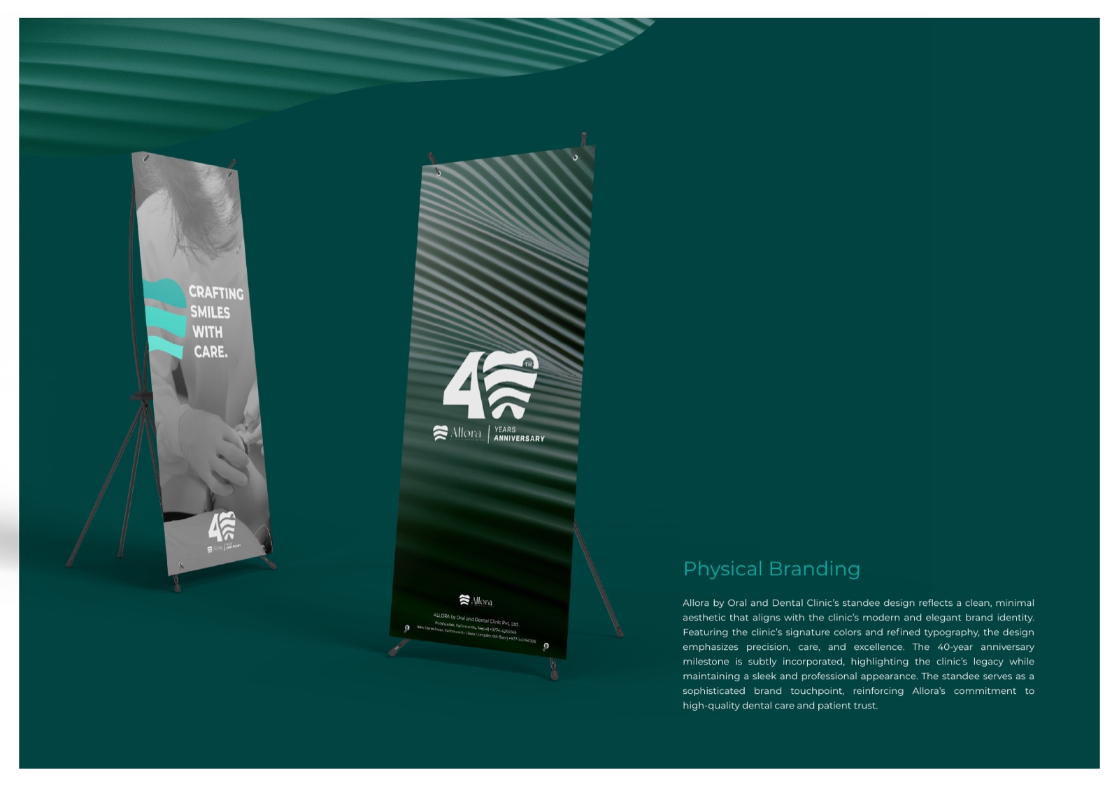
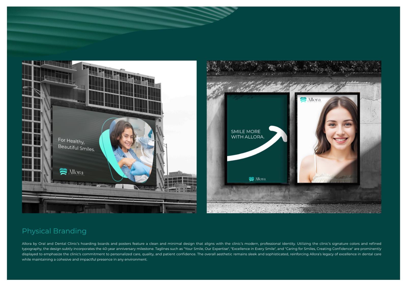
Rolled out across
Every place a patient meets the clinic
How we approached it
Four calls that shaped the whole system
A clinic, not a startup
Plenty of dental brands chase a tech-startup look. Allora has 40 years of history and the trust that comes with it, so we built something calm and premium that respects the legacy instead of hiding it.
One system, two front doors
A primary identity for everyday clinic life and an anniversary identity for the milestone year. Both share the same DNA, so the celebration never looks bolted on, and the brand keeps working long after the anniversary passes.
Designed to be applied by anyone
The guidelines spell out measurement, spacing, minimum sizes, prohibited uses and background rules. A local printer or an in-house designer can pick it up and stay on brand without a single email back to us.
Built for how Nepal finds a dentist
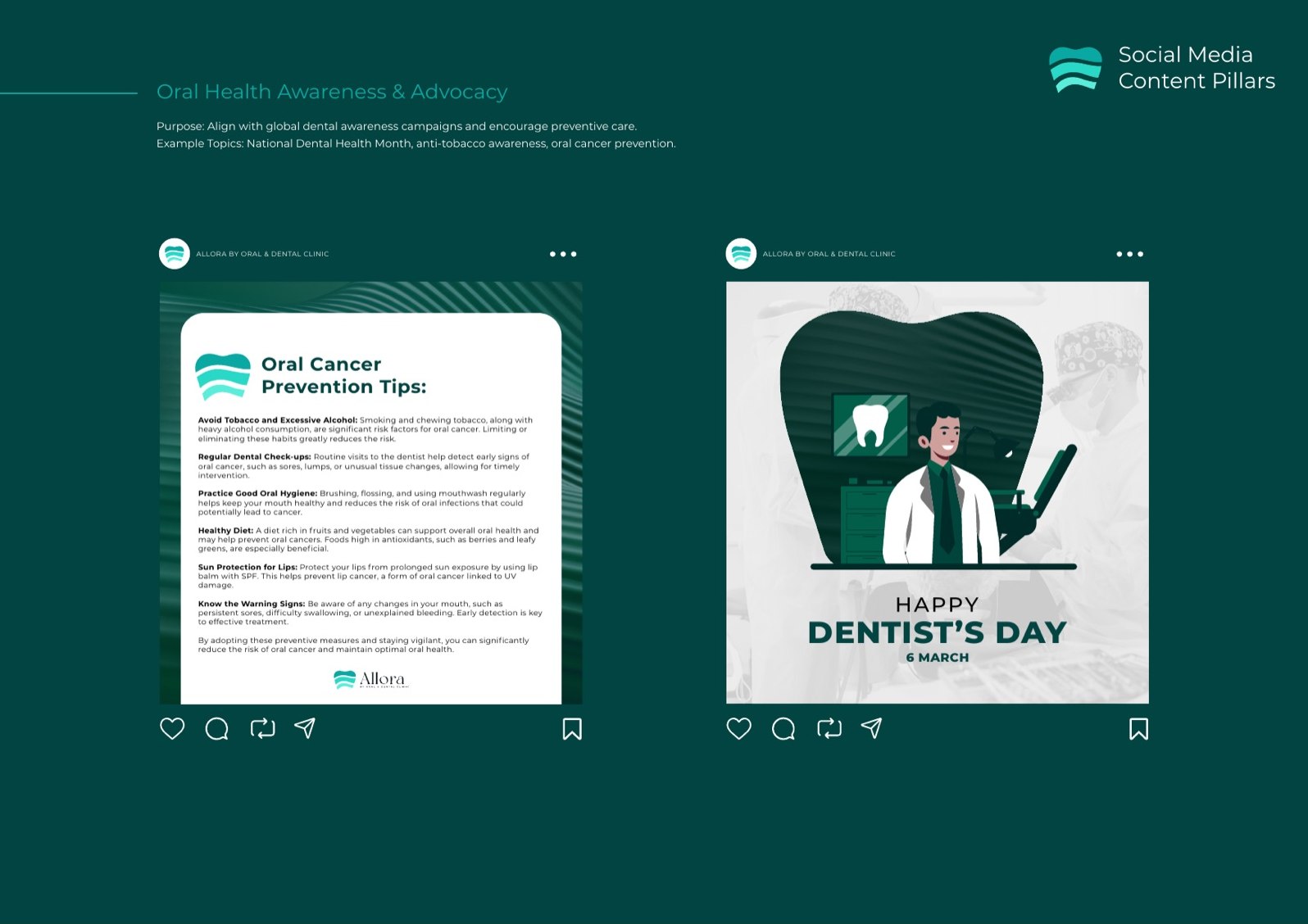
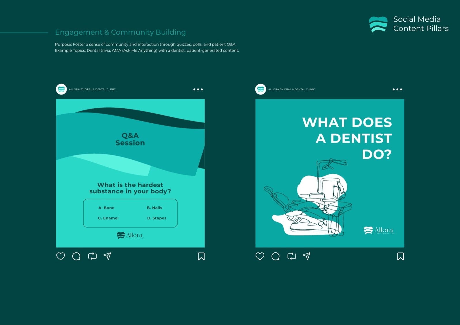
Facebook, walk-ins, word of mouth and community events. The social and signage templates are tuned for those channels, with patient education baked into the system from day one.
Built with TBC, in Nepal
A local partnership, not a flown-in rebrand
We produced Allora alongside TBC, our partners on the ground in Nepal. They understand the print suppliers, the signage trade, the patient base and the cultural detail an agency working purely from abroad would miss. The brand thinking and the design system came from us. The local truth came from them.
It is how we like to work across borders. One team that owns the craft, one partner that owns the context, and a client who ends up with a brand that feels native rather than imported.
A 40-year legacy, finally on brand
If you have a reputation your branding has not caught up to, that gap is exactly what we close. Strategy, identity and the full application system, run by one team.